After the crit I wanted to experiment further with the script font that I had in some of my sketches, so I looked at recreating it at a greater scale and looking at the details.

Joining the P was something I wrangled with quite a lot.
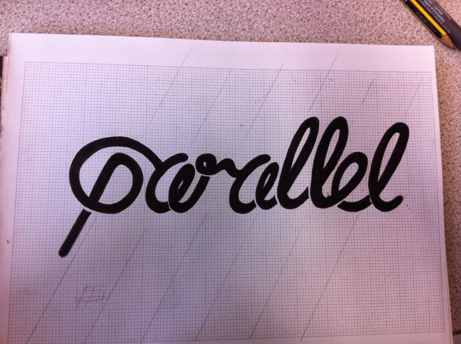
Legibility was also a really big problem, it just reads parcel!!


To try and combat this illegibility by changing the structure of the R but to no avail.

I also tried colouring in the loops of the A's to stop them looking like tiny Es but this still didn't work. Possibly working at this scale is counter productive because the logo will very rarely be seen at this size. So I think I will go back to small scar design so that when I achieve legibility I know it will work at the intended size.

I also played around with some brush pen calligraphy but I simply feel that this is too dated a style to work as a logo for parallel.
No comments:
Post a Comment