Although the response to my design was mostly positive there was some constructive criticism that I would definitely agree with. People seemed impressed by the quality of the print but questioned whether this was right for a Sin City Poster, feeling that perhaps the essence of the film (violent messing and a bit crazy) was not fully being conveyed. I am happy with the design but there are a lot of things i would like to change. I have possibly over thought the design, when I came so close to capturing the right tone of voice early on with the splashes of white ink on black paper. Next Time I do a poster I think I will make a more concerted effort to create something more high impact and eye catching.
Sunday 30 March 2014
Thursday 27 March 2014
OUGD404 Design Principles Type Journal James T Edmondson Brush Pen Type
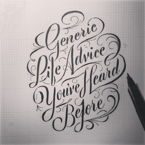
This is a clear use of the sable type style but through the medium of a brush pen. It also seems that this medium has been manipulated to create aspects of one type in the fast change from light to heavy line weight.
UGD404 Design Principles Type Journal Ben Didier Sign Painting
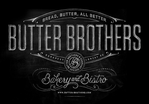
It is not only the type that makes this a beautiful sign but the use of framing lines ando positioning which compliments both the strong shapes of the wood style type and the soft curls of the sable style type.
OUGD404 Design Principles Type Journal Hand Rendered Type by Luke Ritchie
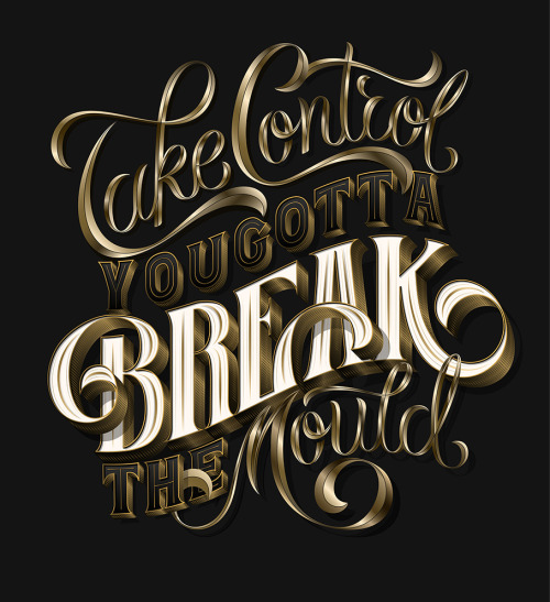
This type really caught my eye because it achieve that dominant look in hand rendered type that I have been trying to achieve myself recently. The juxtaposition of wood type and sable type style creates an engaging design.
OUGD406 Branding Day Brief
In groups we were asked to create branding for a company that communicate its core values and personality. this is what we came up with.
The response was mostly positive, although some suggestions for improvement were made.
The drop shadow was said to be possibly unnecessary because it would compromise legibility when the design was shrunk down to small sizes. The same was said about the symbols at the bottom of the logo. These were intended to outline the different sections within which the company operates, however, we possibly took this too literally and need to work on more simple means of visual communication.
OUGD406 Studio Brief 03 Screen Printing
Here you can see the difference between a print which had two pulls of white compared to one.
Over all I am really please with the finished effect of these poster and just hope that they are alternative enough.
Tuesday 25 March 2014
OUGD406 Studio Brief 03 Creating Screen Print Positives
I Have put together the positives for my screen print tomorrow in indesign.
To ensure that the two colours have the best chances of lining up I have used the layers in Indesign to crete the white and red colours.
The white layer is shown above.
And the gold layer is shown above.
OUGD406 Studio Brief 03 Poster Illustration
I drew up the city scape illustration for the lower half of the poster as shown Below.
So that I make full use of the two colours that are the limitations of the brief I have decided to make the windows of the buildings gold as well as parts of the text.
I also used white ink to create another splash with the right placed drips so that they lead into the city scape drawing.
When I am creating the screen print positives I will use photoshop to invert these drawings before placing them on an indesign document.
Monday 24 March 2014
OUGD406 Studio Brief 04 Brief Writing Session
Because we need to write rationales for our speaking from experience brief, along with creating our own personally tailored brief, we had a work shop in writing briefs.
We were asked to think of five things that we didn't know when we first arrived in Leeds and started the course.
We then swapped sheets with another group and highlighted the two most important points from their five.
We then came together with two other groups and discussed which we felt to be the most important point.
Then, using a brief template sheet we were told to write it up as a problem. We had a few difficulties with this, finding that we were simply making statements rather than outlining a problem.
After we had finished writing them up we swapped with another group which said that perhaps the possible areas for research we had outlined were too limiting. So, after changing these we came up with the brief below.
Friday 21 March 2014
OUGD404 Design Principles Type Journal Bryan Todd
The closest similarity found in this type by Bryan todd is wood type because of the heavy shapes and drop shadows although the curved shapes suggest sable and bone as well.
http://bryanpatricktodd.com/blog/?offset=1381195411858
http://bryanpatricktodd.com/blog/?offset=1381195411858
OUGD404 Design Principles Type Journal Bryan Todd
This Hand rendered yet digital type is a complete hybrid of the liquidity of sable, bone and wood type fonts. In the glyphs themselves the quick change from heavy to light line weight suggests bone, yet the elongated ornamentation has the smooth transition from heavy to light of a sable font and yet again the wide and soft serifs suggest wood heritage. One would suggest that the freedom of hand rendered type is a completely new origin of creation.
http://bryanpatricktodd.com/blog/?offset=1381195411858
http://bryanpatricktodd.com/blog/?offset=1381195411858
OUGD404 Design principles Type Journal Bryan Todd Hand Rendered Type
This hand rendered type is a mix of wood and sable with touches to bone, shown in the changes of line weight in the strokes of some glyphs.
http://bryanpatricktodd.com/blog/?offset=1381195411858
http://bryanpatricktodd.com/blog/?offset=1381195411858
OUGD404 Design Principles Type Journal Bryan Todd
This is some sign painting done by Bryan todd in Louisville Kentucky, it seems to be a mix of sable origins of design and wood type as shown from the soft and heavy serifs.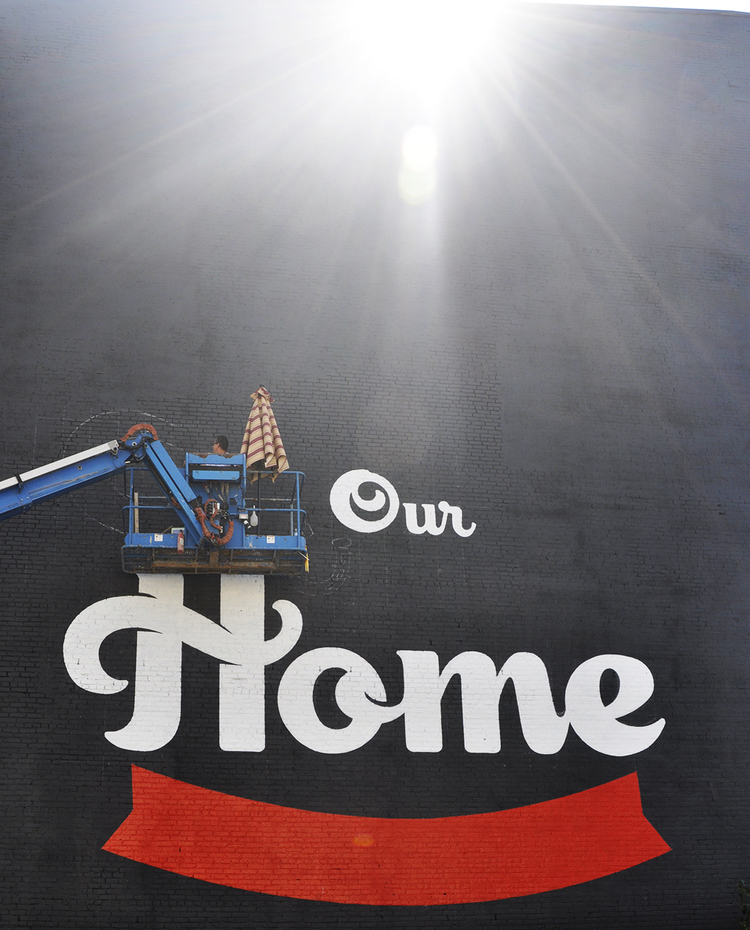

OUGD406 Studio Brief 03 Experimentation with type on Earlier Ideas
Before I go on to commit to the design I have developed so far and produce it in screen print, I want to go back and look at applying the type I created to some of my earlier ideas, to see if I am following the best idea to the end.
Because of the hight texture of the splash, I fully filled in the type to separate it from the background. I also gave it a gold isn colouring just to get an idea of the effect taking this design to screen print would create. I feel that the type is too delicate in form to sit against such a strong visual texture, the legibility is far too compromised.
Because of problems with the program I had rouble creating the drop shadow of the type in anything but black for the screen print positive. However, I still used the front part of the type to get an impression of the poster design shown above. Although I got a lot of positive feedback about this design I just feel it is too delicate for Sin City, it needs to be more punchy and rude.
Thursday 20 March 2014
OUGD404 Design Principles Type Journal Bryan Todd

http://bryanpatricktodd.com/work/#/quiet-company/
Heavy, yet curvaceous font by Bryan Todd for the branding of the quiet company. The shapes of the letters is most closely relatable to wood type but has the curves and freedom of a digital font.
OUGD406 Studio Brief 03 Type Screen Print
After creating the positive from my sketch on illustrator as shown below I used the screen print induction to experiment with the finish this process could provide for the hand rendered type I have created.
I am really pleased with the finished look and I am glad I got to get some practice in before I print the full poster. However, I want to re draw the 'city' part of the design because there are many mistakes with sizing and the angle of the base line that I am just not happy with.
The design was split into two as is shown below so that the drop shadow and the front of the design can be the two different colours as is outlined by the brief.
When considering the colours I took into account the fact that for the image aspects that are to accompany the type, I have decided on white ink on black paper. So, I have chosen white for the drop shadow (so that it is possible for the ink to drip from this part of the lettering) and gold for the front, this is to outline and increase the suggestion of the 'gangster' aesthetic mentioned earlier, aiding the suggestion of wealth and corruption.
The first lyre i printed was the gold and I had to add a bit more powder pigment to achieve a dense enough colour to sit upon the black.
However, printing this layer first proved a mistake because matching every aspect of the drop shadow to exactly the edge of the front so that they didn't over lap proved practically impossible.
So, I had to do another run with the drop shadow first and the gold layer to finish.
OUGD406 Studio Brief 03 Hand Rendered Type
In an effort to create something truly 'Alternative' to the original sin city branding and identity I wanted to attempt some hand rendered type as mentioned in my crit. Because of the positive response to this idea I set to work creating a design, drawing from a number of pieces which I had noticed earlier in the week and documented both in the previous post and my type journal.
I set about creating a base line with a soft 3 degree angle to it because this is something I observed and really liked on the hand rendered type I had found.
The angle of the type, I have also attempted to regulate at 78 degrees, although I found this difficult because identifying the exact centre of each letter, therefore aligning it to the angle proved trying.
Something I admired in the type I found in my research was the heavy drop shadow. it creates a weight upon the page which lends a presence and assertiveness to an otherwise overly delicate font. As previously mentioned I wanted to achieve an almost 1920s 'gangster' aesthetic with this font because it connotes corruption behind the beauty which is such an integral part of the film plot and identity.
Tuesday 18 March 2014
OUGD404 Design Principles Type Journal
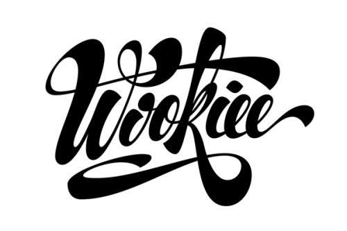
This is some type design done by Martín Krause. This seems to be a combination of the line weight changes of a bone style font with the graduation from one to the other of a sable font, making this most definitely digital. This is clearly not a full font thought, it is much more of a piece of art with letters, which means that this context for these letters is the only one that have to work in making them incredibly specifically tailored to the letters either side of it and how it needs to act in this environment to be legible and readable.
OUGD404 Design Principles Type Journal

This is a design done by Anton Burmistrov for a room to help creatives be creative. there is a definite edge of the wood
type look to these but the details in the terminals and drop shadows could only be drawn and
then digitised.

OUGD404 Design Principles Type Journal
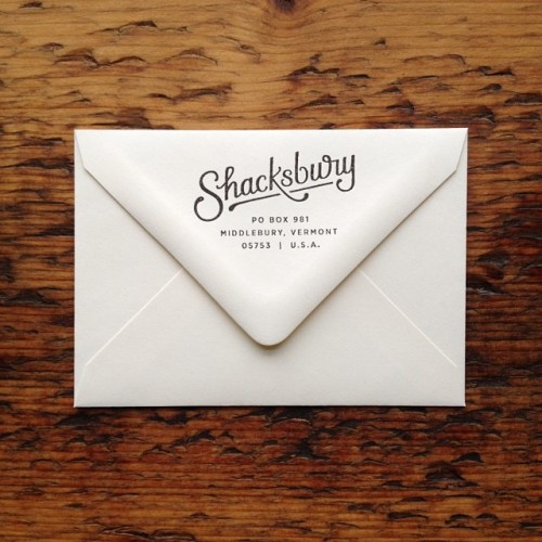
http://typeverything.com/post/75036708969/typeverything-com-shacksbury-branding-by-scouts
This is a wonderful example of type branding by scout's honour co. I found at type and everything, It has a wonderful floe of readability even if the edibility is not that great all the time. The connection to the movement of the hand during creation, somehow effects the smoothness with which it is read.(definitely sable in origin)
OUGD404 Design Principles Type Journal Hand rendered Type
This is some gorgeous hand rendered by Bryan Todd
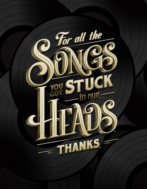
http://typeverything.com/post/74931050785/typeverything-com-for-all-the-songs-by-bryan

http://typeverything.com/post/74931050785/typeverything-com-for-all-the-songs-by-bryan
Subscribe to:
Posts (Atom)


