After our last idea generating meeting we got together again and looked at the wall of pot its we had collected and started to pick out the most important points.
The criteria for what needed to be made soon shaped an idea. A game accessed through and app. This would be based around eco systems that you would unlock as you progress through the game. The game starts from the idea that we discover another earth right next to our own and the gamer has to nurture it in each of its eco systems unlocking animals in the food chain. The more endangered the animal the more difficult it is to get. There would be tasks in the game that would get you panda currency and the added extra of getting tips on living more sustainably day to day. Doing these and taking a slefie would unlock extra pandas in the game. In this way a fun game educates people about the problem and its difficulties and gets them to live more sustainably in their day to day lives.
Outlining the areas of the campaign was the work of a moment.
We then separated out further research areas for the next brief to meet back together next week. My research areas are the desert, temperate grassland and deciduous forest.
Because I decided this was going to be a relatively short Brief. I went straight in with an image I had in my head for a while after reading the book. I knew I wanted this project to be illustrative because of how open and raw the protagonist is with the reader. I chose this flat illustration style in an effort to emulate the flat almost pattern like drawings found in old Bibles on illuminated lettering and the like. This is also why the two 'O's are almost illuminated in their size.
Again I used water colours to create a sense of softness and humanity because the way water colours show the brush strokes of the artist brings the onlooker much closer to the object, because it feels crafted and more natural. Not machine made in the slightest.
On this first draft of the cover I put together the ecclesiastical window frame and the growing orange tree. This image brings together the book title and its deeper meaning of choosing a different path in life and going beyond the normal in being honest with your self. This is because the protagonist is trapped by the religious beliefs of her parents for years but eventually grows beyond them and makes her own decisions. Also the oranges are many different colours on their interior, once again saying that people are all naturally different even if they don't appear it on the surface.
Today, Roz and I (with Fran on facetime) got together and started by simply re reading the brief and highlighting the important parts.
We then took a large number of post its and started to break down the problem into sections trying to identify its many facets. This was a particularly useful method we learned from a previous workshop and it proved helpful this time as well.
The areas we split the problem and solutions into were: Define the problem, Identify Target audience, Format? and Misc. As you can see a lot of ideas started flowing.
Misc was added later because of points that didn't fit into any of the other categories but we still felt they might prove useful later.
We were considering the idea of an app for a while because of its interactive possibilities and the way it fits with the 14-24 target market. However, Fran mentioned the Green Ape app and after researching it, it seems to do everything we talked about doing. i.e. a map for local green initiatives, rewards for green living at a small scale, a sense of community and achievable goals. So, perhaps this is worth further examination, we don't want to make something that already exists.
One thing that green apes doesn't do is reward people in real life and this was were we wanted to differentiate ourselves. We considered having events that the points earned in the app could be used as currency at. This was something everyone felt was a great idea and could even be a local fair that involved all the green initiatives that I found in my earlir research.
Because the brief so explicitly says that we need a digital aspect we found it useful to start generating ideas of different platforms that we could utilise.
Target audience was an area that we had a litle difficulty with because of how wide it is. We literally need to reach the widest audience possible with this campaign. However, we did have a few breakthroughs concerning habits and how easy to make the different aspects of the campaign and what king of rewards would work for this target audience.
My research task for the next meeting was to look into green initiatives around leeds that might provide some insight into what is already going on.
The first thing that turned up in my search was the green exchange that I had already heard about. They are the centre of a lot of initiatives in the city centre.
They have a lot of projects surrounding community gardens and using space to grow extra food.
This was particularly interesting because of the way that they are making student houses more green which is such a huge part of leeds as a community. This shows how people interact more at a local level with these issues because they feel they can actually make a difference.
This is a long term campaign that informs people about ways that they can live a greener life in a big city. Simply telling people they can do this makes a big difference.
The ways they are informing people about the specific green options available in leeds is so personal and useful with a very positive tone of voice.
I also thought it worth looking into the government's plans and how they wanted to progress at a local level on the environmental front.
I also found this plan to create a 'green corridor' through neglected parts of the city to improve appearances and encourage wildlife back into the city. This got me thinking about how local wildlife might play a role in the understanding of wild life over seas. This could be the key to relating to the problem.
Although it is not a green project in its self the Leeds Festival has taken a lot of interesting precautions to lower their events carbon foot print. These could be more relivant at a later stage of the project.
The Real Junk Food Project
Our History
The concept was the original idea of Adam Smith a chef from Yorkshire who became preoccupied with the growing problem of wasted food after spending a year working on farms in Australia. Adam returned to Leeds and connected with Sam Joseph and Conor Walsh, two University students who had been exposed to supermarket waste for years, together their passion, energy and dedication created the first PAYF café in Armley, Leeds in December 2013. It has sparked the creation of a national organic network of similar café’s totalling over 40 that serve 100% food surplus on a strictly Pay-As-You-Feel (PAYF) basis. Over the past 12 months the projects have intercepted close to 50 tonnes of food and fed thousands of people. This is a collaborative effort to bring about a radical change in our food system.
Food waste is a problem that affects everyone day to day and is possibly worth looking at in greater detail. This initiative is a great example of something that people are already doing to help the environment at a local scale first, something people are much more likely to get involved in. Perhaps the next step is to look into ways that people can make a difference at a local level and implement this in our idea generating stage.
Something I have personally been wrangling with during this research was how someone could be feminist and enjoy things like make up and fashion that could also bee seen as oppressive tools. I name that kept popping up in this search was Coco Chanel, so I found this article summarising her role and beliefs surrounding feminism.
"Chanel would not have defined herself as a feminist--in fact, she consistently spoke of femininity rather than of feminism--yet her work is unquestionably part of the liberation of women. She threw out a life jacket, as it were, to women not once but twice, during two distinct periods decades apart: the 1920s and the '50s. She not only appropriated styles, fabrics and articles of clothing that were worn by men but also, beginning with how she dressed herself, appropriated sports clothes as part of the language of fashion. One can see how her style evolved out of necessity and defiance. She couldn't afford the fashionable clothes of the period--so she rejected them and made her own, using, say, the sports jackets and ties that were everyday male attire around the racetrack, where she was climbing her first social ladders.
It's not by accident that she became associated with the modern movement that included Diaghilev, Picasso, Stravinsky and Cocteau. Like these artistic protagonists, she was determined to break the old formulas and invent a way of expressing herself. Cocteau once said of her that "she has, by a kind of miracle, worked in fashion according to rules that would seem to have value only for painters, musicians, poets."
By the late '60s, Chanel had become part of what she once rebelled against and hated--the Establishment. But if one looks at documentary footage of her from that period, one can still feel the spit and vinegar of the fiery peasant woman who began her fashion revolution against society by aiming at the head, with hats. Her boyish "flapper" creations were in stark contrast to the Belle Epoque millinery that was in vogue at the time, and about which she asked, "How can a brain function under those things?" Something that Chanel can never be accused of is not using her brain. Her sharp mind is apparent in everything she did, from her savvy use of logos to her deep understanding of the power of personality and packaging, even the importance of being copied. And she was always quotable: "Fashion is not simply a matter of clothes. Fashion is in the air, born upon the wind. One intuits it. It is in the sky and on the road."
It is fitting, somehow, that Chanel was often photographed holding a cigarette or standing in front of her famous Art Deco wall of mirrors. Fashion tends to involve a good dose of smoke and mirrors, so it should come as no surprise that Gabrielle Chanel's version of her life involved a multitude of lies, inventions, cover-ups and revisions. But as Prada said to me: "She was really a genius. It's hard to pin down exactly why, but it has something to do with her wanting to be different and wanting to be independent."
I also found this interview with Catlin Moran on the issue of make up. It talks about the reasons for wearing make up and how these define health and unhealthy use of makeup.
A lot of feminism focuses on the role women play in the work place and how and if in a patriarchal society women can be valuable in that way. I found a great article brining together statistics and some gender prejudices in a fantastic way.
"Working mothers are less productive than women without children
Some employers are suspicious of mothers, presumably because they know that when you’re responsible for the welfare of a human being, you start to have a threatening perspective on the usefulness of a three-hour meeting in order to approve a corporate hashtag. Yet researchers from the University of Zurich found that working mothers tended to outperform their child-free colleagues, and those with two or more children performed better than those with only one child. Mums get stuff done.
Working women leave it too late to have children and their fertility ‘falls off a cliff’
Earlier this year, Kirstie Allsopp said we needed to be honest with young women about having a baby, then working on their career, because “nature is not a feminist” and if women wait until they’re financially settled, it will be too late for them. But Hanzan and Zobia’s research turns this idea on its head, and new findings show that more than half of all babies are being born to mothers over 30. Our understanding of health is ever improving, and we know how to look after ourselves in order to promote fertility. Egg freezing, while controversial, is becoming an increasingly viable option.
Women are bad bosses
In a Gallup poll last year, 40% of women and 29% of men said they would prefer a male boss to a female one. The Ban Bossy campaign addresses the assertion that women in positions of power are seen in a negative way. However, research has found that venture capital firms that invest in women led companies that outperform those that don’t. Women in charge get results in the workplace – perhaps because they know they have to work harder to gain the respect their male counterparts are automatically afforded.
Working women are bad mothers
On average, women tend to spend an hour a day of quality time with their children, whereas in 1974, when there were far fewer women in the workplace, the figure was only 15 minutes. Researchers from the universities of London and Seville believe modern mothers are doing more for their children’s cognitive development than ever before. A study published in the New York Times showed working mothers were less likely to experience sadness, anger and diagnosed depression. That has to be good news for them and for their children.
They like to define themselves as ‘career women’
Some women choose to work. Some also have a family. Some don’t. Some women have to work in order to support their family. Some women want to work but find childcare costs make it so prohibitive that it makes more sense for them to stay at home. Women are too sophisticated to be defined as either mothers or not-mothers, working or not working – perhaps because we know our state of being is unlikely to remain static."
After reacquainting myself with the work of Catlin Moran I found the name Germaine Greer came up a few times so I have done some preliminary research into her and found some great summarising quotes.
"Greer, a prominent women’s rights activist, journalist and academic was made famous for writing the 1970 bookThe Female Eunuch, which promoted the freedom of women to determine their own values.
She also wrote Sex and Destiny: The Politics of Human Fertility(1984); The Change: Women, Ageing and the Menopause (1991) and The Whole Woman (1999)."
"She once defined her goal as 'women's liberation' as distinct from 'equality with men' and aims to promote the freedom of women to define their own values and determine their own fate."
I also found this group of photographs showing powerful women in history. It's fantastic to see the way that women can be portrayed in images and the way this image of Germaine Greer says so much about what she stands for. I love the written piece underneath as well. What really caught my eye in this article was the way that fashion plays such a controversial but powerful role in defining the way a woman is perceived.
"Look at her. Just LOOK AT HER. Here is a woman who just couldn’t care less what you think about her, and even though that makes her look even more cool, even more awesome, she doesn’t care about that either. It looks like this was taken in 1975, which means this is five years on from the publication of The Female Eunuch, a publication from which the world has never really recovered. It’s easy to dismiss Germaine Greer now: batty, bullish and tainted by reality TV. But that is to take a very short-term view of the woman. In the 1970s, there were few more fabulous than her: she was brilliant, she was fearless and, god DAMN, the woman had a mouth on her. Look at her here, not caring a jot that the photographer is basically taking a photo of her crotch. Good, she probably thought! Remind the world I’m no female eunuch! “I am a woman, not a castrate,” she famously wrote. She is more than just a woman, as this photo captures. She is the one and onlyGermaine Greer. Hadley Freeman" Source: http://www.theguardian.com/fashion/2014/oct/24/-sp-from-twiggy-to-germaine-greer-eight-classic-images-of-powerful-women
A lot of my research has been leading me to the writer Catlin Moran. I have already read her book how to be a woman and loved it to bits so I had a look around for some best bits and found a wonderfully inspiring list. What strikes me is the positivity in the feminism that goes against the feminazi images that have been forced on feminists. 2. You can tell whether some misogynistic societal pressure is being exerted on women by calmly enquiring, “And are the men doing this, as well?” If they aren’t, chances are you’re dealing with what we strident feminists refer to as “some total fucking bullshit.” 3. It’s difficult to see the glass ceiling because it’s made of glass. Virtually invisible. What we need is for more birds to fly above it and shit all over it, so we can see it properly. 4. We need to reclaim the word “feminism.” We need the word “feminism” back real bad. When statistics come in saying that only 29% of American women would describe themselves as feminist — and only 42% of British women — I used to think, “What do you think feminism IS, ladies? What part of ‘liberation for women’ is not for you? Is it freedom to vote? The right not to be owned by the man you marry? The campaign for equal pay? ‘Vogue’ by Madonna? Jeans? Did all that good shit GET ON YOUR NERVES? Or were you just DRUNK AT THE TIME OF THE SURVEY?” A library in the middle of a community is a cross between an emergency exit, a life raft and a festival. They are cathedrals of the mind; hospitals of the soul; theme parks of the imagination. When a woman says, “I have nothing to wear!”, what she really means is, ‘There’s nothing here for who I’m supposed to be today. These days, however, I am much calmer — since I realised that it’s technically impossible for a woman to argue against feminism. Without feminism, you wouldn’t be allowed to have a debate on women’s place in society. You’d be too busy giving birth on the kitchen floor – biting down on a wooden spoon, so as not to disturb the men’s card game – before going back to quick-liming the dunny. This is why those female columnists in the Daily Mail — giving daily wail against feminism — amuse me. They paid you £1,600 for that, dear, I think. And I bet it’s going in your bank account, and not your husband’s. The more women argue loudly, against feminism, the more they both prove it exists and that they enjoy its hard-won privileges. “I’m neither ‘pro-women’ nor “anti-men.” I’m just “Thumbs up for the six billion.”
I love this tone of voice and it encapsulates the positive feminism that should be noticed more and should be shouted about. It's also funny which I love! For throughout history, you can read the stories of women who — against all the odds — got being a woman right, but ended up being compromised, unhappy, hobbled or ruined, because all around them, society was still wrong. Show a girl a pioneering hero — Sylvia Plath, Dorothy Parker, Frida Kahlo, Cleopatra, Boudicca, Joan of Arc — and you also, more often than not, show a girl a woman who was eventually crushed. Source: http://thoughtcatalog.com/nico-lang/2013/10/15-kick-ass-caitlin-moran-quotes-that-will-make-you-proud-to-be-a-feminist/
After reading the book , the obvious religious aspects got me thinking about how I could suggest this in my book cover. I recently visited the Yorkshire sculpture park and bought this set of postcards with each a medieval illuminated letter. I realised that a great route to go down might be the flat pattern like illustration of biblical and manuscript illustration and illumination.
A very strong theme in these designs is the botanical, often in an incredibly symmetrical way. Everything on the page interacts with one another, as if it were actually sitting on the page. It seems flat design, was not something exclusive to the digital age.
There is also a lot of very whimsical imagery that takes you by surprise. Bizarre shapes and animals glare at you out of the page and merge with the decoration the create something slightly unnerving.
There is heavy use of gold throughout all of these designs. of course, this was intended to bring gravitas and grandure to the words of God, which were written here. However, it will be difficult for me to use god in my design because the submission is digital and scanning something that reflective would detract from the design rather than add to it. It would also cost a great deal to reproduce, which wouldn't work in its favour.
The text around the illuminated letters is interesting too. There is a great contrast in stroke weight from horizontal to vertical. this is of course down to the wide quills they would have use to create the letters. This could be something I play on in the lettering of my design, perhaps modernising it slightly to stop the visual link to this era over powering the message of the piece.
I recently visited an exhibition in the parkinson building. It was only small but ther was a great selection of illustration for book covers that re sparked my interest in the pengiun book cover brief.
Some of Emily Sutton's work was particularly interesting for the way that the illustrations covered the entire book and created a lovely unified feeling to the cover. The texture of these illustrations was also beautifully composed.
Mark Haddon has been one of my favorite illustrators for a while now and it was great to see some of his work in its original form. The way that he collages his drawings creates depth and a lack of preciousness with his work which is refreshing.
Charles Keeping was the illustrator of the images directly above. They really caught my attention because of the transparency of the the medium. This is shown in the way the ink dribbles and trails across the paper seamlessly making the shapes needed. Although I was going to put this brief to one side in the interest of doing more work with the arts party, I think I will use it as a quick refresher to try and improve my drawing (something I desperately need).
Although this website is a continually developing entity I have to put a pin in it somewhere for submissions sake. It hasn't fully come into its own yet because of the lack of content (which will become available closer to the event). However, as a first foray into actual functioning web design I am fairly neutral towards it. There are things that I like and feel work, for example the colour coding of the events and the open structure of the website because it fits so well with the printed content they already have and allow me points on which to draw for later cohesive design. However, I am saddened by the lack of inventiveness. It is a fine website but, it doesn't do anything new. I doesn't push the boundaries in any way. This is sad because the arts party would be the perfect chance to do something really exciting and new with web design, all in the name of celebrating creativity. In this situation I feel tat I have missed an opportunity. If I had gone out of my way to learn coding ten this could have been a completely different experience. So, if there is anything that I take away from this it is the fact that I need to learn coding to do precisely what I want. However, because of time constraints I didn't sit down and really put my mind to how the boundaries could be stretched in this situation and I am disappointed in myself for not doing that. However, next time I will know to do so!
Although I had already done the 'banner' on the website that told people about the date and place of the I had doubts about the legibility of the Leeds College of art banner and the dominating size of the banners. This was re affirmed when Fran (the illustrator) said that they felt a little large. So I went back to the drawing board and played around with them some more.
I really liked the way the mobile website came out because of the way that the first screen you see tells you the most important information instantly. Creating a really strong information hierarchy.
I started by swapping the College of art logo for straight text in the brand typeface. This is a lot more legible but I don't think the different text sizes work very well. They create a strange one sided visual texture that seems very busy on the page.
To allow for this and construct a more effective information hierarchy I shrunk the date placard but tried to maintain the type size so that that visual texture shown in the earlier images is avoided.
There is a slight alteration in the mobile website to allow for this change on the website and still made the quirky exact information hierarchy that I liked so much before.
Today we had a meeting of our Responsive brief 02. we talked about the research each of us got and we had some good groundwork for further development Fran showed us the video below and we talked about the research that each of us would go on to do before the next meeting.
We felt that this video could have been so good but missed the tone of voice that we wanted to achieve and could have been so much more visually powerful.
We also looked at this video for the rainforest alliance which has exactly the tone of voice we want to achieve. As was clear from the discussion of the existing WWF campaigns this positive, playful tone of voice is hard to come by. Also the message that people can make a change in their day to day life is great. It gives impetus to the idea of helping the planet and makes it completely relevant to the audience. When talking about this as a group the idea of ingraining this into a community and making it feel like a group activity in which more people are likely to participate. We have scheduled the next meeting for the beginning of the interview week and my task for that meeting is to look into environmental initiatives in leeds around the city centre. This is to see if we can shape our ideas around great projects that people can get involved in.
There are quite a few existing campaigns about or on the issues surrounding feminism. So, I produced a pinterest board to start looking at any missed approaches or the tone of voice that tends to be used. It has provided me with numerous routes for further research which include the he for she campaign and the writing of Catlin Moran.
We started this study task with a seminar that looked at the concept of original art and whether re-appropriation of these originals was original in its self because it creates new meanings which are original and are communicated all the more effectively for this re-appropriation.
Richard Pettibone (1968)
This set of paintings play on the original by Andy Warhol by shrinking down the famous Monroe screen print and multiplying, Questioning the quality of the concept of the original and something of a comentary of the society in which the 'high' art world functions.
‘Andy Warhol, ‘Marilyn Monroe’, 1964’ by Richard
Pettibone (1968)
5 ¼ x 5 ¼” (13.3 x 13.3cm
Elaine Sturtevant (1973/2004)
This piece performs a similar purpose, but goes even further to de-mystify the painting and play with the loss of 'auror' that comes with the reproduction of an original.
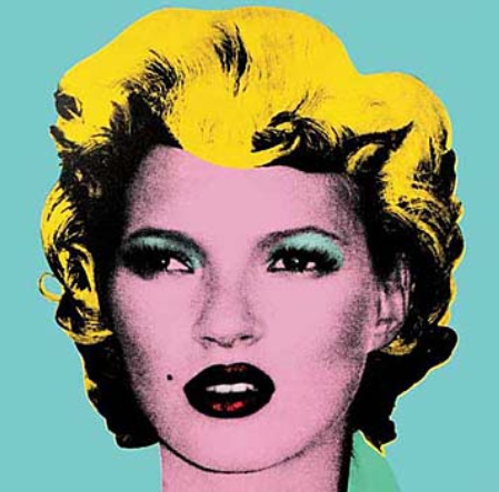
Banksy – ‘Kate’ (2005)
The re-appropriation occurs time and again, each generation of artists has a different opinion to express. Here, Banksy draws a parallel between the celebrity culture of the moment and the life and death of Marilyn Monroe, highlighting the negative effects on the individual in these hegemonies.
Richard Pettibone (1964)
Once again this re-appropriation occurs, but at what stage does it stop being art if ever?
Elaine Sturtevant (1990)
Andy Warhol – ‘Flowers’(1964)
Even Andy Warhol took these images from other sources. Does this count as plagiarism, or do his changes constitute the change from just a picture to art?
Barbara Kruger
In this work Barbara Kruger exemplifies the way this subversion and re-appropriation of designs can have an incredible depth of message and very fast and effective communication to its audience, stimulating change in a way that original work might not.
We then started to look at punk and fanzine culture and the way, through necessity, they have to re-appropriate old and other magazines to create something new in message and appearance. This is already something that I have looked into because of the 'riot grrl' and other punk magazines that were decidedly feminist, so it was great to get to try and make a collage work of my own.
I found this quite difficult and I am not at all happy with the result because I found it so difficult to relax into it and not care what it turned out as. I think this is majorly down to the fact that I don't have a message that I want to communicate yet. So, I could have a try again later in my research when I do.