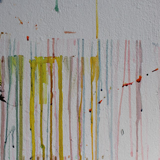
To get all of the photos we needed for the background of the freshers guide I brought in a friend to help me (Fran Tredget on the Vis Com Course). We spent the day walking around the college and truing to collect experiential details and textures from both Vernon street and Blenhiem. The following are the first selection of photos that we presented to the SU.
A fair concern that was raised was the complexity of these photos as background images. It was also said that they were a little too promotional of the college, rather than relating to your experience when you are in Leeds. It was suggested that we get images of Leeds as well as the college to achieve a more complete representation the the experience of study. They also talked about what effect they wanted the cover image to have; one of hope brightness and optimism. Something, green summery and verdant was suggested.
---------------------------------------------------
So, I took a trip to Kirkstall Abbey on a bright summer day and took some experiential photos, maintaining the use of contextualising texture in the form of bright sunshine through leaves to try and achieve the tone of voice that the SU wanted.
I took several but again to detail them all here would boar you to death, so instead above are the two that I showed the SU. They loved them all but get that the lens glare on the last could work really well integrate with the logo. They also asked for the image of the cow parsley to be used on online promotions and banners later in the promotional period.
-------------------------------------------------
I went back and re edited the images we got of the college, focussing down to textures a bit more to see if there was still some milage in them.
However, the SU still had trouble seeing how they could work in terms of backgrounds.
--------------------------------------------------
So, after getting some external to college photos, I re edited them again, reducing there opacity to show how text could sit on the images and finally we got a positive response!
When the content is available, further editing might be required but at least we have a few more photos than we will in fact need approved by the SU, so some selection can also be used to create the optimum layouts.


