Monday, 21 April 2014
OUGD404 Design Principles Type Journal Lauren Hom
http://www.homsweethom.com/SVA-T-shirt-Design
This hand draw type is most definitely sable in origin. This can be told from the smooth transition of stroke weight as it passes through the curves of the letters. (re-brand for school of visual arts)

OUGD404 Design Principles Type Journal Lauren Hom
http://www.homsweethom.com/Cardtorial
Once again the medium has caused a change in the type. To start with the main part of the text is sable. This can be differentiated from bone in the smooth way the stroke weight changes. This type has become somewhat stencil like because of the need to join all apertures to the exterior of the letters because the design is cut all the way through the wood.

OUGD404 Design Principles Type Journal Lauren Hom
http://homsweethom.com/Design-the-Future
This design is a mix of wood and sable fonts. This can be seen in the large condensed style of the wood letters and the smooth transition of stroke weight and extended flourishes on the terminals marks the sable.
(Branding campaign for nestle)

OUGD404 Design Principles Type Journal Lauren Hom
http://homsweethom.com/The-Adventures-Of
http://homsweethom.com/The-Adventures-Of
Once again the base of this lettering starts with the very legible sans serif wood type, which is the altered and stretched with additions from sable and bone type , which can especially be seen in the extended terminals.

http://homsweethom.com/The-Adventures-Of
Once again the base of this lettering starts with the very legible sans serif wood type, which is the altered and stretched with additions from sable and bone type , which can especially be seen in the extended terminals.

OUGD404 Design Principles Type Journal Lauren Hom
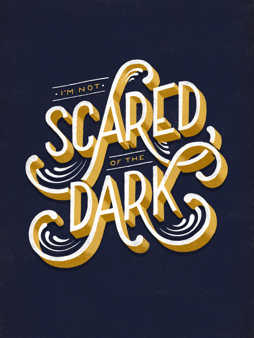
http://typeverything.com/post/70408143894/typeverything-com-scared-of-the-dark-by-lauren
This type borrows heavily from wood type stylings with its steady stroke weight and sans serif finish. However, the extended flourishes seem much more the product of sable or bone type, yet of course the mix and changes come from the freedom of the hand lettering format.
OUGD406 Studio Brief 04 Final Crit and Final Product
Below, the full selection of design work I have done for this brief can be seen.
The final Crit went really well, it was agreed that the idea of a print menu for Rossington street would have been really useful at the beginning of the year. there were a few questions about the posters and decisions on typographic levels, but these were soon answered by looking inside the menu and how it all connected together. They all said that the white belly band was the best option because of its connection to the posters and overall it was very positive.
I am really happy with what I have managed to achieve for this brief but I do wish that I could have challenged myself with colour slightly more. However, in retrospect it is very difficult to see how I could have implemented colour in this chalkboard design. I took a bit of a risk with trying out the hand drawn type but I am pleased I did because it forced me to improve in a short amount of time. I did worry about the scale of the repeat pattern on the posters but I still cannot see a way in which i could have increased the area of the repeat without disrupting the connections formed by the pattern between the different pieces.
OUGD404 Design Principles Type Journal Roxy Torres
https://www.behance.net/gallery/Whole-Foods-Chalk-Art/13852111
The type in the white banner seems to be drawing from wood type styles with its large block or Egyptian serifs and solid stroke weight. However, the small imperfections in the surface of the edges of the glyphs creates a jaunty human feel that hand rendered type is best at achieving.
OUGD404 Design Principles Type Journal Roxy Torres
https://www.behance.net/gallery/Whole-Foods-Chalk-Art/13852111
The flow and ligatures of this type and the smooth transitions in stroke weight form light to heavy suggest a sable design origin, yet the flattened terminals suggest bone, so this design must have draw from both in this hand rendered sign.
OUGD406 Studio Brief 04 Menu Delivery
After my third print run went surprisingly well I started to think about how I would get the menus to the new student because there are so few of them. So because I am putting up posters in the studio i thought it practical to create a way to do the same with the menus (pinning them up on the wall).
I set about creating a net from layout paper to fit to the size of the menus.
The I used this net to make one out of acetate, scoring the plastic using the back of the scalpel.
This way the posters can lead directly to the menu and students can look when they need to.
OUGD404 Design Principles Type Journal Roxy Torres
https://www.behance.net/gallery/Whole-Foods-Chalk-Art/13852111
While the heavy stroke weight suggests a wood type style origin, the flow and curve of the letters most definitely suggests sable. The ligatures and slanted axis are clear signs of this.
OUGD404 Design Principles Type Journal Roxy Torres
https://www.behance.net/gallery/Chalk-Lettering/13974837
This chalk board type can be most closely connected with wood type because of its stroke weight and the crude block like serifs. This type could also be closely connected to the hand painted signs of victorian and present day fairs, because of the pointed connections between the glyphs.
OUGD404 Design Principles Type Journal Roxy Torres
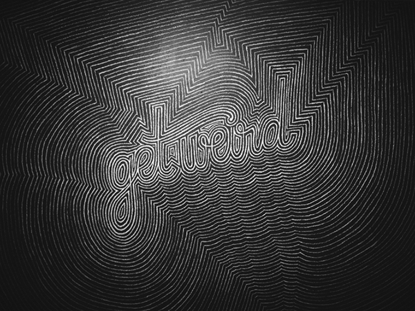
https://www.behance.net/gallery/Chalk-Lettering/13974837
In its most basic form this type bares closest resemblance to sable type or simple hand written letters. However, the ornamentation of pattern around the type manages to successfully make it incredibly difficult to read, as does the lack of spacing between words.
OUGD404 Design Principles Type Journal Roxy Torres.
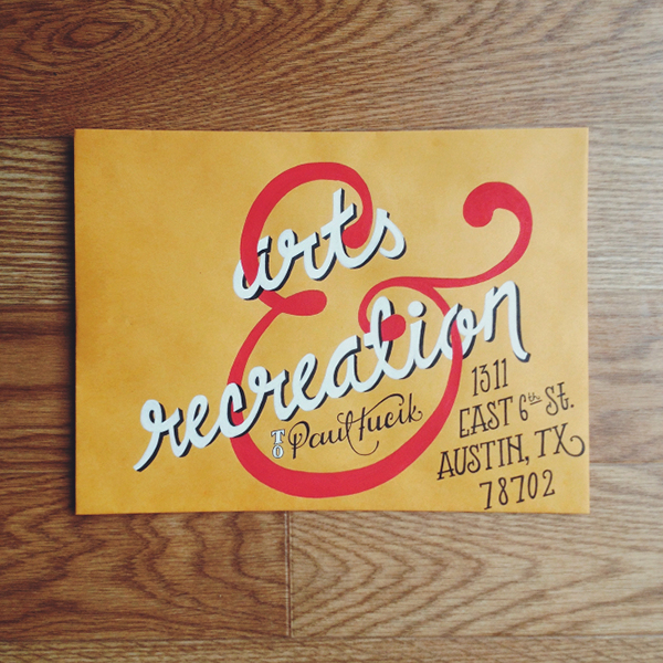
https://www.behance.net/gallery/Snail-Mail-Series/10292339
This draws on mostly sable stylings with smooth transitions from vertical to horizontal strokes and reliably similar ligatures between letters.
OUGD404 Design Principles Type Journal Roxy Torres.
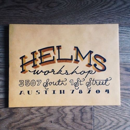
https://www.behance.net/gallery/Snail-Mail-Series/10292339
This design draws on a number of hand lettering styles and therefore a number of historic type production methods. Sable, bone metal and wood type styes are all presented here. However, I question the logic of this because although it looks goo it does compromise legibility, which is most important when writing an address.
OUGD404 Design Principles Type Journal Claudia de Almeida
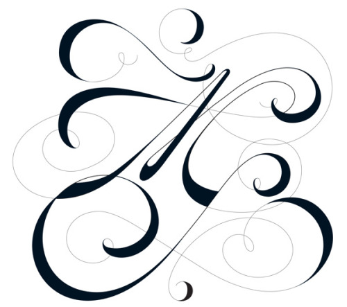
http://typeverything.com/post/82982446004/typeverything-com-more-magazine-by-claudia-de
The stylistic flourishes that are so suggestive of bone type and its production method has been exaggerated and played apron as the identifying part of this brand for More magazine. The already extreme variation in stroke weight has been played upon by making the thin areas grey and the thick full black.
OUGD404 Design Principles Type Journal Ken Barber
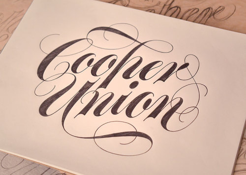
http://typeverything.com/post/62182445976/typeverything-com-cooper-union-by-ken-barber
This hand rendered, round hand, type borrows strongly from bone type styles. This can be deduced from the extreme variation in strike weight and the floured flourishes that spring from many terminals.
OUGD404 Design Principles Type Journal
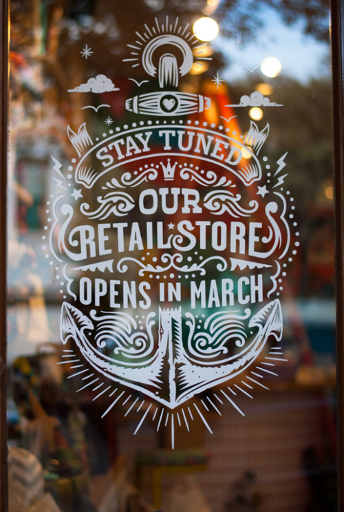
http://typeverything.com/post/57797363754/typeverything-com-texas
I am uncertain of the origin of this design apart from the general local of Texas . Because the type is overlaid on the visual texture of the shop behind, it needs to be legible and assertive. That is why wood style type has been chosen with its strong and simple letter forms, mostly sans serif and with a constant stroke weight.
Sunday, 20 April 2014
OUGD406 Studio Brief 04 Designing Posters
Because I have decided to create one really good print menu, Simon suggested creating some posters for the studio to draw the students attention to the menu. I wanted to use the pattern the I designed for the belly band from the illustrations inside the menu to help establish a continuity and a clear connection between the separate pieces.
When I started creating thumbnails for the designs I realised the difficulty of combining a positive pattern with negative space text. I looked at trying a number of different shapes of the chalkboard texture to put the white text onto. I decided that I definitely wanted to maintain the white text because to change this would break the established negative space text throughout the menuHowever, making the pattern negative would break the link to the belly band, so I needed to find a way of combining them. I also wanted to maintain the scale of the pattern because at a smaller scale the lines in the pattern would dominate the page and obscure the images that make up the pattern. Also, by maintaining the scale it clearly links to the belly band. Although I drew up a number of ideas for the general menu, I think that perhaps the best way to approach the posters is to do them for the production methods only, because anything more would be unnecessary and it makes the menu its self feel more precious and as if it provides something more and leads on from the posters.
After some experimentation I decided on a banner shape because it draws from the belly band on the menu and allowed the set space for the text for the production processes. I also wanted to integrate the relating tools in a way that suggested their use. So, for letter press I put the letters below the text to suggest the downward force of the press.
The mono print roller is intended to look like it is rolling over the word its self.
The lino cut tools are cutting out the word.
The etching needles are poised to engrave.
The squeegee is being pulled across the word like to would across the frame.
I also tried out some different ways to create a taste for print poster although I felt it was unnecessary.
Nothing really worked and it just reinforced my opinion. I think it makes the menu more special if it is the only part with the fully hand drawn text and it makes it the central focus of the posters, drawing the students to it.
OUGD406 Studio Brief 04 Expansion of brief and Designing Belly Bands
When I sat down for a chat with our tutor and talked about the numbers I would be producing he suggested an alternative to multiple designs. I will produce one really well done menu and a selection of posters that outline the processes available. To achieve continuity throughout the products Simon suggested using the illustrations in the menu to create a pattern that can be used on everything as a texture. As a first test for this idea I set about creating some belly bands.
As another option I looked t using acetate for the belly bands because it allows someone to see through to the title of the product.
I had to produce this design in about 20 mins so there aren't any construction images. However, I simply used an inDesign document and imported the vector graphics from illustrator. I made two different options because I didn't have a definite look I wanted to achieve in my head. I was uncertain about changing from the negative space theme I had set up in the rest of the design but I really liked the way the grey on white looked. (I took the grey from the black board image so that it wasn't too intense).
I printed onto some lightly texture paper that is the same GSM as the menu, so that it had enough power to restrain the pages of the menu. I talked to my tutors about this because I originally thought I would want something slightly more insubstantial but practicality dictated otherwise.
Because I am cutting width way strips of the pattern I thought it would be fine if the pattern has a give (part of the repeat that creates a line that can be seen). I tried a number of different styles. I went for quite a wide band at first because I thought if I am going to obscure the title I may as well do so as much as possible to keep people curious. I also don't mind covering it up because you can still read that it is a print menu for Rossington street.
I tried both a slightly thinner band and the same width in the white on grey print but I find that the fact that the paper takes the colour differently is so noticeable and really distracting.
I really like the look of an acetate band because it creates the impression of a clean professional finish.
I also tried some layering but felt this was overkill.
However, it did give me the idea of creating a window to show the type.
I think this is too in-between though. The best effects are achieved by being decisive, and in this situation this is completely covering up the title as much as possible or showing it all. I will bring both the wide white band and the acetate to the final crit and make a decision based on the feedback.
Subscribe to:
Posts (Atom)


