Thursday 28 November 2013

OUGD405 Brief 01 Photoshop Workshop

This workshop included a few key tools and methods to use during the course of this brief in particular.
Photoshop works with image created from pixels. This means that the images are not infinitely scalable and pixelation can occur when they are increased in size. A number of things relate to the idea of size in a photoshop document such as resolution measured in ppi. 72 ppi is the standard for digital display and 300 ppi is the standard for print, this is because this is the ideal resolution for something held 10 to 12 inches away from the face this is because it creates a blend between the dots of colour.
When the distance something is going to be viewed from increases it is possible to get away with much lower resolution because the pixels are less distinguishable from greater distances. the more pixels there are in a given space the more accurately represented the image can be.

Resolution should always be considered when designing because it would be useless to design a website with 300 ppi if peoples computer screens would only be able to show 72 ppi. When paying for a website you actually rent out the space for each pixel son not only would the high resolution be useless it would be more expensive.

When considering photoshop the user can create directly into the program or import the information via a photograph or scan. When in photo shop in order to access the image size or resolution information you can go to image and image size in the top menu or hold down ctrl and click the document name at the bottom of the image.
Often with modern digital images the imported image maintains a relatively low 72 ppi yet increases its size accordingly. So the pixel size is still enormous. By increasing the resolution of an image the size of each pixel is reduced therefore reducing the physical dimensions of the image.

By choosing 'resample image' when the size of the image is reduced below that of the original captured image the ppi is automatically reduced accordingly. The quality of the image will not be reduced because the ppi is proportional to the original image.

If the resolution is manually altered this meant that the size of each pixel is altered. for example, if you were to half the resolution the pixels would double in size and change colour accordingly (the blended colour of all the pixels that previously made up that area.

When creating a new document the default setting for the print options is RGB rather than CMYK. This is because not only will the document be presented on screen and therefore in RGM but also because the coding of the program is done digitally some colours and effects are unavailable when working in CMYK. The best way to get around this is to work in RGB and convert the file before printing.
When looking for different colour modes look in the drop down menu under image and mode.
A diagram explaining the difference between the CMYK and RGB colour modes.
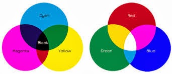
Colour Gamuts define the fact that the range of colours that can be produced by CMYK is a lot smaller than RGB.
The general idea being that light can produce a greater range of colours than ink. (it's going directly to the source of colour if you think about it, ink is merely a medium through which light is manipulated.)

When selecting a colour a small warming triangle may come up next to the swatch, this shows that this colour cannot be printed (is outside the CMYK colour range) to create the nearest colour that is printable simply click the swatch below this sign. The RGB colour range can be altered manually as can be seen above, the values start at 0 as black (a complete lack of light) and runs all the way through to 255 on all shades which is white. The number at the bottom of the window is a hex code which is a computer code for the creation of the colour in a web safe mode. The cube symbol next to the swatch comes up when the colour selected is not web safe (there is not a designated code) simply click the colour square below this symbol to move to the nearest web safe colour.

To change an RGB document to a CMYK to print you can simply send it to the printer and let that deal with it or change it through the image and mode options, however the colours are especially green.


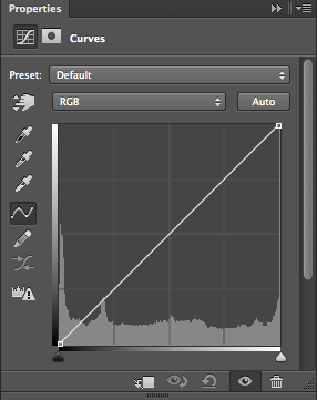
By adding an anchor point within this line we can alter the depth of the blacks and the purity of the whites adding texture and depth to a photograph. You can have multiple points on the line to really fine tune the specific colourings. The adjustment symbols of the right hand side of the screen hue saturation, colour balance


Wednesday 27 November 2013

OUGD405 Studio Brief01 Defining a Photo Frame

Before the ideas generation stage of this brief it seemed sensible to get down what exactly the purpose of a photo frame is and in so doing define why people buy them allowing a more effective design to be produced for a comercial setting.

Below is a list of possible purposes for a photo frame:
-To capture and remind of an emotional moment (holidays)
-To show pride in or the importance of someone (school photographs)
-To decorate a home or space in a personal way.
-In the current digital age the act of printing out a physical version of an image and displaying it has a certain novelty to it and highlights the emotional value of the picture (as apposed to putting it online).

These along with my research will form the catilyst for the ideas generation of this brief.

Tuesday 26 November 2013

Workshop Induction: Screen Print

  These are the images from our screen print work shop. we learned the basic stages of the process by creating an image using two screens.


Sunday 24 November 2013

Typeface Development for Design Principles OUGD404 The Early Stages

 Above is the regular starting point for my exploration into creating a typeface. Taken from the font Georgia the brackets have been softened and some intersections have been curved.
The first tests involved creating bold and light versions of the font, this was done by taking the letter forms to their furthest extremes in an attemt to identify how different two fonts in a typeface could be but still relate to one another. The small touches such as the cut off corners of the bold font were added to create distinct fonts withing this typeface, not just the same font with line wieght variations.
 
 Taking the idea of a sable inspired font the next sketches looked at increasing the terminal size as if ink had collected there after the letter form was drawn. This created an interesting look for a bold font.

The creating of a light font through its construction in lines can be found earlier in this post but Taking this even further produced interesting results and will undergo further experimentation, including the contextualisation of letters once more than the basic six shown above have been added.

Friday 22 November 2013

Design Principles Task: Size and Position Effecting Legibility

The task we were set at the last design principles seminar was to manipulate the miss matched fonts that we put together during the seminar and shown below.
To start with the most obvious thing to do seemed to be a decrease in size as the line progressed. However, as can be seen below, the fonts' variation and the odd changes from capitol to lower case meant that the words quick and brown were the first to be noticed by the eye.


The next attempt plays on the way we all automatically read left to right, this was done by putting the more legible words slightly to the left behind the line created by the end of the first word (the) to challenge and disrupt the eye. 

With the next arrangement didn't seem to work with the same approach because of the line weight variations between the roman, gothic and sable fonts.

Another way to control the order in which the words are read seemed to be interrupting the upper half of the words by overlaying it with the one before it. This seemed to work particularly well with the lower case letters because the ascenders are essential to their legibility. This is shown in the word fox below which in its legibility was over powering the other words in the image.

The delicate forms of the roman font meant that it needed to be the largest on the page to be read first. The legibility of the gothic font was tuned down by placing it above the much larger 'the' disrupting rhythm of the line. The capitals of the word 'fox' made the word over powering on the page and so its reduction in size was intended to counteract this. 

At larger sizes the italic font becomes very imposing, clearly the strongest on the page. The strength of legibility found in the gothic font was counteracted by the two words arranged in order to obscure it. 


Friday 15 November 2013

OUGD403 Module Evaluation

Throughout this module My practical skills have been greatly improved. Coming from knowing very little about the production processes of design or much at all about digital design methods a substantial knowledge of production and design method has been created.For example, studio brief 02 introduced me to areas of illustrator I had no idea existed, the use of pathfinders and clipping masks feeding directly into my final design. Although the mono-print workshop did not form part of any particular brief I managed to use it for a further development of studio brief 03, the direction and purpose this lent to the experimentation with this media produced some really interesting work and allowed me to get to grips with the technology more effectively. Despite being unable to use this process on my final designs, my new found understanding of it means that in future projects I will be able to tell when it can be most successfully utilised and do so.

Through the crits that took place during and at the end of each brief I started to develop a more critical way of thinking, this became useful in not only analysing my own work but other's as well, gradually making the effort to become a more active member of the class. By making use of this skill I have become more and more aware of the delicate balance between the aesthetic of a design and the concept behind it that should be communicated. During the design process balancing these two things can be very difficult, especially when you are very deep in a project, but through the crits and the critical way of thinking these have fostered in me focussing on this problem has allowed me to become increasingly more effective in addressing it. This development can be best seen when comparing my reaction to studio briefs 01 and 05. My response to studio brief one was very thoughtful and heavily conceptual, but I was unhappy with it because the aesthetic and the way I had chosen to represent these concepts was not effective enough and far too obscure. Where as my response to studio brief 05 is pushing in the other direction, I have pinned down exactly what I wanted to communicate but I feel that the aesthetic has taken the upper hand, once again compromising the communication of the design. Although I have not yet found the balance between the aesthetic and the concept this module has allowed me to identify it and start to address it, as I will continue to do in the future.

Something I am less happy about in regards to my response to this module is the sometimes tentative link between my research and the final design. This tends to be because I think too deeply into the line of concept I am following and when I come to blog about the ideas that I have produced, it seems like a large jump has been made between times. This could in turn be because instead of physically doing and experimenting with a thought, I simply think more about it. To combat this I will need to act more quickly on ideas so that the development of a concept seems logical from the exterior of my brain. However, this module has brought this problem to my attention and in so doing, has given me the tools to solve it. So, overall I would say that this module has been a personal success, even if I am not 100% content with what I have produced, I am very pleased with how much my design process has improved and soon hopefully my designs will follow suit.


Wednesday 13 November 2013

Studio Brief 02 Final Design and Evaluation OUGD403

Below is a final alphabet for studio brief 02. 
The letterforms were developed from the 'W' chosen from the ten letter forms from studio brief 01. Overall I feel that these letter forms are more successful in conveying the concept of 'damage' than the ten letter forms from brief 01. At the beginning of this brief I was aware that the concept of damage being caused to the readers eye had not been conveyed by the final designs of studio brief 01. So I went back to the drawing board and tried to keep the designs as simple and communicative as possible.

The incorporation of the representation of a beam of light in the way the angles of the letter lie works well on two levels. Not only does it cut and distort the letter form making the eye struggle to identify it slightly, in a sense damaging it, but it also is a subtle reference to the way light may damage the eye. This is something discovered during the earlier design development, but felt the ideas I was playing with was far too oblique. The most successful aspect of these designs is the way that they appear relatively simple yet manage to convey the message of damage in a number of ways.

A less successful aspect of these designs would have to be the slight lack of perfect alignment of the two layers of each letter form. In retrospect this could be because the clipping mask used to create the line silhouette letter form includes the outline where as the angular letter form may not have included this outline, causing a slight difference in size. Another area that disappointed me was the fact that the purpose of this font was to damage the eye of the reader, and in so doing convey the concept of damage. To do this the fact that the letter forms themselves should not be damaged not only to avoid doing something blatantly obvious and unimaginative but to confuse the message. However, arguably the angular shapes I have reduced the letter forms to are damaged but this somehow doesn't effect the message being sent too much and in this moderate form possibly enhances its clarity.

Tuesday 12 November 2013

Design Principles Seminar Notes OUGD404 Legibility and Readability of Type

The seminar began with a discussion of what we looked for in a really legible type face or font, these are the criteria we found we all had in common.
. Ease and flow of reading with little thought.
. A defined difference between ascender and x-height.
. The bigger the differences between the glyphs the easier text was to read.
. The size and nature of negative space within and between letters in areas such as counters.

This the developed into the analysis of distance and its effect of readability.
(image)
By placing different text samples on the walls of the studio we found that lower case was more legible over a greater variation of distances. Where as capitals were readable from further away, when moving towards text it remains legible for a large proportion of the approach and at very close proximity. This could be said to explain the use of all lower case lettering on the county's motorway signage. 

The samples we were using were roman, gothic, script and wood type. By analysing these samples using the criteria discovered earlier in the seminar we found that the most legible fonts were the gothic and roman ones. this often seemed to be because the counters in wood type were often too small for ease of legibility and the glyphs of script fonts were to similar to separate from one another.

The wide nature and small counters of wood type was testament to the fact that negative space in lettering is usually the thing the eye reads, rather than the letter forms themselves. Some examples of the clever use of negative space in branding are shown below.


We were shown a number of images where kerning and leading had been abused, which I found very difficult to see the absolute flaws in. Although I could see that they were ugly and hard to understand, without the context of the design how can we definitively say that the design is wrong? For me the context and purpose of the design is quintessential to identifying its level of success although I am aware of the argument that the purpose of all type is to be legible and 'invisible' in its communication of the words but part of me is repelled by the sudden assumption that this is the only rule to be applied across all uses of text. I know that these rules are grounded in years of experimentation in design and that I can in no way suddenly over turn them but I would like to keep an eye out for examples of where these rules have been broken and how successfully this has been done in relation to the context of the design.

The images below shows the way distance effects which type is most legible.

Type Glossary:
(because we are told about more type language in each seminar I have decided to add a type glossary to each set of lecture notes to record the increase in my typographical factual knowledge)
. Leading-the spaces between the baseline in body text.
. Kerning-spaces between letters specifically reducing it (this has only become possible with digital technological proliferation because reducing the width of lead slugs was practically impossible.
. Tracking-the increase of space between letters.


The image above is the starting point for a task due in for our next seminar. We must digitally create each of these lines and effect the order in which the words are read by only changing the size and positioning of each word.

Monday 11 November 2013

Stone Type with Calligraphic Origins

Although this type is clearly set in plaster the origins of the design come from the flourishes and decoration found in calligraphy. A brand that used a similar approach was that of BIBA, possibly this type was put here during the 1970s.


Wood Type Origins on Hand Rendered Type Fair Ground Horse

The glyph shapes suggest a wood type origin but most likely this type comes from the designs developed specifically for hand painted signs so common in fair ground signage.

Wood Type With Suggestions of Hand Rendering From The Corn Exchange

The blocked heavy shapes suggest a strong origin in wood type production methods, although kerning varies greatly suggesting it was hand painted as does the weathering and cracking in the paint surface.

Studio Brief 02 Design Development OUGD403

The letter I chose to shape my full alphabet from is shown below. This was because it has a decisiveness of aesthetic that makes it easier to apply to a wider range of letters and has opportunities for development. Follow the link to see the development to the second image in this post.


The image below is a test from an illustrator workshop that forms part of this brief. Because of its development and improvement of the message that was intended to be conveyed in Studio Brief 01. 


When attempting to apply this aesthetic to a wider range of letters there were a few problems encountered. For example, the angular shape created by the removal of anchor points is very hard to make work on rounded shapes.

As is shown above a way of solving this was to cut across these rounded edges in a way that marred the gentle curve of the letter. Once again, however, in order to avoid the trap of simply damaging the letter the clipping mask of the lines allows the silhouette of the letter to continue maintaining legibility but hopefully damaging the eye. To see the earlier sketches attempting to use these optical illusion lines please follow the link.

In letters where there was a cross over between straight and rounded edges the best solution seemed to be the introduction of a sense of perspective through the look of light falling on an object. This comes from some earlier experimentation with the idea of light blinding the eye of the reader.

With very rounded letters I found that it was best to keep it simple by incorporating minimal angular cuts and corners.

Where the direction the letter design was going it seemed to be too obvious and predictable the letters were made slightly more strange in shape in the hope that when reading a few letters might stand out more than others, distracting the eye and arguably 'damaging' it.


Thursday 7 November 2013

Studio Brief 05 OUGD403 Final Designs and Final Crit

These are the designs I ended up taking to the final crit.
This is the image poster. It received a mostly positive reaction but stimulated a few questions such as the reasons behind my choice of colours. As can be seen in much of my design development for this brief the colour consideration for this design was considerable and concluded with the use of blue because of its connotations of the loss or lack of energy in the form of heat. Something that faintly surprised me was the fact that no one mentioned the obscure nature of the image (previously I had felt that this might effect the communication of the idea) I guess this means this worry was unwarranted. 


A problem that was brought up was the legibility of the type in the type and type and image posters. This was something I was concerned about during the development stages for this design. The fact that the type was created using the pen tool in illustrator means that the width and height  of the letters was not as exactly regulated as an already set font. If the time were available I would have liked to re-do this type by starting with a font and manipulating it into something to the same effect as the design shown above and below. Apart from this once again the feedback was positive, specific points were made about the way the type and image worked together well because of the similar visual tone achieved in each. It was also mentioned that it was interesting that an influence outside typography was used to create type, in this instance electrical cables. Possibly this was just because I have little experience with type and fell more comfortable drawing from influences outside it that I fully understand.

Over all I am really pleased with the outcome of this brief because of the strong message that it conveys. However, I will go on to work on the type after module submission because with some work I feel that these designs could be worth putting into my portfolio.

Studio Brief 05 OUGD403 Poster Development

After the interim crit had provided a slightly more decided direction for the project the designs were moved to illustrator for further development. The design with the most positive feedback and constructive criticisms was the light bulb ice cream sketch so this is the design that has been taken forward. 
Because of the limitations in colours Playing around with negative space was a prominent option. The image above is the first manipulation attempted once the sketch was put onto illustrator. It is a direct trace of the very first sketch and it looked a bit too flat and simple, hence the variations in colour in the ice cream section of the image. However, this design lacked the high impact that was specified in the design brief, so further experimentation was needed.

The colour yellow suggested its self purely because of its links to energy and light. This didn't work badly because arguably the bright glowing yellow allows the poster to be high impact but once again it just felt a bit flat. The persistence in using blue at this stage in the development was mostly due to my awareness of its close connection to the concept of energy in the form of heat. It connotes coldness in its self an absence of energy, fitting in with the idea that our gluttonous  consumption of electricity will soon mean there won't be any left. 

One of the suggestions received in the interim crit was to look into doing this poster in the style of 1940s propaganda posters. On previous designs the impact had been reduced and the addition of extreme contrasts in shadows, as seen on 1940s propaganda posters, could change this. The two blues seemed to represent it relatively well but further experimentation was once again needed to be sure this route would be the most productive. 

The use of greens readily suggested its self because of its eco friendly connotations which matched with the gently chastising tone of the designs. However, this seemed too much like an intertextual reference to the extent where it just seemed like a promotional poster for green peace or similar. 

By maintaining the negative space concept and removing the colour from around the image the poster has a much higher impact. By removing this colour the definition of the swirl of the ice cream at its tip is lost, possible sacrificing how recognisable the image is and compromising the message of the poster. Because the image is something that has been created for the poster it is likely that people might have to stop and think to figure out exactly what it is, this means that the image has to be as clear as possible so no confusion is caused. By removing the surrounding colour this clarity is lost so possibly this is not the route my final design will take.

In order to combat this problem the next designs started to incorporate a coloured outline rather than negative space. The green colouring with this outline simply appeared too dark and heavy, just not fitting with the concept of a light bulb. This test definitely set in stone the fact that the defined swirl at the top of the ice cream is quintessential to the recognition of the image.

In an attempt to rectify the dark and overbearing look of the previous design the removal of darker colours was tried. This worked relatively well but once again the connotations of the colour green confused the clarity of the design and its message.

Because the outline of the image was now clearly defined yellow was once again brought into play. the fair ground connotations of this colour combination worked well and started me thinking about the visual identity of victorian fairs and how I might tie into my typographic poster with this identity by using a font such as rosewood.

The warmth and light connotations that seemed to work so well lead me to the warmer colors of orange and red. To do this the designs had to use negative space because of the colour limitations of the brief. Once again the swirl on top of the ice cream was lost so this was soon discarded.
                                                          
All the designs above were tests to see if any particular colour combinations caught my eye. Once again the two blues seemed to work the best even though the high contrast shadows suggested high contrast colours. The green and blue and the orange and blue just looked a bit cheap and tacky, distractling from the message of the image not complimenting it.


After looking at high contrast colours, the highest contrast suggested its self (black and white). However, because the eye is used to seeing black on white the audience assumes that what they are looking at is two dimensional so arguable full colour, in this instance, could be high impact than black and white. Also the connotations of black and white jarred with the message of the image, making it seem serious and somber.


In order to combat this somber tone but maintain high contrast a similar design was attempted but with blue in the place of black. The tone of the image was instantly softened and blue seemed to be the best direction to go in, yet there was something a bit harsh about the use of white in such large areas.


To reduce this harshness the natural progression was to a light grey. his worked really well but once again the connotations were too somber. The image wanted to be playful and slightly light hearted. But blue is definitely the colour I will use in my final designs.

At the interim crit the typographic design which grabbed a relatively large amount of attention was the type based on the designs of chip board. However, when this was transfered to illustrator it became far too harsh and angular, in no way relating to the soft playful shapes of the image poster.

So, taking inspiration for one of the earlier sketches that also got a lot of positive feed back (type made from electrical cables) a completely new type poster was created in order to fit with the image poster. This was done using the pen tool and some simple guides. The slogan has also been changed since the crit. Previously it was "a moment on the switch, a lifetime on the hips" but one person had obviously never heard of the saying "a moment on the lips a lifetime on the hips", so it needed to be changed to something universally understandable. "have you tried a low kilowatt diet" seemed to fit with the tongue in cheek tone but still get the message across. The image above was simply an experiment with the line and fill colours that came to nothing but the looped and linked type was promising because not only did it look like electrical cables, suggesting the flow of electricity as you read it, but also neon signs.

This is a test for the image and text poster. The idea behind the placement of the text was that our consumption of electricity is a form of gluttony, the electrical cable turning into the sauce that goes on top of the ice cream. This represents electricity not only as a food that we consume but also as a luxury that we take for-granted and expect to be cheap.


The more obvious placement of the text was so that the cable fed into the light bulb. However, the previous design seemed to direct the eye in a much more satisfactory manor and convey a greater depth of meaning. The legibility of the text is reduced by being lighter than the surface it is on so perhaps it would be better with the colours reversed.

This is a test where the colours have been reversed. The legibility of the text has been improved, although this is still something I am concerned about and may have to return to later, and the impact of the poster has been improved. For the final image and text poster the design will be a combination of this colour organisation and the layout of the picture two images above.