Showing posts with label IB Sticker. Show all posts
Showing posts with label IB Sticker. Show all posts
Friday, 4 October 2013
Final Presentation
Our presentation was very informal so we talked through the images in this presentation, explaining our research, design and evaluation processes.
Final Designs
In the end we produced a booklet, key ring, app and stickers, both for the door and the app. We used the digital print room to print out the stickers and booklet, along with the instructions for sticker use.

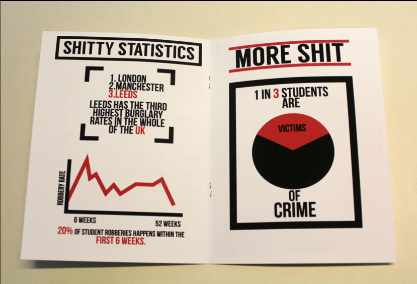
Within the booklet crime statistics, 'where to lose your shit', instructions for the app and a small comic strip about how 'John didn't lock his door'. If we were to go back to this brief I would have liked to reconsider the organisation of the booklet so it really clearly solves the brief in a direct and simplistic manor. I have to admit that I got a bit caught up by how beautiful the stuff we were creating was that I didn't give the organisation of the products much thought. But next time I shall make a particular effort to distribute my effort and time between the fuction of the solution and its look, so the two areas are balanced.
As mentioned in our crit we replaced a few of the places where we were going to use the word shit with our supplementary strap line "Shhh,It's Gone!", the poster below is an example this. I am very pleased with the clean look, its clarity and simplicity shines out of the picture!

The picture below shows the final part of photographing the pack contents for our presentation on friday.

Crit
We got together with another group in our class and informally presented our ideas for solving our brief. We presented the mock ups for the app, envelope, booklet, key Ring and stickers. The response for the majority of our work was extremely positive, although there were a few things they brought up and we discussed in detail.
They brought up the fact that we had used a swear word and asked us to justify it. we found that they agreed quite strongly with the fact the most freshers students are bombarded with leaflets and other bits of information and having something that pushes the boundaries of the acceptable and is completely unpatronising at the same time would create a much more positive response than a more average bit of propaganda. The also really liked the variation on the title we had created as a fall back, if in our crit they said they felt our original title was too much. They suggested we integrate 'SHHH...IT'S GONE' into some parts of our pack so we were not using the word 'shit' quite so much, which they said could get a bit old if we were too repetitive.
They also asked us why we had decided to use brown envelopes instead of white ones because the rest of our designs were whit on black. This really got us thinking because we knew we loved the look of the black print on the brown envelope, but were not quite sure why. After further discussion were realised that the most common link to a brown envelope is official business such as school reports and pay slips. By placing this in your face statement and graphics on a symbol of formality and 'the establishment' we created the tongue in cheek tone we wanted. Now that we have become aware of this we plan to start implementing this juxtaposition of the formal and striking in other areas of our designs.

They also looked at the different options of font for the envelope print and said that the non drop shadow version was the most powerful. However, they also said that the text sizing was different to what we had done on a number of other pieces. the suggested using the drop shadow version of Langdon on the word shit and the non drop shadow version on the other words. The word shit should also be bigger than the others in a similar way to the door sticker designs.
They also brought up the point that if someones valuables were stolen, could the thief not simply remove the sticker? We agreed this was a valid point but when we showed them the very simplistic and anonymous designs we had produced for the stickers they agreed that the lack of awareness of the technology that provided the tracking the the fact that you could not simply tell what the stickers were intended to do from their basic design combated this problem.
The also came to a decisive decision on the door sticker designs.

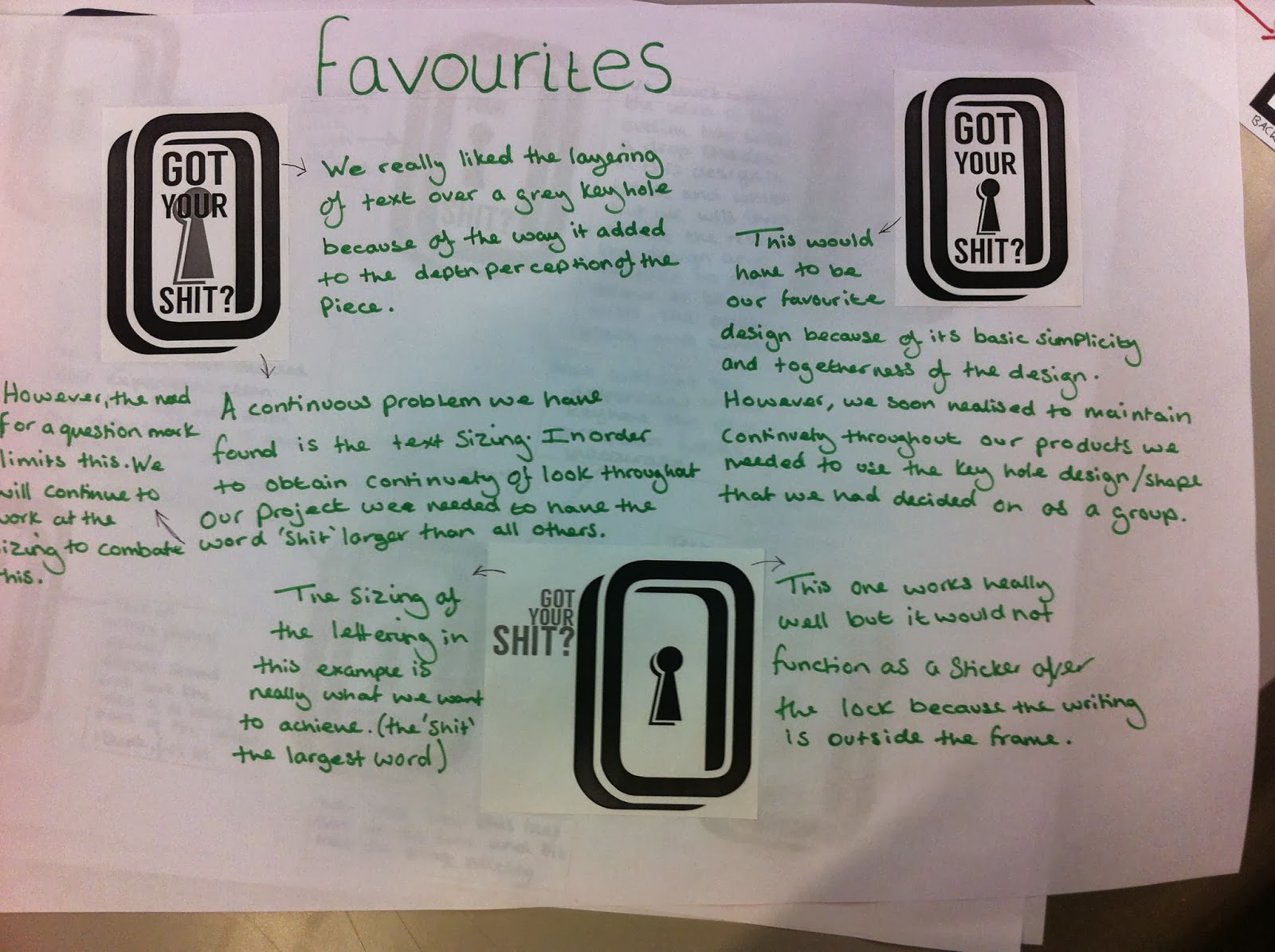
We showed them this sheet with our two favourite designs and they instantly said that the angular one on the right work best with the other designs for the pack. Although they said they may like the other one more if it were separate from the pack, the continuity of design was crucial to the success of the product.
Thursday, 3 October 2013
Door Sticker 03
As part of the development of the door sticker we decided we needed some small instruction graphics below are some sketches for these instructions.

Door Sticker 02
After we had come up with a sketch that we really liked we produced it digitally to see if it had the strength that we wanted. Below are a few pages showing the different options we came up with.


 The picture below displays the huge amount o development we managed to do in a single day.


After going through many different options we settled on these three as our favourite.

However, at the end of all this we felt that the look of our sticker jarred with the sharp and angular look of a lot of the other graphics. So in a last minuet moment of inspiration we tried a more angular version of the design. This version can be seen below along with our original favourite. During the crit we will ask peoples opinion about which to use.

Sticker For Door 01
One of the main ideas we came up with was an app which when down loaded would connect to several coded blue tooth stickers, intended to track the whereabouts of peoples valuables. In addition to this we had the idea to create a further sticker which would go on top of a door lock. This would also be linked to the app, causing it to remind the user to lock their door and make sure they have 'Got Their Shit?'. Below are a couple of pages of sketches for the very beginnings of ideas.
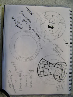


I was very much stuck on a circular design because I felt most locks were circular and the sticker was intended to be placed over the lock. We are undecided as to whether the sticker should have a hole in the middle where the key would be inserted into the lock or to leave a space where the key is supposed to break through the paper to lock the door. We like the way that the break of the sticker shows that the door has been locked (if only for the first time) but question its practicality as a product.

There were a number of ideas I was following that sprang from our early research, such as the texture created by the functioning edge of a key, the movement to locking something and even the texture and look of a micro chip in a credit card, but none of them really worked.
However, after we saw the work Alex had done with the Typeface Langdon, we went back to the drawing board using the shape of the letters and the drop shadow as a starting point. The design at the bottom of the picture below really caught our eye and so we took the idea further and did a couple more sketches inspired by the first, as seen at the bottom of the page.


Subscribe to:
Posts (Atom)