Thursday 30 April 2015

OUGD505 Study Task 03 Concertina Booklet

Once again the nature of the study task meant that I needed to do this quickly. 

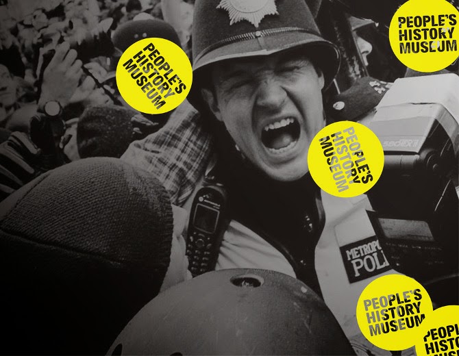
I took the theme of the torn paper and used it to frame the images in question. To dictate the images I read through the content and found the most relevant images. The suggestion of physical layers and collage meant that the application of the people's history magazine logo worked really well, acting as a sticker for the content.

I quite like the full colour version and the bright pink of the logos stand our beautifully. However, I do feel that if the flyers were to be on yellow stock, so should the leaflet.


So, I printed onto the same stock and apart from an issue translating the opacity adjustments on the drop shadow of the torn paper, it looks ok. 


The progression of information makes sense and the images relate to the nearest content.


Another issue that I would have liked to had time to rectify is the space that some of the text has. I should have allowed more. It feels a little squashed and I had enough space on the back of the booklet to allow for it. However, on screen it looked fine! I know that printing mock ups is important and this is a situation in which I should have done this.

Wednesday 29 April 2015

OUGD505 Design Practice 02 Study Task Three Constructing The Flyer


Because of multiple time restraints I had to create both outcomes for this study task very quickly. So, I could not stick completely to my usual methodology. I took simple and straight forward inspiration from the name of the exhibition and looked to re appropriate the promotional print from the actual exhibition. I took the words disobedient object in a much more literal manner and looked to making the 'objects' come to life a kind of fit of passionate rebellion.


Using the water bottle poster made me think of using a sea monster of some sort and I wanted to keep the illustration style quick and reminiscent of the passion of protest graphics.


I tried both quill pen and ink and a soft felt tip. 


I struggled to achieve something that looked right and conveyed the idea of the bottle its self coming to life.


Using a slightly more controlled style and the felt tip because this seemed like a medium more available to protestors. I stretched the lines of the water bottle to make it seem like the plastic was stretching and warping in the effort to live.


Once I had an illustration I liked I found a font that emulated the angles of the one originally used and applied all the information required of the brief.


I Created a black and white print out but also wanted to try some coloured stock because I felt that it could bring the design to life and make it seem a little less sinister.


Using the colours of the print handouts at the exhibition and the people's history logo colour (yellow and pink) I tried out some different coloured stock.


The yellow provides the best contrast and legibility of text so I think this would be the best coloured stock to go with. I like the design but I am not convinced that it communicates the right things. It is possibly a bit too dark and sinister. In the booklet I want to use the same design as a cover but try and use the content arrangement to lighten the tone of voice.


Tuesday 28 April 2015

OUGD505 Studio Brief 01 Study Task Three People's History Museum Research

Afyer understanding the relationship between the v&A and the exhibition in the promotional work, I thought it worth while to look into how the people;s history museum would go about applying their logo.

I first looked at the website  and instantly the logo stands out. The Florissant pink can't be said to be classy in the same way the V&A logo is. I think perhaps it is slightly over applied but then again it could be argued that the museum is about shouting and taking notice throughout history, so it could be said to be apt.

What did strike me was the way that the logos look so much like stickers which is played on with the angled application. 

Where ever it is applied it seems to be in clutches rather than simply one and the odours vary between yellow and pink and these could be the colours of the stock for the flyers and the booklet. The suggestion of collage or at least layers of visual in this sticker like logo have given me the idea to re appropriate the posters from the London based work in a collage fashion and just see what I come up with.


OUGD505 Design Practice Studio Brief 01 Product Range and Distribution Study Task 3 Disobedient Objects Original Exhibition

Because I didn't get a chance to attend the actual exhibition I thought it worth while to look into the visuals and promotions for inspiration and comparison reasons and basically to understand what it is my designs will be promoting.


I found the summary of the exhibition and what struck me both from the image above and the summary was the sense of a miss mash, of the scruffy and the 'made in haste' centre of the whole exhibition.


'From Suffragette teapots to protest robots, this exhibition was the first to examine the powerful role of objects in movements for social change. It demonstrated how political activism drives a wealth of design ingenuity and collective creativity that defy standard definitions of art and design'

(Source link click on images)

The supporting material still for sale also provides an inside into the slap dash aesthetic of the exhibition.


This poster is somewhat different to the messy passionate aesthetic of the exhibition pieces. However there is a definite college ish feel to the overlaid text and visuals even if they are very considered and neat. The font is an interesting decision because of the contrast in shape of one letter to the next. The most noticeable letters are h and e this is because the E is so rounded and soft (almost like a Euro sign) and the H is so sharp and angular. These combine to create something quite strange and almost russian in block text as in this poster. Instantly it manages to have connotations of politics and unrest. This small typographic hint at political unrest is so clever and is something I play on in my own designs.
First printed in 2009 in response to the economic crisis and the impact on the creative community and their businesses. A copy of the original print is in the V&A collection and was included in the 2014 display  'A World to Win. Posters of Protest and Revolution.'


This flyer for the exhibition and the difference in production methods is distinct but not without reason. The single colour design on coloured stock is much cheaper in production and something much more within reach for protestors and those involved in the disobedience. 
I also thought it worth looking at how the V&A logo was applied in this and other situations. It seems where key colours cannot be pulled out of the design question, the logo is obstructed in some angular way that integrates it into the design as can be seen in the design above.


OUGD505 Studio Brief 02 Covered Further Reading and Conversation


After considering other book covers and how they explained theoretical ideas I went back to the book I am working on and read a bit more. What instantly stood out to me was not only the idea of the degradation of reality into spectacle but also how the theory is constantly related to consumerism and how appearance has become a kind of currency that we are in a constant state of illusion, believing the importance and reality of the spectacle. 

When talking to Danny about the book this was also one of his main take always. I asked about whether I should avoid imposing my own reading and he said that it would actually help because the theme can actually be so dense and hard to grasp at points that visually tying it down with an interpretation would actually help.

So, considering the new themes of consumerism and group delusion I instantly made the connection to hallucinogenic drugs. 

I quickly sketched out a few more ideas around this theme and came up with quite a few parallels between consumerism and drugs. the most effective three were:
Cocaine as Gold Dust 
Gold coin as LSD
liquid gold as heroine.

I think the two most effective communicators are the cocaine and the LSD just because they have the tone of unpleasantness without possibly being too dark. Adding these to the two strongest from my last idea generation session I have 4 total to pursue further.


OUGD505 Studio Brief 02 Covered Book Cover Research


 Although I can guess at the purpose a theory book cover must fulfill and I can apply the reasons I would read such a book. It would be very beneficial to look into other theory book cover designs that I feel have succeeded and the reasons for this. I have carefully chosen ones that I am unfamiliar with and then looked to explain the contents. I will then research the contents and see how the two compare. 


Somehow, instantly the lack of elements of this design seem to communicate the fact that the subject matter is of an evasive nature and possibly a theory or subject difficult to grasp.  Also there is a contrast of messages created by the small input of image; the scatter of symbols at the bottom of the book, all at once it communicates the idea of something quantitate and exact with the vector like shapes, all edges and finiteness, and also through the scattered irregular placement of the symbols it communicates something more human and hard to define. The obvious connection here is to that of a scatter graph so added to these ideas is also one of data analysis and understanding.

Finding out what this book is about was quite a surprise. It turns out to be about dream, fairy-tale and myth analysis. When considering this in relation to my analysis the links are undoubtably all there. what this book cover seems to do is intrigue more than explain and the cover reveals its secrets as the book is read and understood by the reader, adding to the experience of the reader. it occurs to me that perhaps the cover is there to be engaged with as much as the book.

Of course this and the previous book cover are part of some sequence of books that are linked in aesthetic. However, this book title gives somewhat more away than the last. So, the slightly more simplistic visual is made up for. With the title in mind it is clear the the concentric circles are intended not only to make a link to the scientific understanding of the obvious things such as solar systems but also the more spiritual links with the shape such as a sunset and the more deep patterns of existence and physics.

I think the contents of this book are fairly self explanatory which I am uncertain whether this is positive or not. I guess the difference between this book and the society of spectacle is the fact that the content is much more at mercy of the readers interpretation and more difficult to define generally.

Once again there is an illusion to the manual and the interaction or relation to the individual in this cover design. The inclusion of the pencil suggests this enough with the sense of three dimensions and even the gnawed surface linking directly the the hand and therefore the person who held it. The most direct communication of idea is through the combination of title and the gnawing of the pencil. Instantly the quite general and hard to communicate idea of thinking is communicated. The use and shape of the line drawn by said pencil also adds greatly to the idea of linear development, in its self connected to thinking. I think it is a fair assumption to say that this book is a study of thinking...

I also found some wonderful book covers that may be nothing to do with theory but make use of interesting methods of design and work within the two colours plus stock limitations of this brief.

I adore the use of the shape of the book to make this design so communicative. It is incredibly powerful as a cover. the two colours used and the contrast of the yellow enhances this to a point of pain. The small touch of it and repetitive shapes shouts loneliness. This effective communication in the tone of voice of the subject matter is something I had not yet thought to communicate with my cover. The effect of such a deep theory about our own society is an unnerving one and perhaps the cover I design should reflect that rather than trying to be neutral, I should attempt to communicate the experience of reading the book, in all of its deep revelations  and stimulated self questioning.


Because I ended up creating the ubiquitous pinterest board I also came up with some book covers that, although not theory or philosophy had a great condensation of information and communication that I just had to include in this post. Although such condensing of information for my book cover would be detrimental to message I think these are great feats of design and communication. Only really achievable because of the familiarity of the stories.


OUGD505 Design Practice 02 Workshop/ Study Task

Methodology:

What does methodology mean and how does it relate to as graphic design students?

-The examination of method and creation of methodic plans in relation to your ways of working. Challenging and understanding your personal methodology is important as developing designers so that with each project we challenge the direction we are going in and push ourselves to the best outcome. 


-The idea of a system is inherent to methodology and placing a methodology of interrogating your work is very useful.It encourages an adaptable practice that will see you through hugely varying projects and a way to address problems in a methodic' and repeatedly effective way. It is a way to make  sure that you are future proof. 

- consider what the people who need the design are and what limitations and requirements this applies to the outcome. 

Methodology Evaluation:

Limitations are usually the first point of focus when analyzing a brief. Limitations of context and audience are the two big ones that grab attention from the outset. For example the limitations of audience for my Penguin book cover brief was very different compare to that of my Salt of the earth website designs in the previous module. With the competition brief I researched the judging panel and the professions that each indevisual came. These were predominantly either illustrative, publishing or more hands on print processes. I then looked to shape the design I created to these criteria, creating something illustrative and tactile in appearance, but only because it fitted so well with the content of the book. With the website design brief I looked into the location limitations of such a project and looked at creating a audience profile so that I could pin them down more effectively. I then used tis profile to look at venues and establishments in the area concerned (North Norfolk) that could provide the context for my design outcomes. Limitations of media format also fed into this creating the need (through augmented design) for strong wifi. These limitations in themselves then give rise to other links to other works that have functioned within the same parameters. Analysing the good and bad of these provided not only perspective but also provides inspiration and design context for the finished piece.

What does the client see? It is often the case that the client has an image of what they want in their head and although this speaks greatly of enthusiasm it can be an impediment to progression. Talk closely with the client and help them to open up their mind to more experimental and exciting options if possible. This is something that I made great use of during my work with the Leeds Arts Party. Conversation is so valuable for the eventual creation of an effective design and close communication is key to its development.

Tone of voice, along with a specific message is always something that I strive to pin down. I usually simply write word associations until I have a few for tone of voice and a short sentence for message. Against this I will constantly measure my design outcomes. This was of particular help during my parallel re brand brief in the first module of the year in which I strived for something close to gender neutral in colours but also somehow strong in its femininity and unapologetic in its presence but also tasteful at the same time. A constant state of critical evaluation was and is always required required. Production methods are particularly useful in the creation of a distinctive tone of voice and I often use tone of voice to shape these discussions closely. However, often limitations of cost can cause problems, as with the flyer I designed for the Leeds Arts Party, in this case aesthetic decisions in design and composition can alleviate problems.

Something that I do not always manage to do but always want to do is work with several designs to a mature stage. This allows the merits of each to develop and a well rounded design at the end. I hope to do this more in the future because the projects when I have found time to do this have been my most successful i.e parallel branding.

Overall I feel there has been a slight degradation of my methodology this year, so I must make a conscious effort to actively partake in these stages detailed above. And so I shall for the next modules. More writing is the best way to do this and take note of all formative evaluation, be it even in passing.


Task 2: (analysing feedback)

In my responsive feedback I mostly got suggestions that my research could be of greater depth and I might find in enacting this research I could find that the conceptual content of the designs would be greater.  This lack of research was something that I noted in my evaluation of the module and something that I was aware of during the module. However, at the time I don't think I could have done better because each live brief I received tended to be needed very shortly and the research had to mostly be talking to the client and ascertaining exactly what they needed. In the future however, as mentioned above, I will make a more concerted effort to go through all of the motions of my methodology even if excitement or pressure pushes me not to. Research in particular is something that I should undertake in a more open minded and relaxed fashion for it to be as useful as possible. This ca be difficult for me because controlling my stress levels is not something I am adept at, but I shall try. Where my Design process module feedback is concerned I got some very specific but very useful feedback about my illustration style and how this could be utilised more widely and more experimentally at larger scales and with a less cluttered texture. This is something I did act on in the following responsive module with my feathr wallpaper design, using the line illustrations but with a lot more space and at a much larger scale than any of my previous illustrations. this was a fantastic brief and although it was hard won I was very happy with the finished result. I will go on to consider scale more openly as well as experimenting further with the visual textures of illustration.

Friday 24 April 2015

OUGD505 Studio Brief 02 Covered Refining Message and Thumbnails


Because the concept of the society of spectacle is quite complex and needs to be relatively open to the readers interpretation I started my design work by creating a flow diagram of associations and words that might lead to a visual solution.


The main point of interest I found was the idea of having and appearing to have and the loss of substance that is inherent in such. The real and the appearance is what I would like to represent as well as the suggestion of the appearance shaping and editing reality.

I thought of a range of image and text based designs and had a lot of trouble generating ideas that I felt communicated the idea truthfully. Two of my favorites however stem from to combination of media to represent the spectacle and reality, but the uncertainty of which is which brings another level of interest and thought to the designs.  The hand would be a photograph overlaid with ink illustration, the extra poignance of the human subject matter allowing another pause for thought. (however I do have worries about pinning down the theory too much or inadvertently putting my own interpretation on the cover,because the reader wants to interpret the text for themselves.)  The other favorite is a completely text based design which relies on using clear or spot shine print that overlays type illustration over strong sans serif digital type, constraining and going beyond the type forms. 

I will go on to test both these ideas out and decide on further development. 


OUGD505 Studio Brief 02 Covered Study Task 5


The three books I selected were: Simone de Beauvoir by Ursula Tidd, The Society of the Spectacle by Guy Debord and On Anarchism by Noam Chomsky. To start with The Society of the Spectacle held most of my attention, simply because I briefly studied it at A level and it interested me greatly then. However, I soon got pulled in another direction. From reading the intros of each of these books it became clear to me that the reason to read these books is interest and enlightenment. People seeking to inform and better themselves. In this case is not a distinctly academic appearance exactly what is needed? But the question of intimidation also arrises. Does this academic appearance scare people off and stop them from reading said books? In which case does a balance need to be struck between the academic and serious appearance and the inherent interest of the subject matter?


Although I read the introduction I was already aware that the theory was very dense so I went on to do some online interest with some more general explanations of the themes in the book. I am already aware of the idea of people seeking to represent themselves to others and constantly living a representation of live rather than the life its self. I am also familiar with the idea that reality and its representation are so tightly wound together that differentiating between the two can be nigh on impossible, and there in the danger lies.

I found a great summary of one of the most interesting theories to be conveyed in the book which can be found below. Found at http://culturalstudiesnow.blogspot.co.uk/2011/05/guy-debord-society-of-spectacle-summary.html

One of the key and most famous notions in Debord's "Society of the Spectacle" is "the obvious degradation of being into having… and from having into appearing" (17). And as articulated is the second chapter of "Society of the Spectacle", late capitalism has turned appearance into a commodity, which is the root of all evil in Debord Marxist eyes.

These are some fascinating theories that are spread throughout this book and that is the main issue that I am struggling with for this book. There is so much to focus on that to try and represent one thing would be to ignore everything else which would be to the detriment of the book. The over-arching theme I suppose is the creation of  a fake existence which then we try and emulate and model our real existence to. But how to represent that?!

The clear relation of this theory to modern day social media is a possible link to make visually. However, this could be seen as interpreting the theory for the reader which takes away so much of the experience. Perhaps a certain level of ambiguity is required to create a cover that communicates this theory but only truly is understandable as so when the reader has understood the theory. Something else that might be a root for communication is the  fact that this book, although written in the 60s is incredibly relevant to today.

I also found this podcast that examines the theory and attempts to pin it down. It provides a bit of background information about the culture at the time of writing and the entire society of spectacle and thew ay it changes us. A great way of describing the centre of the theory is the way social interaction is becoming increasingly falsified in that the 'spectacle' is something we both construct through representations and allow to constrain us and shape our social interaction. In this way it becomes false because it is no longer something that the individual creates. However, it is important to understand that the spectacle is not necessarily something negative, it is worth thinking about the possibility of a society existing without a spectacle of society, is that even possible. Rather should the spectacle be seen as a manifestation of something deeply set in the human condition.

 I also found this article that help explain the theory in yet another different way but I believe is helps when considered alongside the podcast to pin down the basics.
http://www.theguardian.com/commentisfree/2012/mar/30/guy-debord-society-spectacle


Thursday 23 April 2015

OUGD505 Study Task 3 Disobedient Objects North Briefing


Background:
Understanding the needs of specific layouts for specific jobs is key to your development and practice. There are many times as a designer that you will have to consider differing formats for layout due to clients’ needs and also the need of information.
This one week task is a practical exercise that will highlight layout skills and understanding of application of text, point sizes, columns, margins, gutters, image, page size, bleed, scale, format, pagination, fluidity, audience and composition.
You will be given dummy type / text / images to work with during this task that is studio based. You will be given instructions per layout requirements and also a context to help you decide how information should be positioned and organised.
You will be expected to add your own design flourishes upon these designs, where appropriate.
You will share visual representations of your work with a partner / small group.  
Layout 1 – Minimal Text / image: A5 Flyer
Layout 2 - Text Heavy / Imagery: Concertina spread (10x A5 pages)
Extended Practice:
As soon as you have completed your flyers and brochures, you are expected to extend the range of design across platforms. Suggestions are: Poster / mail shot / tickets and appropriate mediums. 


Brief:
You are asked to produce a simplistic flyer design for a 'Disobedient Objects North' Exhibition at the People's History Museum (www.phm.org.uk) using the instructions below.
Specifications:
Format: A5 – Portrait
Title: Disobedient Objects North
Sub-Title: In Association with the V&A
Date: August 3, 2015 - August 29, 2015
Location: People's History Museum, Manchester.

Routes for Research and Consideration:
Generally what instantly stood out to me was the need to comprehend more deeply the practice of event and exhibition branding. I will also look specifically at cultural branding and how they appeal to such a wide audience.
Because I did not manage to get to the exhibition in question I will aslo look into the aesthetics of the exhibition its self and why certain design decisions have been made. This will also allow me to collate all of the content that will be needed for the two publications.
Branding research will also need to be undertaken to understand the original exhibition, the V and A and the people's History Museum, Manchester.

Tuesday 21 April 2015

OUGD505 Studio Brief 02 Covered Brief and Analysis


Following your initial engagement, locate one publication that documents the work of your chosen thinker and develop a design for a book cover that capably communicates something about its content. Your submission is in two parts:
  • An A4 poster print of your proposed cover that is produced using a process of your choice. This should be limited to two colours plus stock.
  • A completed jacket design including front, back and spine complete with blurb, publisher logos, ISBN numbers, etc. Again, reflecting some of the constraints in book publishing, this should also be a two colour (plus stock) design.
Areas of consideration:

The first hurdle to surmount is that of understanding the content of the book of my choice. These philosophical and theory books tend to have many complex ideas to convey and choosing the main idea or even one application or interpretation of the content to communicate will need to be something that takes place with decidedness. 

I want to closely consider the production methods of the poster and book cover and there might be slight differences between the two because of the different applications. I am especially aware of the angles that the design will be viewed from in an exhibition environment. When people move around the poster reflections and texture might help in communicating message. 

I have looked at the list of theorists in the brief and have decided to look into three plus someone of interest already to me. These are: Barthes, Lucan and Guy Debord. Guy Debord being a theorist I became aquatinted with during my A level Media Studies.


Tuesday 14 April 2015

OUGD505 Design Practice 02 Studio Brief 01 Product, Range and Distribution Development of Concept

I have been thinking about my campaign and how I will, through typographic means, create the visual idea of liberation. I think that this will be best achieved by using textures and pairing them with typographic styles that contradict the texture. For example, brush pen calligraphy and a flint texture. The liquidity of the lettering clashes with the hard and sharp connotations of the texture. I want to add a part of the text where the texture is extending beyond the lettering and using the word to liberate its self, in this case the word feminist. I have also come up with a tag line which helps communicate the idea further 'liberation, not a label'. Because what I want to do is to redefine feminism, or rather get everyone to think enough to define their own feminism.

Wednesday 8 April 2015

OUGD505 Studio Brief 01 Product, Range and Distribution Re-Written Brief

The problem I want to address with this brief is that people have this set idea of feminism as a set of man hating beliefs and because of this our generation are throwing away the term. We need the word feminism! In actual fact feminism is gender equality at it ground level and more than anything feminism is a discussion, a conversation starter. Something that wants to liberate and not dictate. People today need to be more informed about feminism but they need to seek it out and define their own feminism or it will be meaningless. 

My research was basically me doing just that. Finding out how I felt about feminism and understanding the movement in greater depth. I want to open up the positive connotations of the word feminist, to free it from the stigma of late. I want to show that feminist is a word that frees and doesn't label. To do this I want to create a campaign that communicates this through typographic means. To do this I will look into creating visual contrasts that can communicate this central idea of liberation that the campaign is about.  I also want to create an online aspect to the campaign. Considering the other projects that I am working on in college and out, I predict tat I will need about 4 weeks from now to do this to a good standard.