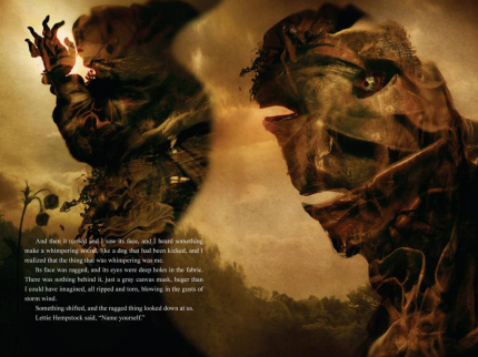

As I explained to Dan I wanted to achieve a scratchy more expressive illustration style and he asked if I was familiar with Niel Gamen and in actually fact I have been reading his work for a very long time. So, I went back and collected some of his work to draw on when doing the illustrations. I love the texture they have in the background created by layers of paint and collage. The scratchy drawings are quite angular and raw, the imperfections forming part of the shapes in a slightly crazy and surreal fashion.


In some of his illustrations he makes use of a combination of these two themes by reducing the intensity of the colours in the collage, as if with layers of white wash and draws over the top. This is something I would really like to experiment with because it allows me to use images in the collage that delicately suggest some of my influences with out it interrupting the main flow of information in the drawing. Below is an example of one of my favourite Dave Mckean pieces, this is because of the way he manages to create a sense of fields of focus through his collages. The eye with its contrasts of reflections and shadows is indubitably the focus of the image but the textures that surround it provide a sense of depth and complexity as you notice new details, communicating much more in one glance than a flat illustration would.

I think the best war to approach this is to experiment with a collage of images and paints to create a texture that I feel adds to the meaning of my illustration but has a balance of colour that can take an illustration over the top. I also want to look into using both fountain pens and cocktail sticks with indian ink to create and illustration style a kin to Dave Mckean but also works in a map format.
No comments:
Post a Comment