Thursday 26 November 2015

OUGD603 Extended Practice Brief 01 SU Work Part 2 Elections Print Testand Final Designs for A5 and A6 Flyers

We did a couple of text prints to evaluate which of the two textures we wanted to use. 
                                 
                                
The image above is the original risograph texture and the one below id Billie's edited one.

                                 
After talking with Billie, Emma and Kaitlyn, we felt that the new texture was more happy open and vibrant. it also had a cleaner finished look when printed. So, the final designs were given this texture and the designs can be seen below.


OUGD603 Extended Practice Brief 01 SU Work Part 2 Elections: Flyer Development

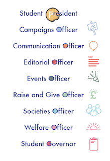
Because we had already developed an approach to the front of the heads up flyer we started by working on the back. I took the content and began to work in the icons,  trying to create a sense of flow and legibility.

A lot of trial and error was involved in this but some feedback from Billie helped and reducing the icon size seemed to make a lot of difference.

Adding colours to the officer roles was just an experiment really but it seemed to add a sense of fun to something that would other wise seem very functional.

The only issue with this was the way that the governor and president roles didn't have any place to put the colour.


Putting it in anything but the 'O' seemed to ruin the context of them being like the planets in the logo.


In the end we settled on the compromise of using enclosed apertures only.


The front design had already been settled on but Billie did some work in photoshop and created a different version of the risograph texture with less semi tones. This can be seen when you compare the images above and below.


This more intense texture has more of a suggestion of a night sky. However, we have settled on doing a text print in the digital print so that we know which creates the better finish physically before we send it off to print. The presidential flyer was fairly simple too. Billie sent over the layout above and I tweaked it to the one you can see below.

It was decided that to create a definite sense of difference between this role and the others, this flyer would be A5 while the others are all A6. Following the same template as for the other flyer and te poster designs created a really nice sense of continuity for this design


The back layout proved more tricky because of the amount of content that we had to fit on it. We followed the same pattern of Billie creating the first draft, me trying a few things out and then sending it back and her refining it.
We knew that we needed some image content on the back and played around we a few ideas, but noting fitted with the rules set up by the designs so far except for using the Presidential icon.
We talked to Emma and Kaitlyn in the SU and they like this so we stuck with it.


Wednesday 18 November 2015

OUGD603 Extended Practice Brief 03 Botanical Collaboration Responding to the Crit

Collaboration Partner: Jess Wood
As part of the feedback received in the extended practice crit it was suggested I look at the publication Another Escape just for examples of how they deal with natural subject matter in print form. 


Although the majority of the plants we slightly more scientifically and abstractly presented than we would want,  it was interesting to see how they dealt with their type on the natural of surface of uncoated paper. They created a distinct contrast between the subtitles which were open sans serif and their body copy which was transitional serif. I think what predominantly makes this difference is the all caps nature of the subtitles which structurally looks so different to the lower case body copy creating a solid hierarchy of information.
The strong decisive nature of the dark images means a slight sense of structure is given to the page. This is because the frames of the images are completely discernible against the paper. This is something that we could implement in our designs, despite the illustrations being water colours and therefore soft by nature we can increase the intensity of the colour for a clearly defined edge. However, this may not work but is worth experimenting with.
Both Jess and I really liked the use of identifying colours relating to articles and we related this back to the swatch colours schemes Jess made up for each plant and how we could utilise this in the planning of the publication. 

It was also agreed that at this stage both myself and jess would just focus on the type and image for the publication and expand to an app design if we felt it was right. This was majorly down to realising the scale of the project and agreeing that making on thing really good was better than quantity over quality.

OUGD603 Extended Practice Colour samples and Layout Ideas

Collaboration Partner: Jess Wood
For the meeting today with Jess we both brought along bits of development work we had done. One thing that sparked conversation was a set of colour swatches that Jess made for each plan in preparation of creating the full illustrations.

We got talking about how pleasant these colours were and how we could even possibly create designs that are more space and block sampled colour to sit across from the plant ident pages. This way the whole layout has more space to breathe.
To confirm that we were both on the same page with this idea  we created a pinterest board looking at the many ways other people have achieved a similar sense of space.


Monday 16 November 2015

OUGD603 Extended Practice Brief 03 Botanical Collaboration Crit and Feedback (Formative)


Collaboration Partner: Jess Wood

To day we had an informal crit just to touch base with extended practice and see what everyone os working on besides COP. I presented the Botanical Collaboration work as far as I had gotten with it anyway and I got some interesting feedback.
Because of the early on nature of my work in the brief, a lot of it was considering research methods and routes to explore developmentally.

It was suggested that I sit down with Jess and we identify a target audience, perhaps even do a profile that we can tailer the publication and the app to. When it came to the app it was also pointed out that it may be tricky to get the spacious aesthetic that we have set out to achieve in the publication, to which I said I had been thinking about this as an issue but had so far seen it more as a challenge than as a hinderance. Although, it has got e thinking about the UX design that could allow for a more spacious aesthetic and that perhaps I should look into this in more detail.

Since the aesthetic of the publication will in many ways shape the app, it was suggested that I look at publications that have the mix of practical and cleanly earthy that we are trying to achieve and see how it was done. A friend on the course even had an example in the form of 'Another Escape' which is shown below. He suggested volume four had had a particular emphasis on plant forms and might be worth having a look at if I could find it.
       
All in all fairly successful. Billie also presented our collaborative work for summative evaluation which was really useful too.

Sunday 15 November 2015

OUGD03 Extended Practice Brief 03 Botanical Collaboration: Starting Type Design.


Collaboration Partner: Jess Wood

Once I had done the in depth type analysis of the old and modern fonts, caslon and Didot I had three words that I wanted to evoke with the type that I create and a basic understanding of how I might create this. The three words are: sharp, elegant and natural

To get to grips with the 'natural' I spent some time sketching a few of the plants that we selected for our content, simply to familiarize myself with the shapes and forms that might fit into the letters.


I started my design process proper by tracing small all caps versions of caslon and didot and making alterations to them, finding the most important aspects of each letter silhouette and how they might be safely and legibly rethought.

I found that the line weight changes in the letters match the up and sown strokes originally associated with calligraphic forms. I played with sharp serifs and soft natural serif brackets as well as general letter proportions. I found that focussing on the negative space created by the letter is a great way to create a natural and open glyph.
Once I had these theme that I thought could be more widely applied (softened serif brackets, sharp serifs, open and curved apertures and suggestions of calligraphic flourishes) I tried a few more letters at a larger scale. This drew attention to the changes I needed to make, predominantly the balance of line weight. At the moment the letters seem too fat to be elegant, so some slimming of the heavier lines will need to occur.

Thursday 5 November 2015

OUGD603 Extended Practice Brief 03 Botanical Collaboration Typographic Research and Analysis

Collaboration Partner: Jess Wood
In oder to fully understand the sort of typography that Jess and myself wanted to achieve for this project I chose two fonts (one typically 'modern' and the other typically 'old style'. I did an examination of a variety of glyphs, upper and lower case and noted the dfferences etween the two fonts.

Apature shape, letter width and angle f axis were a few things that differenciated the fonts very clely frm one another.
As well as whih letters had r didn't have descenders.
I found that often Didot took aspects that were present in caslon and eaggerated them. For example, the curves of Caslon re very rounded from a distance but on closer insection they are in fact gently squared off, Didot too this and made the most languorous curves from these shapes. 
Sometimes, this works against Didot in my opinion. As can be seen above the extreme line weight changes and exaggerted curves make the didot glyph (right) seem a bit imbalanced. As a sillouette it is argubly more attractive but as a letter it reads less fluidly.

The next step is to come up with a few words that we want the font to evoke from our readers and start alligning design decisions to those.

Wednesday 4 November 2015

OUGD603 Extended Practice Brief 03 Botanical Collaboration Layout Experimentation and Content Decisions

Collaboration Partner: Jess Wood

After the basic layout mock ups I created (detailed in the last post) Jess illustrated over and around them with the specific plant in question. We agreed that the colour was unecessary for this early experimentation. 


The structure of the way the plant grows informs how it frames the content. Jess tried a few different options and we talked about how the plants could interact with their name. 

The layout above was both of our favourites because of the way it directs the eye through the hierarchy  of information without getting in the way of any of it. I especially lve the way it spreads across the page as wisteria would grow, communicating so much about the plant without having large bodies of dense text.

We talked about choosing the content for the publication / app and how we would limit it in a way that would make sense and be useful. We decided that because we wanted the publication to be an introduction a good way to choose the content would be the most common plants in each season. We sat down and went through some options for each seasonal section of the book/app. This is what we came up with:

Spring:
-Primrose
-Crocus
-Blackthorn
-Red Campione
-Frittilary
-Dog Rose
-Nigella

Summer:
-Honeysuckle
-Teasel
-Buddei
-Heather
-Yellow Iris
-Harebell
-Foxglove
-Martagon lilly

Autumn:
-Common Fern
-Sea Buckthorn
-Virginia Creeper
-Bramble
-Apple tree (Russet)

Winter:
-Winter Heliotrope
-Gorse
-Sweet Violet
-Holy
-Snow drops
-Winter Jasmine
-Ivy

We have ensured that there are at least 5 in each season, this is the number we are evetually aiming for. We have include a few extra where we felt we could so that Jess can have a go at drawing the different plants and possibly pick and choose the ones that work best for her.

While jess experiments with the illustration of these plants I will look more closely at the typographic styles we cited in our last meeting and draw some of these plants myself to become more closely aquainted with the botanical shapes that will dictate this brief.


Sunday 1 November 2015

OUGD603 Extended Practice Brief 03 Botanical Collaboration Typographic Discussions and Layout Experimentation

Collaboration Partner: Jess Wood

Jess and myself have talked at length about the typographic aspect of this brief so that we both are on the same page with what we are looking to achieve. We talked about the fact that we wanted something to starkly contrast the soft shapes of the illustrations in its general tone of voice but have small flourishes that are nods to the specific botanical subject matter of the entire design piece.

Caslon in a great example of these flourishes, with small shapes and elements which nod towards the calligraphic.


We talked about how the transitional fonts like Baskerville came really close to what we wanted to achieve with great visual lines and sharp bracketed serifs.

We also talked about Didot having a great look to it for what we needed and the fact that the contrast in line weight was the major reason for this because its startling abrupt change in weight contrasts so exactly with the gradual curves and flow of many botanical structures.

I realised from this conversation that what we wanted was a hybrid of 'old style' fonts and 'modern' fonts as shown above. (These images all come from the app Typography Insight)

However, I think it is important to consider why each aspect from these contrasting typographic families is used. For example, we will need the font to work in small sections of body copy and there are certain tricks that make Caslon work in this context particularly well. I think the next step is to analyse fonts from these two families (old style and modern) and see what some of these tricks and trends are before I start design for our project.


-----------------------------------------------------------------------------

After our last meeting we agreed that we wanted to try out an approach to creating the layouts for or publication and app. The idea being that I create a typographical layout that can work on its own but allows a lot on space. Jess will then illustrate on top of this and around this with the relevant plant, so that the type and image interact in a way that the botanical books we have looked at didn't.


We decided to use the plant Wisteria because it is a plant that Jess is happy to illustrate and I am familiar with. I may not be in the final publication but it will do for this experimentation.


I tried out Baskerville,


Caslon

and Didot for this layout. I ended up settling on Baskerville because it is closest to what we are looking to create in the end.


I simplified down the information because this will be a publication for beginners and added a scale for the length of the bloom, which is something Jess and myself had talked about previously. I used the plant title in the upper middle of the page as the starting point for the positioning of the rest of the text. This is because this main plant name is most likely where the illustration will interact most with the text and is the first thing to catch the eye in the layout. To then direct the eye from here seemed the most logical hierarchy of information. The next step is to send tai over to Jess for the illustration. To do this we have set up a joint google drive so we can constantly back up and access all of the files relevant to this project.

OUGD603 Extended Practice Brief 01 SU Work Part 2 Iconography Development

After we had re sized the iconography as asked by the SU we had a meeting in which they invited the execs to suggest further changes to the icons for their respective roles.


Below is the feedback that we got.


After talking with emma about the presidential role she said that every year they wrangle with a way of representing the role in a way that is not over the top and doesn't presume power. She said that they tend to simply go for using the P instead.

For a more detailed record of the first iteration of the iconography please visit Billie's blog as she worked predominantly on this.


I wanted to avoid making it look like a parking sign or something so I used the typographic alterations from the logo type to just add the look of the campaign to the glyph. I think this works really well but I will go back to get emma's opinion on this.


The events officers said the that the calendar didn't communicate enough excitement for the the role. They suggested a party popper. I looked at creating a traditional english party popper which is a cylindrical shape but it just didn't read right in the simplifies vector format. So, I had a search for how others had represented party poppers and came up with the circular based pyramid shaped popper whig is much more easy to read.


As much as the SU liked the wavy lines icon we came up for the editorial role but we realised that it was very similar to the colours may vary logo. Also, the name of the role doesn't communicate that it is as the editor of Nest, so it was suggested that the icon helped to communicate this better than the role name.

Using the same concept of lines of text I created the icon below. I then brought these icons to a crit box with a few second and third years and it was suggested that I use the full word rather than one letter just to be more oblique. 


The campaigns officers felt that the icon should be more active and expressive to communicate the activism that is behind the role.

They suggested the addition of a placard but I still felt that it seemed a bit inactive and didn't communicate their political activism enough.

I added some sound marks to connote political shouting and I think this made the difference.  The sharp straight nature of the lines angled up and out suggesting positive and direct change. 

It was suggested that the Raise and give logo had a link to the logo previously used, which was two hands. 

Billie had already tried this so we had the vectors already. We took one of the hands to keep it as simple as possible. Angling it up and right seemed to make all the difference again connoting the positive direction that the money raised goes in.


These icons work really well together. To test this I put them together on the interior of the front cover to show the separate roles and how they could interact on the page. This is a situation in which the smaller presidential role icon comes into play in order to show its importance as the central leadership role.