After many discussions with friends I have decided to look at current magazine logos in an attempt not only to understand the limitations of this format and type of logo but also to see how I could make my design different. This is so I can understand what it visually identified as appealing to women and why.
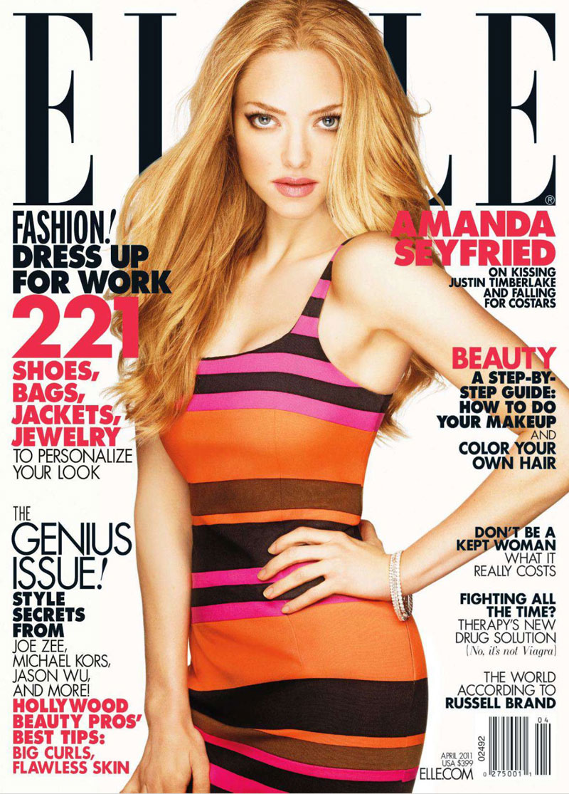
There is a definite theme of tall elegant forms for the letters in the more high fashion magazine logos. there is a clear connection between these letter forms and the idealised body images communicated in many of these publications.
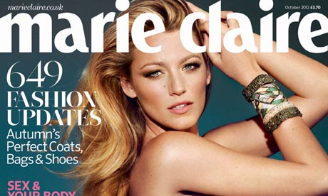
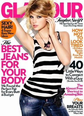

However, there are also obviously a group of designs that have a more assertive look but still have a definite softness to them. The most obvious theme is the positioning of the logo; at the top of the page like a title on an article. This is because the brands have become conglomerate personalities "cosmo suggests this" ect because they are selling a lifestyle ideal, like a perfume add in a way. The real difference that parallel has is that it has a focus on content that stimulates independent thought and action, not mindless following. So, I want to look at changing this format and creating something that is truly different for a magazine.
No comments:
Post a Comment