


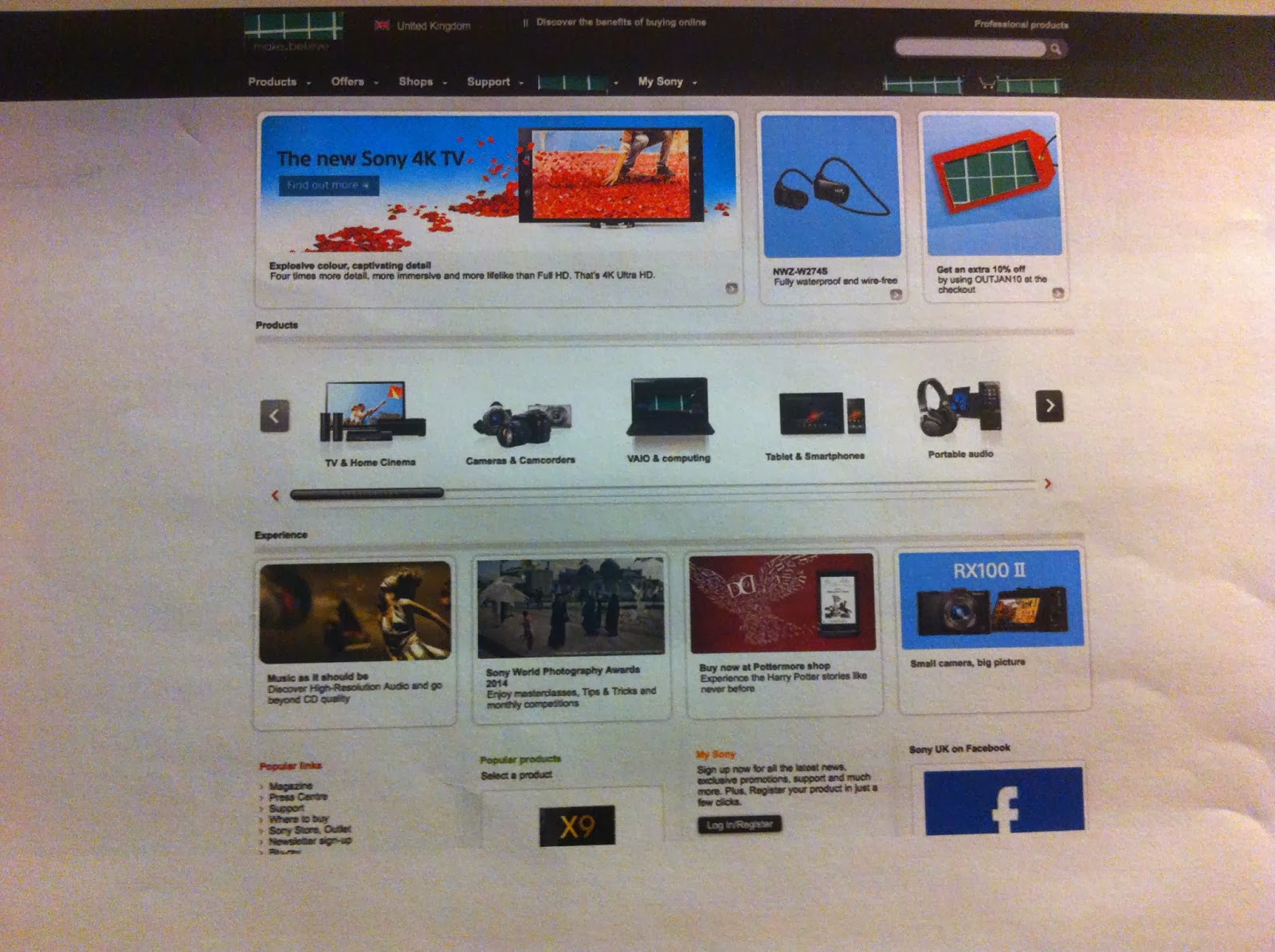


Although there are eight different fonts on this website the low proportion of type to image means that it does not appear over crowded or busy. Once again there is this recurring theme of boxes or columns like in the BBC website, I wonder if this is to allow easy access and functionality on portable devices. the width of the page means that the upper section of the page naturally draws the eye. however, the links made by colour from the top left to the bottom right help combat this and draw the eye across the page. The wide almost square layout allows the eye to use the centre as the focussing point and this dictated the major difference from the first to second hierarchy, which was the VAIO logo in the centre of the page dropped from the middle to the bottom of the second hierarchy because without its central position it in no way drew the eye. In both the first and second hierarchy the reversed out type was very near the top yet in the second hierarchy it was clear that the bold reversed out type was by far the most dominant.
No comments:
Post a Comment