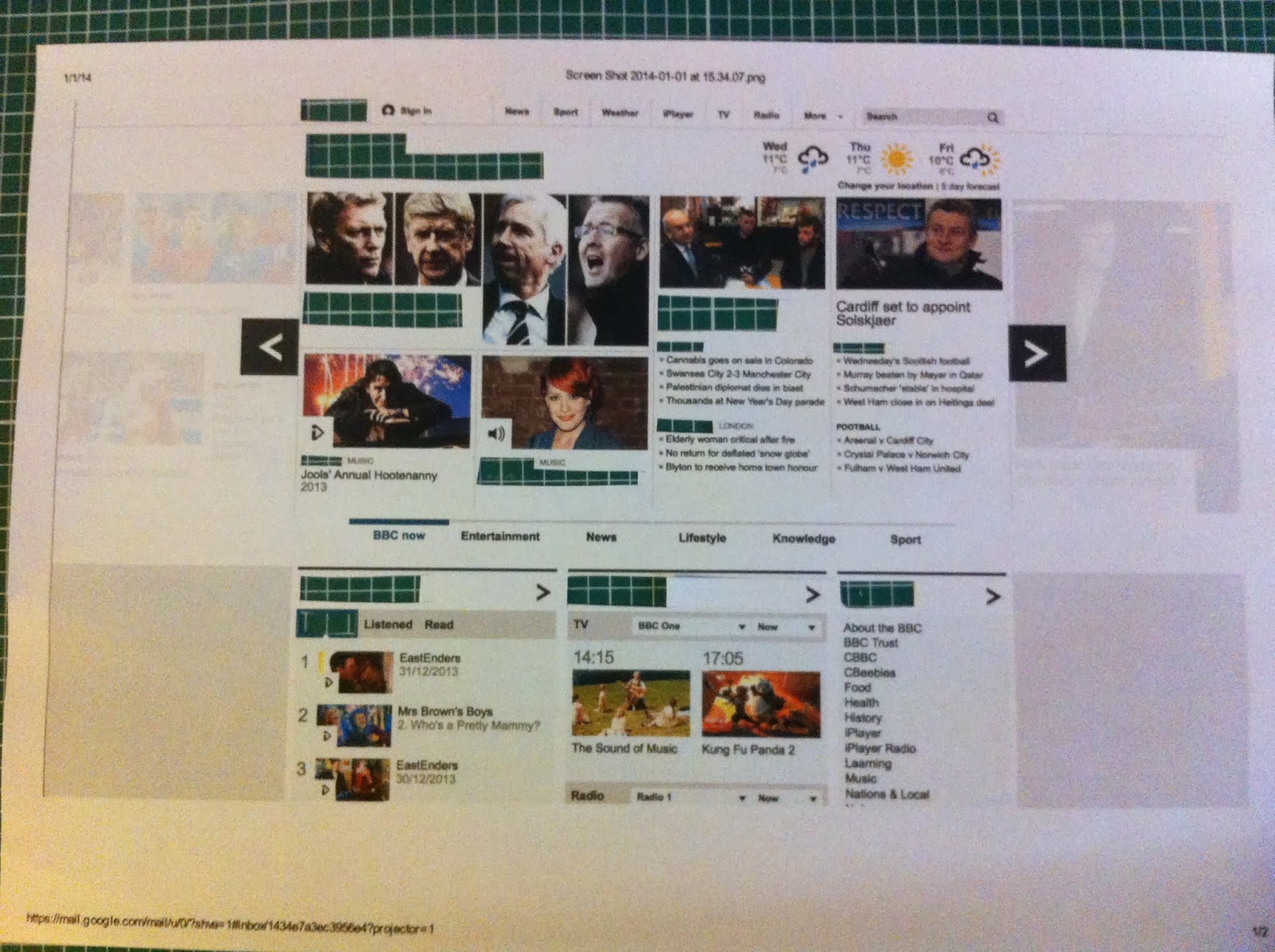
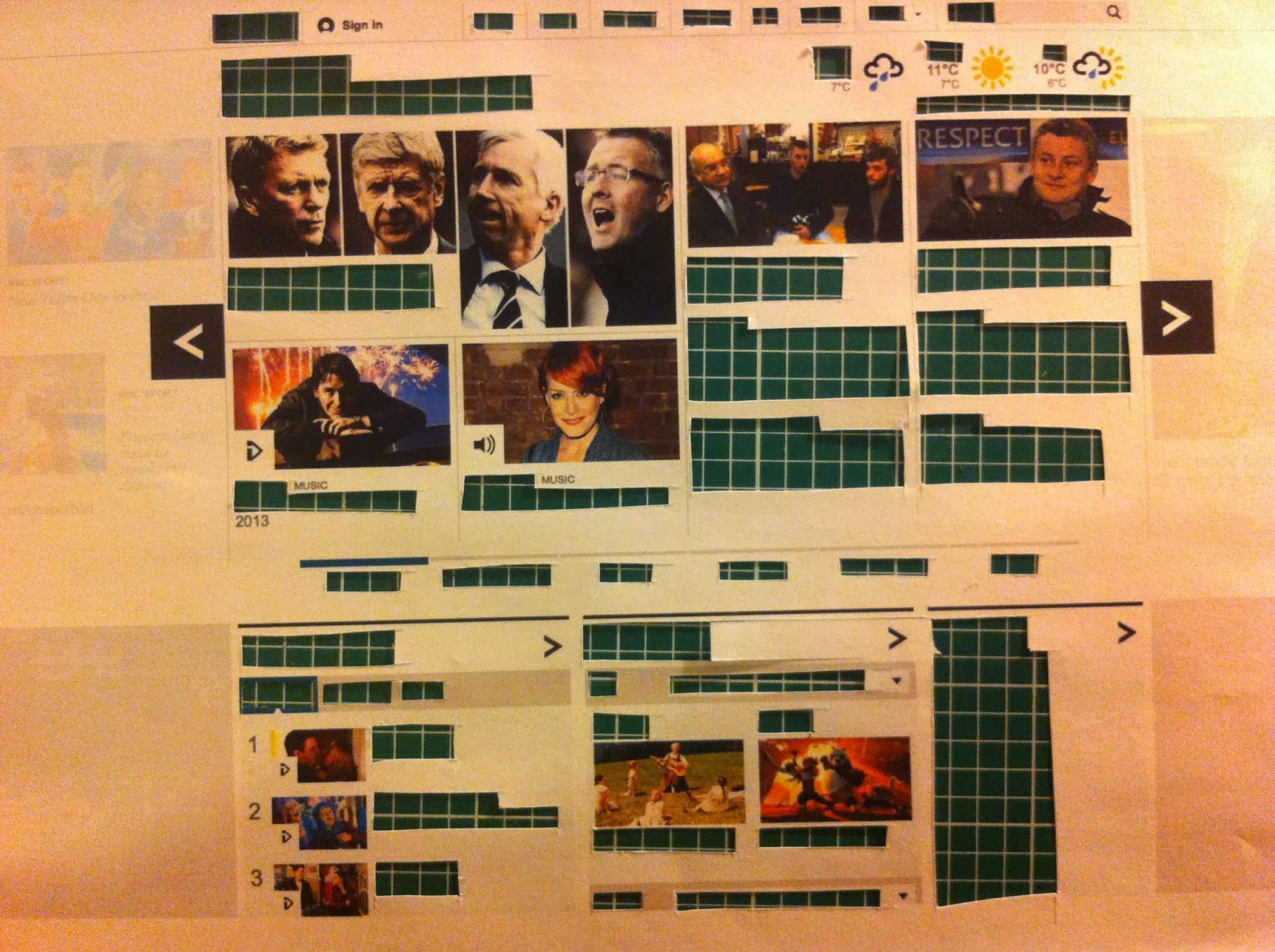
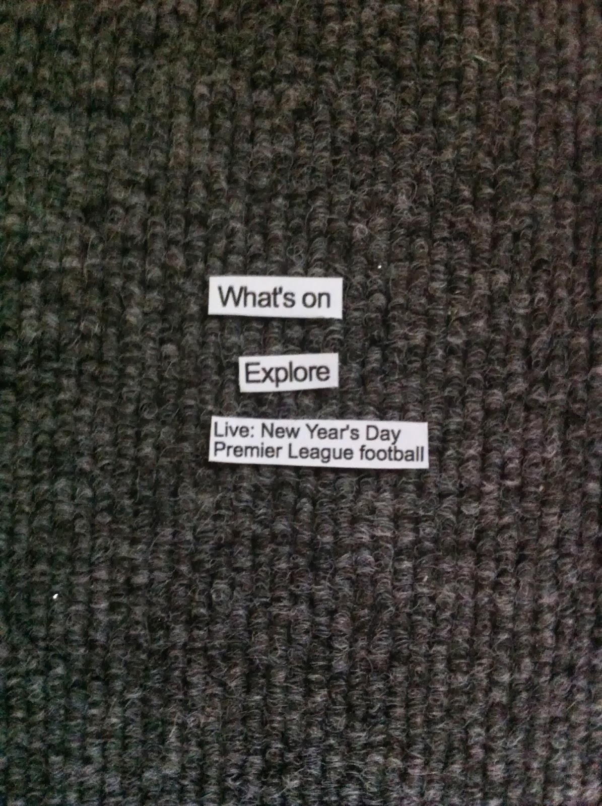
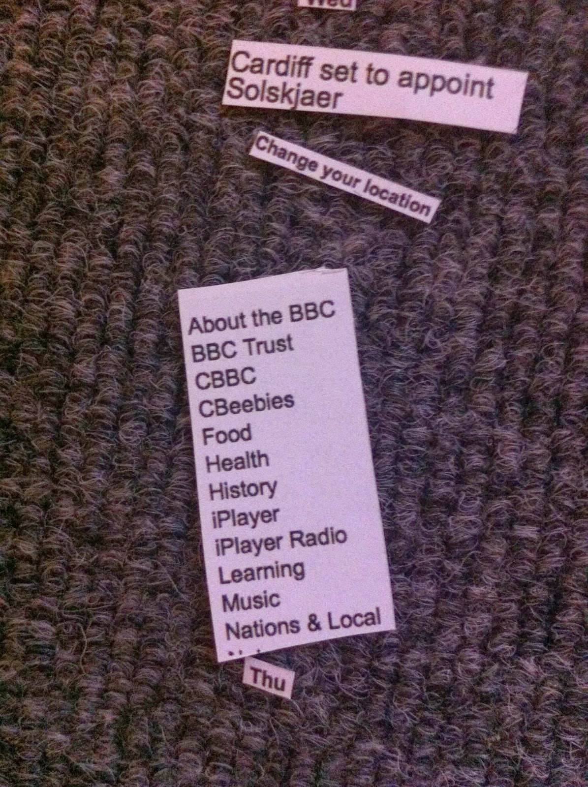
Unlike the printed formats I have previously done in this task this website only had three fonts which I believe to be Gill sans light, bold and regular. this could be because when viewing a web page you only see small sections and to use lots of fonts would over crowd it. Also I think Gill Sans has been used because of its clear association with the english identity (because of its use in the London Underground.) the main thing I noticed about its layout was its separation into columns and small boxes which brought tot mind not only the layout of many newspapers but also the structure of mobile websites. The largest difference between the first and second layout was the power reversed back text had out of context and the way small bold type had a strong grip on the eye in context yet in the second list all of these dropped down the hierarchy.














No comments:
Post a Comment