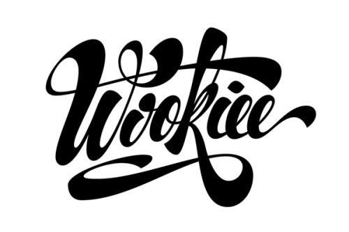
This is some type design done by Martín Krause. This seems to be a combination of the line weight changes of a bone style font with the graduation from one to the other of a sable font, making this most definitely digital. This is clearly not a full font thought, it is much more of a piece of art with letters, which means that this context for these letters is the only one that have to work in making them incredibly specifically tailored to the letters either side of it and how it needs to act in this environment to be legible and readable.
No comments:
Post a Comment