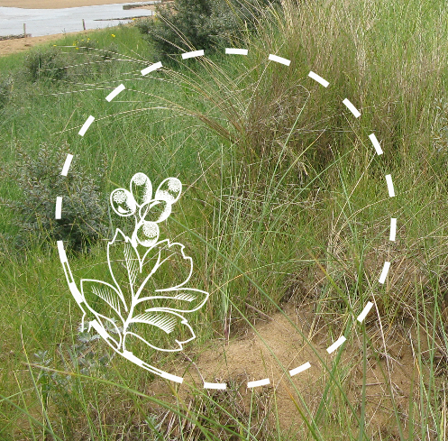
Because the plants I collected in my summer project all relate to the place that they were collected, I choose a few plants to represent each walk and tat could be used in the logo design.

I started by limiting each walk down to a few different plants.

I didn't want to make the plants I chose too flowery or girly but I also wanted the plants to represent the walks themselves and the sort of experience you get with each one. For the third walk I chose common Bent because it had slightness and delicate shape that worked quite well for suggesting the light and open expanse of the dunes at wells next to the sea.

For the first walk I chose prickly saltwort because it manages to encapsulate the essence of the salt marshes and the sand hillocks that form a major part of this walk. This is because it is quite a meaty plant similar to the most recognised salt marsh plant (samphire) but also quite harsh in shape with its spikes, referencing the harshness of the drier areas of the walk. However, this may sound negative but I feel that prickly salt wort represents it in enough of a stylish way that it could still work.


I started looking at how I could translate these illustrations into a logo.


I then took the drawing into illustrator and started tracing over it using the pen tool.


No comments:
Post a Comment