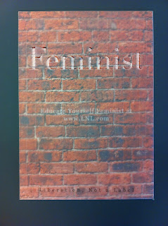
After a long period of perforation and some free hand cutting which was a bit touch and go for a while there, the posters were all finished.
I am particularly happy this the the way the tester tore and the way that the way people choose to tear it will dictate the way the poster looks, metaphorically defining the image of their own feminism.
The border of non perforated paper around the posters worked wonders (thank God I tested it out).
Some of the more fluid perforation paths proved difficult and are a little less than perfect. I probably should have printed a tester but the cost was hight as is.
Aligning the cut letters on the tracing paper don't always align perfectly with the text underneath. However the slight displacement highlights the upper layer from a distance which is definitely a positive to come from it.
The tag line of the campaign doesn't always line up either but they don't interrupt one another so I don't think it is a problem.
Because these are intended as at least slightly contextual posters I mocked up a basic context example. I really like the way the brick poster sits in context, the slightly foggy tracing paper inviting people to reveal the truth. I also put in the moss poster slightly out of context just to show that they can also work that way.


No comments:
Post a Comment