Because I wanted to create contextual posters using the textures of the surfaces that the posters might sit against, I set out to collect together some generic textures that, although cannot be guaranteed to be exactly where the posters are, it still creates the sense that a true surface is being reveal which is what I am going for.

I want a real mix of textures for my four posters so I had a list of texture types that I wanted to achieve. One, which I managed above, was soft. The curves and soft application of the spray paint this close in, manages this impression whilst still being undisputedly urban.


Although an obvious choice, brick work needed to be one of the textures. I went for an old, weathered brick wall because I intended to match quite a clean elegant font against it and the contrast of impression needs to be strong for the message to be definite.

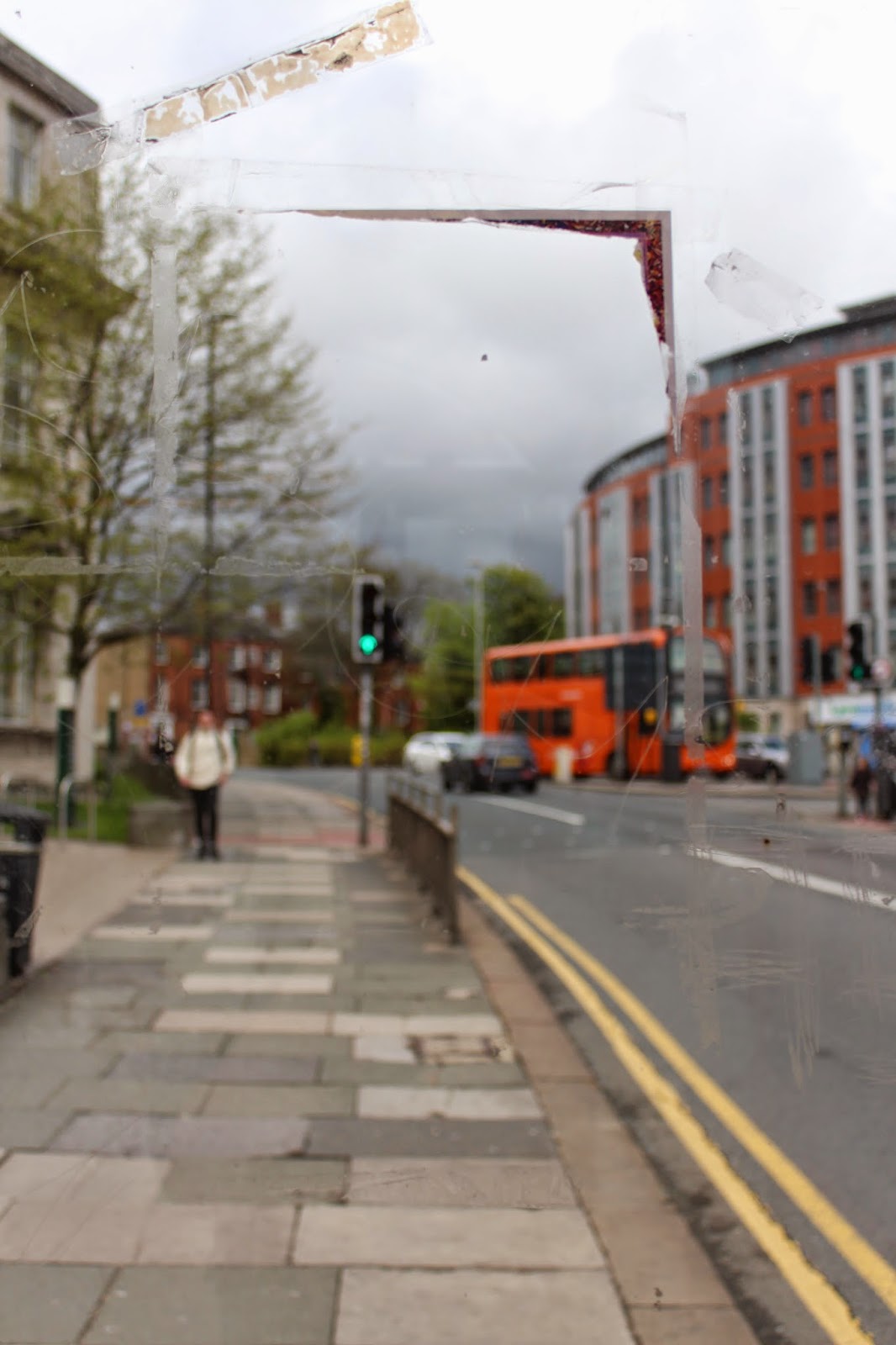
I played around with photographing the glass in a buss stop but immediately found that, to my surprise, glass is transparent! So, getting a texture off it alone is very tricky.


I also looked at the idea of using plants in an urban environment as a texture, because it is a contrast in its self. However, the depth of these images (above) didn't really come under the heading of texture and because I am overlaying them with a perforation pattern I am concerned that these would make the posters way too busy and not really communicate the complex message that I am attempting.


One success I did find was moss on concrete. I think his could be because the whole image is soft and gentle so that my type decisions can contrast it. Also the close in nature of the image makes is feel abstract and the general tone of voice of the texture is easier to extract quickly from the photo.


I thought briefly on the concept of having floor posters, but having people actively walking over the new feminism is not the message I wish to advocate. However, taking textures from the floor and putting them on wall posters could work. It communicates a certain upheaval of predjudices and ideas which fits perfectly with what I am trying to do.

I also collected some generic textures online to fill some gaps. The glass and cracked concrete are really lovely visual textures because the suggest a break through, a passion and energy to make a change. However, I feel like they are not textures that have a definite identity that I could contrast typographically. I will try them but I am uncertain of the result.

No comments:
Post a Comment