When considering colours that might work in branding context we did some research and landed on orange. It seemed the least politically charged colour so that the show could seem as neutral as possible, even if people in the show showed particular political leanings.

It was my job to go away and come up with the branding for the show and I did some searching before finally landing on the font lemon/milk. I knew we wanted something that felt a bit brash and unapologetic (we talked about vice and the the way their tone of voice managed to engage through creating this brash and crass identity). This font had the right mix of strength, with its continuos stroke weight and open apertures, and oddness with its pointed shapes and irregular imbalances. I added to this brashness by creating a coloured drop shadow, making it look as if the word is shouting its self off the page.

We went through a lot of options for the name. We knew we wanted a play on words to help communicate the comedy side but found it difficult to strike the right note. Eventually we settled on bollotics which summed up the tongue in cheek tone of voice perfectly.

It was Jamie's job to mock up the website for me to apply the branding. We decided on Avenir as the body copy font because of the way it contrasts the shape points of the logo type but also has many similarities in silhouette.

Putting the logo design on an angle was a decision made in conjunction with the other print design. It adds to the sense of shouting and helps to communicate the genre of the show.

I mocked up both the posters and the tickets for a hypothetical event. I carried on the theme of the angled title but made it more extreme so that parts of the word actually fall off the edge of the paper. This was done to create the sense of something completely unapologetic and unashamed. I also came up with the social media tags (talk bollotics). I thought it would be interesting to use orange stock rather than white, because it would be cheaper to print and also give the edge of political graphics in its affordable finish.


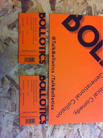
I took the same 'too big for print' approach to the ticket designs but for practicality reasons had t have it straight one. The limitations of the information required on a ticket meant this had to be.


Jamie also mocked up ballets that would be sent out to people that bought tickets so that they could decide what would be discussed in their local show (as previously mentioned the show would be nomadic).
No comments:
Post a Comment