Because I am making the transition from print to web when people access the website from the information on the posters I needed a brand or a logo that would make it clear that the audience is in the right place as soon as they enter the website.

I wanted something that didn't tie down feminism to one thing but rather varied in the same way that feminists do. I realized that from the posters I had already started a theme of contrast and variation, so why not go back to that for inspiration?


Then it occurred to me not to have a set logo but rather a gif that acts in the place of a logo and is the loading gif for the website. This way each feminist identity I had constructed could have its chance.

To start with a slightly messy animation seemed like a good idea but this so sacrificed legibility that I though something more straight forward might be better.

A simple wave like progression seemed like a compromise between legibility and communication and also has a sense of growth and going forward which is just the kind of positive enforcement that this campaign needs.

I tried two different speeds and ended up going for the slower one shown below because it flows more like the eye reading the word. i love the suggestion that feminism changes as you read it, because this is exactly what my campaign is about, 'educate yourself feminist'.
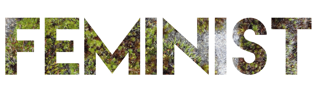
This gif will act as the loading image for the website.
No comments:
Post a Comment