7- When considering a colour scheme, which is more important aesthetic or concept?
'Without the influence of graphic designers, the aesthetic and intellectual growth of society would be clouded by shades of grey.' - Graphic designers colour handbook.
'Colours can be loud, calm, fresh, neutral, dark, rich, stimulating or mysterious.'
(GDHB)
(page 14)

' To become a successful colour connoisseur, you need to understand the psychology and evolution of colour.'
(GDHB)

http://www.telegraph.co.uk/science/science-news/4980503/Roses-are-red-to-deter-not-to-attract.html


(page 17)

'In western culture, for example, white symbolises cleanliness, virtue and chastity, where as, in china, white is associated with grief and mourning.'
(GDHB)
'Whether consciously or not individuals have innate and specific relations to colour'
(GDHB
(page 19)

in short it is not a question of which is more important than the other but rather that one was born of the other and they are inherently connected. the aesthetics that have been established and any new ones are by there very nature driven by concept. the way colours harmonies and work together has become conceptual because of the associations we have formed around them.
9- How to create a colour scheme and why do they work?
A color scheme for layout is much like another colour scheme it is just that different considerations have to be made in accordance with context and purpose. These include paper, size, location, tone of voice and many more.
'When you are sitting down to a new colour project, the first and most important task is analysing the job. Objectivity and common sense will help set the tone'
- Graphic Designer's Colour Handbook by Rick Sutherland and Barb Karg.
The application of colour theory allows colour schemes to work. As long as sufficient thought has been put into why each colour is being utilised and how the colours interact with one another then a colour scheme should work.
(Page 28)

( page 31)


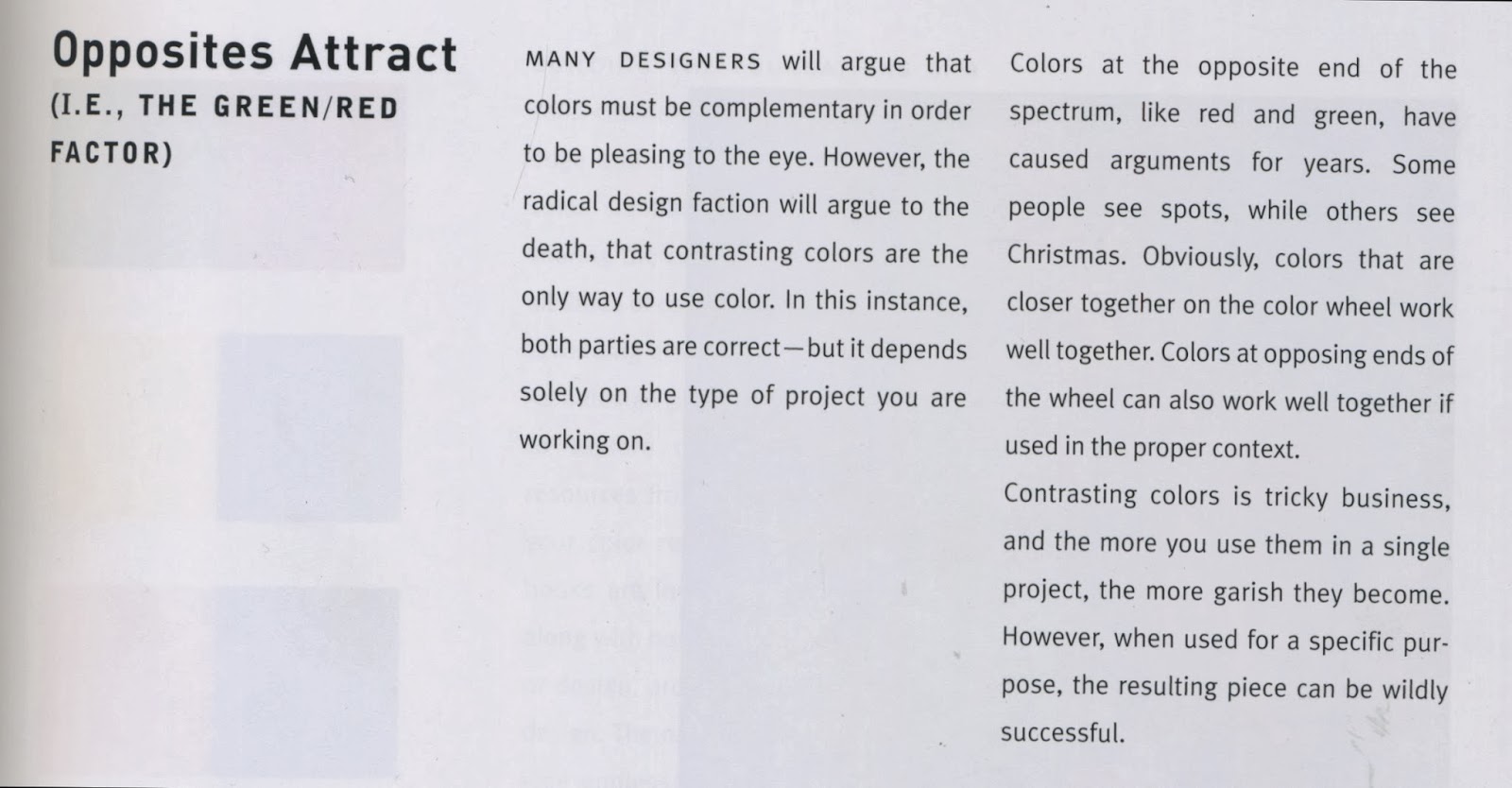
examples of natural colour combinations used in layout.


By Jessica Watts

by Claire Munday
http://www.behance.net/gallery/Layout-Design/6869911(page 41)

(page 37)
Go Grayscale
The best way to work with color is to start with none.
Removing color from a design reveals fundamental problems that should be addressed before worrying about which shade of chartreuse works best. If the design doesn’t feel right in black and white, then it’s time to make changes.
Does each page have a clear purpose? Does the design guide readers through the content? Is the content compelling, inspiring or informative? Are the headings clear? Do the links contrast with the other text? Color improves these effects, but problems in layout, type and organization can’t be solved by color alone.
To do a redesign, first suck out the color. The simple act of washing out over-saturated primaries really shows where a website stands. (Actually, you should really start a redesign by re-evaluating your goals and content, but that’s another story.)
Sometimes removing color is a solution in itself.
Type And Color
by Ilene Strizver
When you think of type, what colors come to mind? Black type on white paper, right? It’s true that much of our daily contact with type is in books, newspapers and magazines, in which text is predominantly set in black ink on white (or light-colored) paper. Black type against a light background is the easiest combination to read. It’s also the least expensive to print. But don’t assume color and type don’t mix; on the contrary, color used well can add focus and energy to your message.
Why Use Color?


Color and typography work together in many ways. Color can attract attention to an element, help emphasize, contrast and organize content, reinforce impact and recognition, create a mood, strengthen an identity and even assist readability. Color and type interact dynamically in logos, packaging and product design, movie and video titles and credits, greeting cards, book covers, CDs and posters. Color can be critical in establishing powerful corporate identities and product branding.
The Internet has added another new dimension to the use of color and typography. Web sites aim to attract your attention quickly and keep it as long as possible, and color is a powerful tool for achieving this.
Succeeding With Color
Think of color as an accessory to a basic wardrobe, something to enhance an already strong foundation. Many designers actually design in black and white first, then add color as a separate step.
Readability should be your primary consideration when combining type and color. Contrast is the key: maintaining a high degree of contrast between type and background colors helps keep type readable, while reducing contrast reduces ease of reading.
There are technical considerations to consider when choosing colors for the web. Macs and PCs display color differently (sometimes drastically), and so do various types of monitors. To be certain your audience sees what you intend, stick to the 216-color web-safe palette. Simply put, this is the lowest common denominator of colors that most older browsers and operating systems will display consistently. These days, however, the web-safe palette is losing ground. Many designers don’t want to be limited to 216 colors, especially since newer systems can display up to a million!
Here are a few DOs and DON’Ts to help you make successful color choices:

- DON’T tint type that has thin strokes.
- DON’T drop out or reverse type that has very thin strokes.
- DON’T set lengthy amounts of text on colored, tinted, or black backgrounds.
- DON’T use a color copy (ink jet, laser proof, photocopy, etc.) to select colors for print.
- DO consider how web color will appear on all monitors.
- DO maintain high contrast for optimal readability in all media (print and web).
While not a requirement for good typography, color is a fun, eye-catching element that can make a good design even better. The key is to use it tastefully and appropriately – as in all things typographic!
(page 208)

In conclusion, Colour schemes for layouts are created through the collection and application of many colour theories and your own personal understanding of colour. while certain collections of colours are known to work well together the choices of colour depend entirely on the context of the design. These are a few hints and tips on how to become acquainted with the application of colour, whether for a layout or any other design solution.
No comments:
Post a Comment