Tuesday, 18 March 2014

OUGD404 Design Principles Type Journal

Typeverything.com
Shacksbury branding by Scout’s Honor Co.
http://typeverything.com/post/75036708969/typeverything-com-shacksbury-branding-by-scouts
This is a wonderful example of type branding by scout's honour co. I found at type and everything, It has a wonderful floe of readability even if the edibility is not that great all the time. The connection to the movement of the hand during creation, somehow effects the smoothness with which it is read.(definitely sable in origin)

OUGD404 Design Principles Type Journal Hand rendered Type

This is some gorgeous hand rendered by Bryan Todd
Typeverything.com - For All the Songs by Bryan Todd
http://typeverything.com/post/74931050785/typeverything-com-for-all-the-songs-by-bryan

OUGD404 Type Journal Retro type

This is some amazing hand rendered type by Brett Stenson. I found it on type and everything in my search for content for our own type blog. there is a definite 1950s movie feel to this font with its gradients and soft suggestions of drop highlights.
typeverything.com, Seasons Greetings by Brett Stenson

OUGD404 Design Principles Brief 02 Interim Crit

We first were separated into groups, then we each introduced the woe we had done and talked through our process.
I brought both the working drafts of the two layouts I had mocked up digitally and all the thumbnails of all the layouts I had produced so far, so that people could understand the full picture of where i was up to with the designs.


The feed back I got was invaluable. I had been having trouble with evening off the bottoms of some columns but it was suggested that I play with the spacing of the words possibly rather than moving the columns around or increasing the size of the text. however, it was mentioned that perhaps my text was a bit too small and should be upped to 9 or 10 pt. The spacing of the margins and gutter was also looked at and it was suggested that I reduce these to give the content more space. When it came to the colour layouts the idea to place the coloured squares on either side of the spread rather than in the centre really caught my attention and i will definitely try it out. I mentioned my trouble with the quotes and the bullet points on the colour layout and it was suggested that i do not mix alignments because it confuses the page and that I could try placing the quotes within the text but play with bold type, spacing and kerning to draw attention to them. From looking at other peoples work too it came to my attention that adding horizontal lines to my grid might help me a lot, as would not simply constraining text to a single column, playing with the grid more.

We also split into twos to analyse others work in greater depth and the feed back pretty much summered what had been said before but suggested the use of colour in my thumbnails, reducing image size and keeping headings level with one another.

OUGD404 Design Principles Digital Development of Colour and Grid Spread

 I started out for the grid layout with the print out of the content to gauge the amount of space the content would take up and the percentage of text to image.


I took the 4 column grid that I used in the colour layout development to create some thumbnails.


I took the most promising thumbnail and mocked it up in in design and printed it out to get the best visual understanding of what needed to change.

I feel that the two columns in the centre of the spread weigh down the layout too much and the reflected alignment of the text makes it seem as if the right page is upside down, confusing the eye. Also i am becoming increasing y uncertain about the change of alignment between the body text and the quotes. Although both look good, when put together they clash quite a lot.


Monday, 17 March 2014

OUGD406 Studio Brief 03 Interim Crit

The feed back for this brief's interim crit was pretty positive. Although I hadn't digitally put the aspects of some designs together people seemed to get where was going with the designs, i suppose that's the advantage to getting such an established aesthetic along with the film. However, I hope that I can do something slightly 'alternative as well (possibly something to ask at an informal crit later in the brief).

The questions I asked were:
-Is the key lighting/negative space white on black effective as a representative of the film?
-I am having trouble considering the second colour to involve in these designs but was considering yellow (bright sickly) possibly incorporated in the same print as a gradient, do you think the could work visually?
- I was thinking about doing some 1920s hand rendered type (almost heavy classic gangster) could this work with the feel of the poster or dominate too much?

These are some of the more useful bits of feedback I received:

-I love that you have picked up on the white lighting which is in the film. Although, the drips work well, will they be suitable for screen print? White and yellow would work well.
(Although I am certain that creating positives from these shapes will not be difficult I will experiment with this further.)

-yes, I think your ideas are really strong although I am unsure about the gradients, are they really necessary? But I think the yellow and white as block colours could work. I don't think it needs the type.

- The type might work but it could over complicate the designs a bit.

-Stick to the black and white. I think the drip idea, I might keep it as just the drip though, it's more interesting in my opinion

- Minimal black and white is effective and synonymous with the film. ink splatters work really well, create an interesting contrast. the fluorescent idea is effective too.

- 20's imagery for the type may not work well with the minimal look of the designs.

-Although I understand why you have chosen black and white, some key colour use could really work.

-All the images are really effective and smart looking, the use of white on black is a great idea and fits with the movie. I really like the bullet hole dripping into the city, this could look awesome and really suit the film. 

-The font could work, however it would be nice it to be in a colour.

Saturday, 15 March 2014

OUGD404 Design Principles Brief 02 layout development

I started the process of designing my layout or the colour spread by printing out all the content for this layout.
I went on to do some small scale thumbnails with A paper proportions and three columns


Creating a balance of text and image across the spread was quite difficult but an even divide seemed to be the best way. Avoiding large bodies of text also presented a problem but even distribution was once again the solution.
I then used this square paper to upscale the thumbnails to A5 portrait format (this was something I did in the last design principles seminar.)


At this larger size the content seemed less controlled and more unorganised with much too large bodies of text.

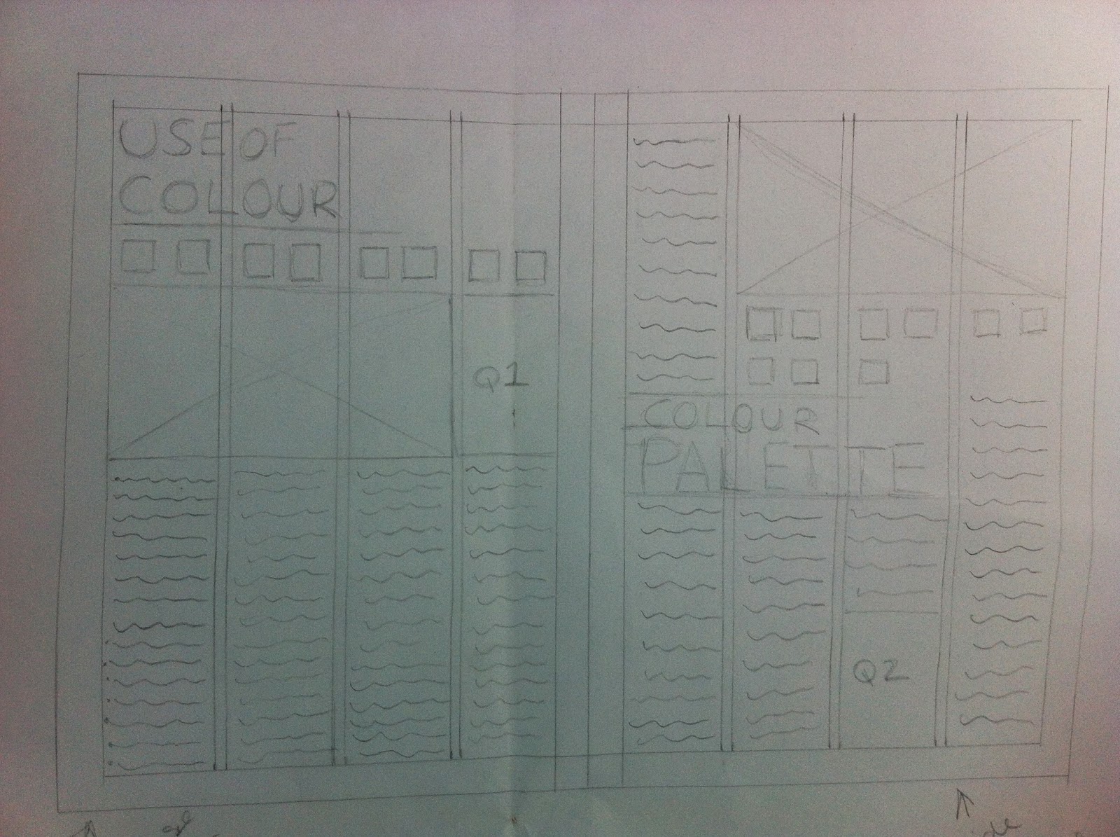
So, I tried a four column grid on each page and did some more full scale thumbnails.

This seems much more satisfactory, the text seems less dominant because of the thinner columns and the content feels more thought about. However, the justification of the text will really effect this. For example, if it is fully justified the text might suddenly look much more dense. this is something that I will need to look into when I create the digital mock ups, it may mean further changes to the layout are required. 


This is a digital mock up of the thumbnail with content. I have not completed the titles but have left the space for them on further revisions. There are lost of things I am unhappy with:
-Spacing between elements is inconsistent.
- Framing of pictures has different stroke width
- The arrangement of the words in quotes needs to be done in illustrator and brought in to get it right
- Justification of type makes it look as if the columns have just been dumped in.
- The bullet point arrangement at the top of the page needs major re-organising
- I am uncertain about the capital letters at the beginning of the columns.
- Possibly sans serif fonts would provide a more spacious feel
- The way the pages are a refection of one another throws the eye off I should try and make them more consistent.


I am so much happier with this layout. I had a bit of trouble with laying out the quote on the right page and it's not quite perfect yet but it's a hell of a lot better than the last try. Just changing to Gill sans opened up the whole page allowing me to use semi bold on the tiles and light on the quotes giving variation yet unity.