Monday, 3 March 2014
UGD406 Studio Brief 02 Final Logo Development
After our interview with Jon banks from craft design and direction we found the ampersand from the font F37 Bella which is shown below. I captured the exact transition from heavy to light line weight that we were looking for when we were going to create our own ampersand.

We tried one last time with the Type and I title but the balance was so off we couldn't find a way to make it work. To be honest I prefer the title type and eye, because of the double meaning it initiates when spoken. It both means looking at type and the relationship between designers and type.

Previous experimentation proved that it was difficult to mesh sans serif fonts at a large scale with a heavily ornamented ampersand; it just looked too busy. However, the huge change in line weight got me thinking about Baskeville and Bodoni as font options and we found that Bodoni really worked, where as Beskerville just felt complex. The vertical arrangement had to be done so that it could be viewed in the small square available for profile images on twitter and Facebook.

We did a test rum with this logo in the website layout we chose for the Wordpress and we all felt it worked really well, the cleans aesthetic will not inter fear or dominate the content in any way.

Sunday, 2 March 2014
OUGD404 Design Principles Brief 02 Layout Specific Content Decisions
After looking back at the list I compiled of all the research myself and everyone else in our group did I have decided to choose the content for topics three, four, five, six, and eight. This is because one or two people have not put their research up on their blogs, or I was unable to find it, which has stopped me from accessing the information.
4. Colour Schemes.


Quotes to space around the page:
- "use common sense as your base"
-' It's important to develop a palette of tried-and-tested colours that you feel comfortable with and you know will print superbly"
5.Colour applied to print.

CMYK is a scheme for combining primary pigments. The C stands for cyan (aqua), M stands for magenta (pink), Y for yellow, and K for Key. The key color in today's printing world is black but it has not always been. During the early days of printing, the colors used for Key have been brown, blue, or black -- whichever was the cheapest ink to acquire at any given time.The CMYK pigment model works like an "upside-down"version of the RGB (red, green, and blue) color model. Many paint and draw programs can make use of either the RGB or the CMYK model. The RGB scheme is used mainly for computer displays, while the CMYK model is used for printed color illustrations (hard copy).Pigments, as opposed to colors, represent energy that is not absorbed by a substance such as ink or paint. The primary pigments are cyan (C), magenta (M), and yellow (Y). Sometimes black (K) is also considered a primary pigment, although black can be obtained by combining pure cyan, magenta, and yellow in equal and large amounts.http://whatis.techtarget.com/definition/CMYK-cyan-magenta-yellow-key

When two RGB colours are mixed equally they produce the colors of the CMYK model, known as subtractive primaries. Green and blue creates cyan (C), red and blue creates magenta (M), and red and green creates yellow (Y). Black is added to the model because it cannot be created with the 3 subtractive primaries (when combined they create a dark brown). The K, or “key,” stands for black.

CMYK in the Printing Process: The four-colour printing process uses four printing plates; one for cyan, one for magenta, one for yellow and one for black. When the colours are combined on paper (they are actually printed as small dots), the human eye sees the final image.CMYK in Graphic Design: Graphic designers have to deal with the issue of seeing their work on screen in RGB, although their final printed piece will be in CMYK. Digital files should be converted to CMYK before sending to printers, unless otherwise specified.
Because of this issue, it is important to use “swatches” when designing if exact colour matching is important. Swatches provide a designer and client with a printed example of what a colour will look like on paper. A selected swatch colour can then be chosen in Photoshop (or a similar program) to insure the desired results. Even though the on-screen colour won’t exactly match the swatch, you know what your final colour will look like. You can also get a “proof” from a printer, which is an example of your printed piece provided before the entire job is run.
6. Colour associations and psychology.
'Colours can be loud, calm, fresh, neutral, dark, rich, stimulating or mysterious.'(GDHB)(page 14)


8. Web layout design.
Design is about solving problems and those problems can't be resolved through gradients or shadows but through a good layout and a clear hierarchy. Think about the content, the layout and the functionality before starting to drop shadows.


9.Grids and how they work.


4. Colour Schemes.
- "use common sense as your base"
-' It's important to develop a palette of tried-and-tested colours that you feel comfortable with and you know will print superbly"
5.Colour applied to print.
When two RGB colours are mixed equally they produce the colors of the CMYK model, known as subtractive primaries. Green and blue creates cyan (C), red and blue creates magenta (M), and red and green creates yellow (Y). Black is added to the model because it cannot be created with the 3 subtractive primaries (when combined they create a dark brown). The K, or “key,” stands for black.
CMYK in the Printing Process: The four-colour printing process uses four printing plates; one for cyan, one for magenta, one for yellow and one for black. When the colours are combined on paper (they are actually printed as small dots), the human eye sees the final image.CMYK in Graphic Design: Graphic designers have to deal with the issue of seeing their work on screen in RGB, although their final printed piece will be in CMYK. Digital files should be converted to CMYK before sending to printers, unless otherwise specified.
Because of this issue, it is important to use “swatches” when designing if exact colour matching is important. Swatches provide a designer and client with a printed example of what a colour will look like on paper. A selected swatch colour can then be chosen in Photoshop (or a similar program) to insure the desired results. Even though the on-screen colour won’t exactly match the swatch, you know what your final colour will look like. You can also get a “proof” from a printer, which is an example of your printed piece provided before the entire job is run.
6. Colour associations and psychology.
'Colours can be loud, calm, fresh, neutral, dark, rich, stimulating or mysterious.'(GDHB)(page 14)
' To become a successful colour connoisseur, you need to understand the psychology and evolution of colour.'
(GDHB)
(GDHB)
8. Web layout design.
01. Put your thoughts on paper first
Design is about solving problems and those problems can't be resolved through gradients or shadows but through a good layout and a clear hierarchy. Think about the content, the layout and the functionality before starting to drop shadows.
02. Start sketching a top level framework
When I'm asked to create a look and feel for a project, the first thing I do is come-up with a top level framework that solves all the design problems. The framework is the UI that surrounds the content and helps to perform actions and navigate through it. It includes the navigation and components like sidebars and bottom bars.
03. Add a grid to your PSD
It's as simple as it sounds. Before starting to design anything in Photoshop you need a proper grid to start with. There are no valid excuses for starting without a grid, and yes if you don't, I can assure in one way or another, the design won't look as good.
04. Choose your typography
Exploring different typefaces and colours is part of the discovery phase of a project. I would recommend not using more than two different typefaces in a website but it really depends on its nature you could use more or less. Overall choose a font that is easy to read for long amount of text and be more playful with titles and call to actions. Don't be afraid of using big fonts and overall be playful and consistent when using typography.
06. Divide the layout
Each section in your site needs to tell a story. It needs a reason and a final outcome for the user. The layout needs to help the content highlighting what are the most important pieces in that story. In reality there shouldn't be too many call outs on a page so everything should drive to that final "What can I do here".
'The simpler the structure of the site, the easier it is for users to navigate'
09. Pay attention to the details
This statement has been overused lately but it's not always visible in the final product. Depending on the concept behind the project, that "love" could come in different ways.
It could be a small interaction, an unexpected animation or an aesthetic touch like a little gradient in a button or a subtle stroke around a box in the background. But overall this touch is essential and also natural if you really enjoy what you do.
07. Rethink the established
As designers we shape the way users browse the internet, it's up to us to decide how many steps a simple action will take and how efficient our site will be. Design patterns and conventions are there because they work but sometimes they are there because no one spent enough time evaluating them or rethinking them. It's important to rethink the established interactive patterns on any component and to see how we can improve them.
Single-Column Grid
Every time you open a new document in a page layout program, you are prompted to create a grid. The simplest grid consists of a single column of text surounded by margins. By asking for page dimensions and margin widths from the outset, layout programs encourage you to design your page from the outside in. (The text column is the space left over when the margins have been subtracted.) Alternatively, you can design your page from the inside out, by setting your margins to zero and then positioning guidelines and text boxes on a blank page. This allows you to experiment with the margins and columns rather than making a commitment as soon as you open a new document. You can add guidelines to a master page after they meet your satisfaction.
Multicolumn Grid
While single-column grids work well for simple documents, multicolumn grids provide flexible formats for publications that have a complex hierarchy or that integrate text and illustrations. The more columns you create, the more flexible your grid becomes. You can use the grid to articulate the hierarchy of the publication by creating zones for different kinds of content. A text or image can occupy a single column or it can span several. Not all the space has to be filled.
Modular Grid
A modular grid has consistent horizontal divisions from top to bottom in addition to vertical divisions from left to right. These modules govern the placement and cropping of pictures as well as text. In the 1950s and 1960s, Swiss graphic designers including Gerstner, Ruder, and Müller-Brockmann devised modular grid systems like the one shown here.
designing programs Grid diagram, 1963 (redrawn). Designer: Karl Gerstner. Publisher: Arthur Niggli, Zurich. This square grid consists of six vertical columns and six horizontal modules, overlayed by grids of one, two, three, and four units. Vertically, the grid is governed by a 10-pt measure, which would determine the spacing of type from baseline to baseline.
When creating my layouts I will use this as content, I may also extract a few more quotes from the body text but this is uncertain as of yet.
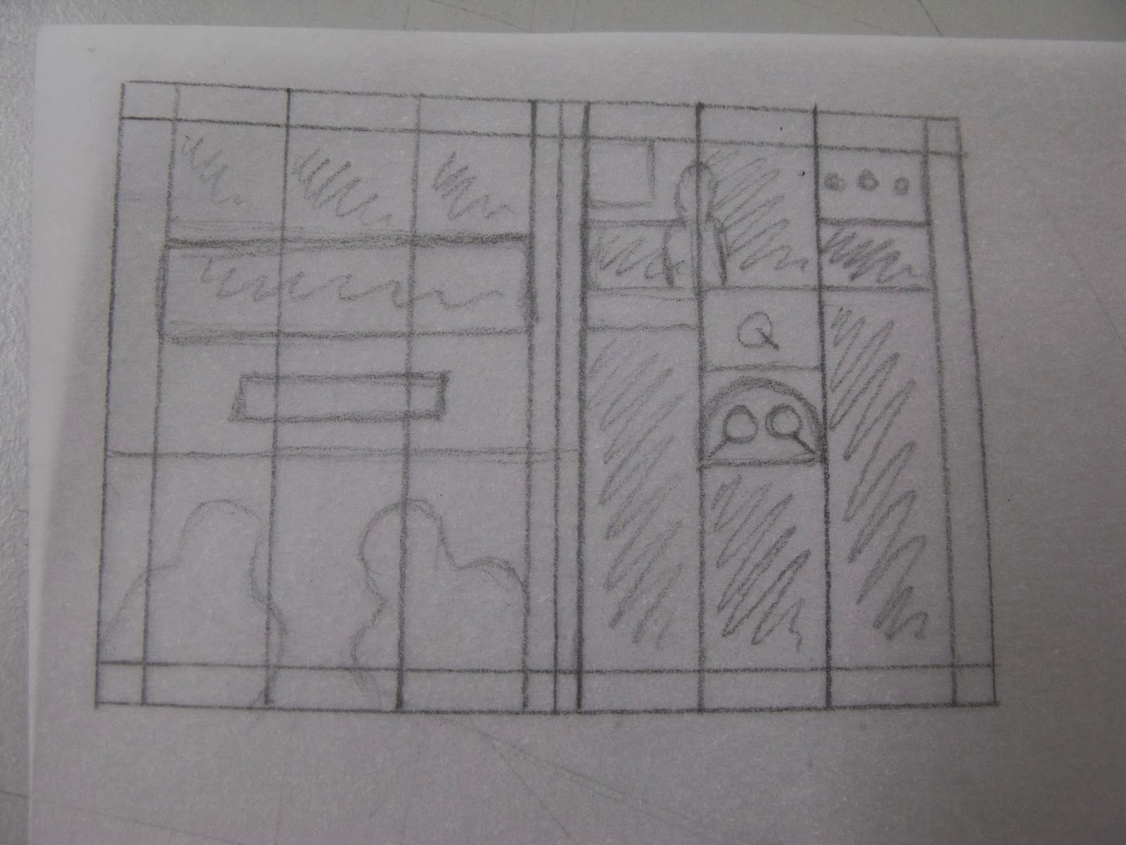
OUGD404 Design Principles Grids and Thumbnails Workshop
We started out the session talking about the way we had learned to pick out a grid from a finished layout but this is not alway completely accurate and laying the same grid over a number of pages from the same publication to add to the details of the grid can help this. Before designing a layout is is helpful to consider the ratio of image to text in the content (when deciding on my content this must be at the forefront of my mind). Creating thumbnails helps you to take this ratio and start applying it to layout designs.
We repeated the grid drawing process, as can be seen below.


 I added some colour so that the text and image aspects of the page could be clearly separated.

We repeated the grid drawing process, as can be seen below.
We each got a sheet of square paper and drew the spread proportionally correct but at a much smaller size.
Then taking the content that we had sign pointed when drawing the grid we created a new layout on the small thumbnail designs.
I fell into the trap of perhaps being too precious with my thumbnails. They are, after all, supposed to be quick simple mock ups, as long as I am aware of which images are where I need not make it more obvious to others.
Working to ratios rather than exact sizes works very well with layouts because they are fact and simple and easily translatable to a bigger size. Understanding the exact content you are working with is quintessential to creating useful thumbnails. When selecting content having less than you think you are going to need is a must. We all found that finding places for such a large amount of information was very difficult. The information needs to be in a variety of forms, so as to give the page texture and shape. Really anything above 12pt in print becomes a subtitle.
For the next session I need to select the specific content for five of my layouts with all of the above content in mind I will also do a selection of thumbnails for one of these layouts, just to keep in practice and start thinking about the design direction I want to go in.
Saturday, 1 March 2014
OUGD406 Studio Brief 02 Responses from Professionals
We have just received another reply to our request (Craft design), and with full answers this time that will be perfect for our 'interviews with professionals section!
Beth
Beth
That's a great idea to promote the course and yourself. Good luck
Of course you can use images from my website and send through a link to whatever you are creating.
My answers are below in green.
Look forward to seeing the campaign.
On 27 Feb 2014, at 20:34, Beth Taylor <bt250877@students.leeds-art.
Hello there!We are a group of Graphic Design students at Leeds College of Art and we are trying to create a viral campaign exposing the amazing typography going on in Leeds. We love the typographic work You are doing at the moment and want to shout about it. Would you be happy about us using some of the images from your website to do so? we will of course include a link to your website.We would also love it if you could answer just a few questions about your typographic practice:1.When approaching a brief how much time do you spend considering the typographic aspect of the designs? For me the type is the most important element, so about the same time as the idea. If the type is bad people will pick up on this and it will distract you from seeing the idea.2.Have you attempted designing a font? and what are the difficulties you have encountered in doing so? Yes, I've designed a few. The main issues are the more complex letters like the S. &. G. Also you must always remember to do all the punctuation.3.Where do you draw your inspiration from when designing type? Everywhere really, I look at type on anything. I find that fashion publications tend to push the boundaries with unusual, interesting typography.4.Could you suggest a designer in this area that has inspired you? Richard Bassett, Thompson Brand Partners5.What is you favourite font at the moment? F37 Bella
OUGD406 Studio brief 02 Type and I Time management and Development of Design
Today we got together in the studio just to touch base after the crit yesterday and apart from making discussions as to the website location and hosted, we also talked about the jobs each of us would do during the week and spent some time of the logo designs.
After the research done into existing typographic blogs we felt we wanted to outline exactly what we wanted to provide to our readers.
We thought of some names for the different sections of the website:
-Student Exposure- Type & Students
-Interviews with professionals- Type & Pro's
-Studio work- Type & Industry
The whole website will be united by the theme 'Type &'
I have also put a draft of the email we sent to a number of studios so that we can send further ones from our proper website.

We decided that each of us would go away and collect one piece of content for each of these sections, make contact with a few more designers and design studios using the join email we have created and continue to work on the logo we started together. Below is just a snapshot of the many lists i create when organising my day.


 Although we had found that the serif fonts had the most flourishing ampersands I wanted to see if reversing the balance with a serif font for the letters and a sans serif for the ampersand, I like this but as a group we decided that we wanted the ampersand to be the focus, which this design does not achieve. This is because of the detail fond in the text and not the ampersand.

Trying with lower case seemed to have very little effect on this balance of detail.

Both font serif made the whole thing far to busy.

 With both fonts sans serif the whole thing lacks focus.

 Gowever, we did feel that although the type and eye looked good it didn't say exactly what we wanted it to, so we will go on to see if we can find a way to make the original name work.
 I quite like this approach but find that perhaps it is slightly hard to understand. We will all work on these designs and touch base on monday.

After the research done into existing typographic blogs we felt we wanted to outline exactly what we wanted to provide to our readers.
We thought of some names for the different sections of the website:
-Student Exposure- Type & Students
-Interviews with professionals- Type & Pro's
-Studio work- Type & Industry
The whole website will be united by the theme 'Type &'
I have also put a draft of the email we sent to a number of studios so that we can send further ones from our proper website.
We decided that each of us would go away and collect one piece of content for each of these sections, make contact with a few more designers and design studios using the join email we have created and continue to work on the logo we started together. Below is just a snapshot of the many lists i create when organising my day.
We wanted to logo to be clean and crisp so that it would not over power the content of the website. So we started to play around with creating our own ampersand seeing as this would be the centre of the identity. However, we soon found that there are so many ampersands, doing this was really necessary.
When putting together the logo we had a few problems with the balance of a four letter word one side of the ampersand and a one letter word the other, so we started to play with the words Type and eye and these are some of the ideas we came up with, none are the finished thing, merely experimentation.
These are some of my favourites, not only because the balance of texture in the two fonts is much better but because it is orientated in such a manor that would allow it to fit into twitter thumbnails and Facebook profile pictures.
A thought that has just occurred to me is that because we are exposing students work we will also be exposing work that has no copy-write and is therefore vulnerable to creative plagiarism or whatever the correct term is. We will have to talk to Simon and possibly Jon about this so that we can protect the work that we praise.
OUGD406 Studio Brief 02 Type and I Website Decisions
Because we had a strong idea of what we wanted to achieve with we looked at a number of hosting options for our website /blog. the first one we looked at was wix. This looked great and had the mosaic image based layout that we wanted down to a T. However, we looked at the preview of the page and found that six used all of their pages as a platform for their adds, which ruined the clean aesthetic we wanted to achieve.


We also looked at Wordpress which had the themes shown above and below which once again captured the minimalist look we wanted however, we opted for the blog layout below because it allowed for some text to be visible as well to illuminate the subject of the post.

Subscribe to:
Posts (Atom)