Because part of the brief outlines the fact that the cover design will need to stand out in the context of a busy book shop shelf, I thought it worth while to go into a book shop and look at what makes a book stand out in this context.
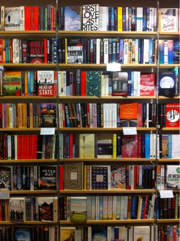
After a while of walking around and allowing whatever grabs my attention to have it. There was a definite dominant theme that did this repeatedly - colour limitations. For example, on the shelf above, what instantly stood out was Moby Dick.

The combination of bright yellow and soft teal, along with clever use of the off white stock, ceases a powerfully simple design. It takes the simple themes of the story and communicates them straight off the bat, with powerful block colours. This simple design also creates the impression that the contents of the book is approachable and understandable. This is something I should bear in mind, because the modern identity of feminist ideals, is aggressive and can put people off, also the written tone is approachable as mentioned in the previous post.

The bright red on this cover is used in a similarly controlled fashion. In a book shop full of busy image and photograph based designs the simple clean ones really do stand out in a way others simply do not. The combination of this with the fact that it also brings the suggestion of depth into play makes it doubly effective. It pulls the eye into the design, the angled lines of the train tunnel creating a sense of drama with the bright red to communicate the contents.
This approach of simple forms and limited colour pallets is something that I want to adhere to when creating my own design because of how powerful it proves to be in this book shop context.
No comments:
Post a Comment