

For a little more detail on these designs please follow the link.
Because the crit was in a written format we each wrote out three questions that we wanted answered concerning our designs. My three questions were as follows:
-Do these designs fit with the John lewis brand and identity?
-Do you think that they will appeal to the John Lewis target audience?
-Do you think each of the designs represent the era allocated to them?
Question one:
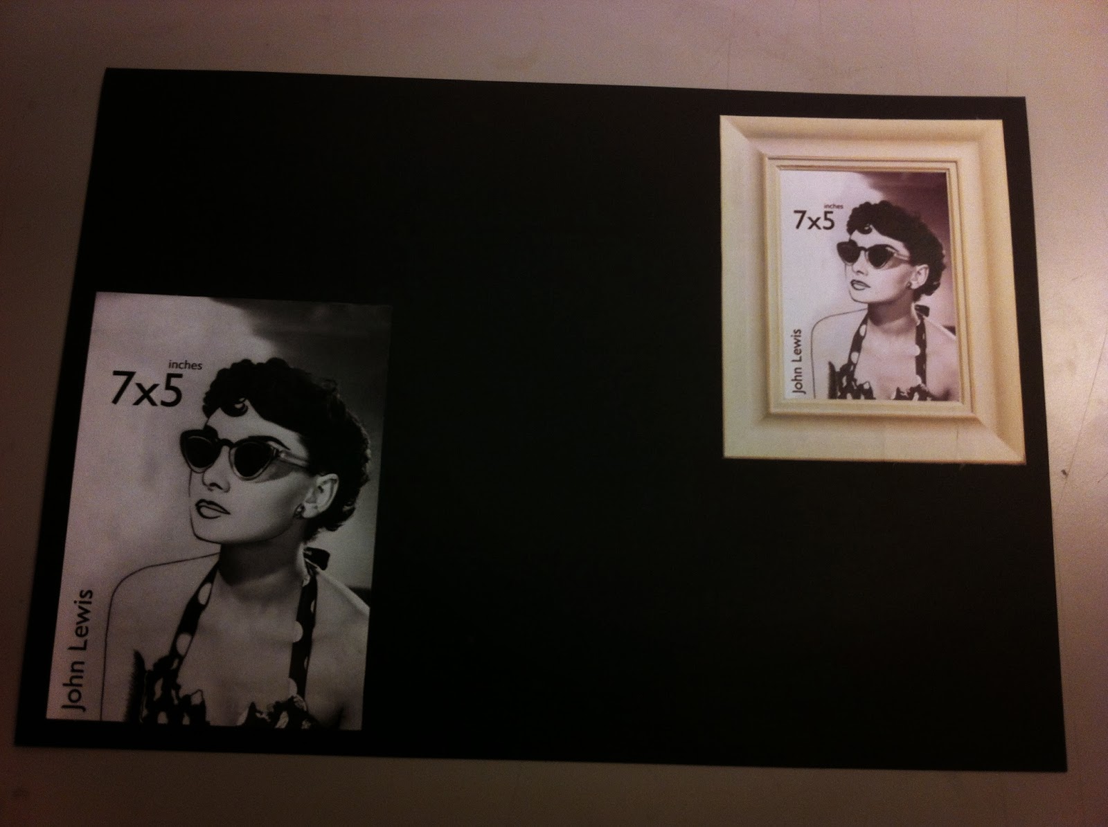
Answers varied greatly, as they did throughout. For example, someone said that the only one to fit was the 7x5 Audrey Hepburn design because John Lewis doesn't use illustration. However, this design did have illustration in it, just in pen rather than charcoal creating a slightly more crisp look. This is a partially valid point because John Lewis doesn't overtly use illustration in their branding but it does fit with their identity as a brand otherwise why would they use soft hand drawn animations in things such as their christmas advert?
Two people said that the Sassoon bob worked really well in this respect saying that it definitely captured the essence of the John Lewis brand. Yet another said that it was the worst of the designs because it didn't symbolise as much. However, I challenge this because really what they should have said was that it didn't symbolise as much to them and in the end the images were not chosen to communicate to a young adult audience. My research looked into what symbolised these eras to the John Lewis target audience.
This point was outlined by another persons comment in which they say "I don't really know what the John Lewis brand is to be honest."Despite this they wet on to practically deduce it from my designs saying that "the designs are classy, inoffensive and simple." This was one of the pieces of feedback I am most happy about.
In general people seemed to respond very positively to this question, one person even saying "Yes, the use of classic imagery and the style of illustration used looks like something that John Lewis would design for their shop", going on to say that the designs fit together well too.
Question two:
Four people were instantly positive that they isolated and addressed the John Lewis target audience exactly. However one person pointed out that the target audience may mostly be older or middle aged but by creating designs exclusively aimed at them I have alienate a small but possible there, younger audience. This is a valid point and perhaps a reason I should have gone for the obvious icons of each era.
During an answer to this question someone pointed out that they didn't understand why the car was there when the other two were portraits. I would argue that the only design that was actually a portrait was the 40s one because the icon is Audrey Hepburn herself, where as the 60s design focusses purely on the shape of the hairstyle not the woman modelling it. I also included the car because I felt that showing another female shape that references fashion of the time would alienate the male audience which is no doubt part of the John Lewis target audience.
Question Three:
Every single answer to this question was different and in high-sight I feel it was the wrong question to ask. As mentioned before the decisions for what to use for each era came from my research into what represented the eras to the John Lewis target audience age group. Each design had at least two positive answers but there were deciding lines in the answers, the most obvious of which being that the male answers tended towards the 50s car design and the female towards the instantly recognisable Audrey Hepburn. So, possibly I wasn't wrong in thinking a car design might appeal more to a male audience.
In all I am really pleased with these designs and the feedback that they received. Although they were not perfect, there was a reason for every aspect of the designs. I learnt a huge amount about how to use photo shop during this brief that will definitely be utilised in the future. Most of all I am content that the designs came from though rough research and critical thinking rather than depending on an instant spark of inspiration.
No comments:
Post a Comment