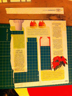
There is definitely more type than image on this page. However, if the block colours that the type is place on is considered image then this ration would go by far in the other direction. Although the path tracked across the page by the coloured blocks does pull the eye with it in some way, the fact that it is separated into blocks reduces this effect. The fist thing the eye is drawn to is the title with its high contrast of weight and smooth curving lines which actually compromise the legibility of the text but in the situation this aids it ability to grab attention. Next the orange red block at the centre of the page, then the poinsettia with the same colour to the right which then jumps across to the left with the other box of the same colour. It seems like reversed back lettering really draws the eye, especially when combined with the right colours. There is a large amount of text but parallels are draw constantly with the use of the same six fonts in upper and lower case across the page. For my breakdown of the type and information hierarchies please look below
The most noticeable from the first to the second hierarchy is the way that in the context of the page reversed back type really stands out but when looking at the separate type decisions out of context, the bold black type seems to make its way to the top of the hierarch. Although size always plays a major role in type hierarchies, the first hierarchy, as effected by layout, shows that some of the smallest type is very noticeable. This could be attributed to the way that the eye is drawn around the page. By the second hierarchy all the bogy text is at the bottom of the list, demonstrating the influence of layout perfectly. The fact that there is no add space means that the person arranging the page had full flexibility to use the space, this means that the eye is drawn in multiple directions, as if the loss of restraints imposed by add space was a novelty.


No comments:
Post a Comment