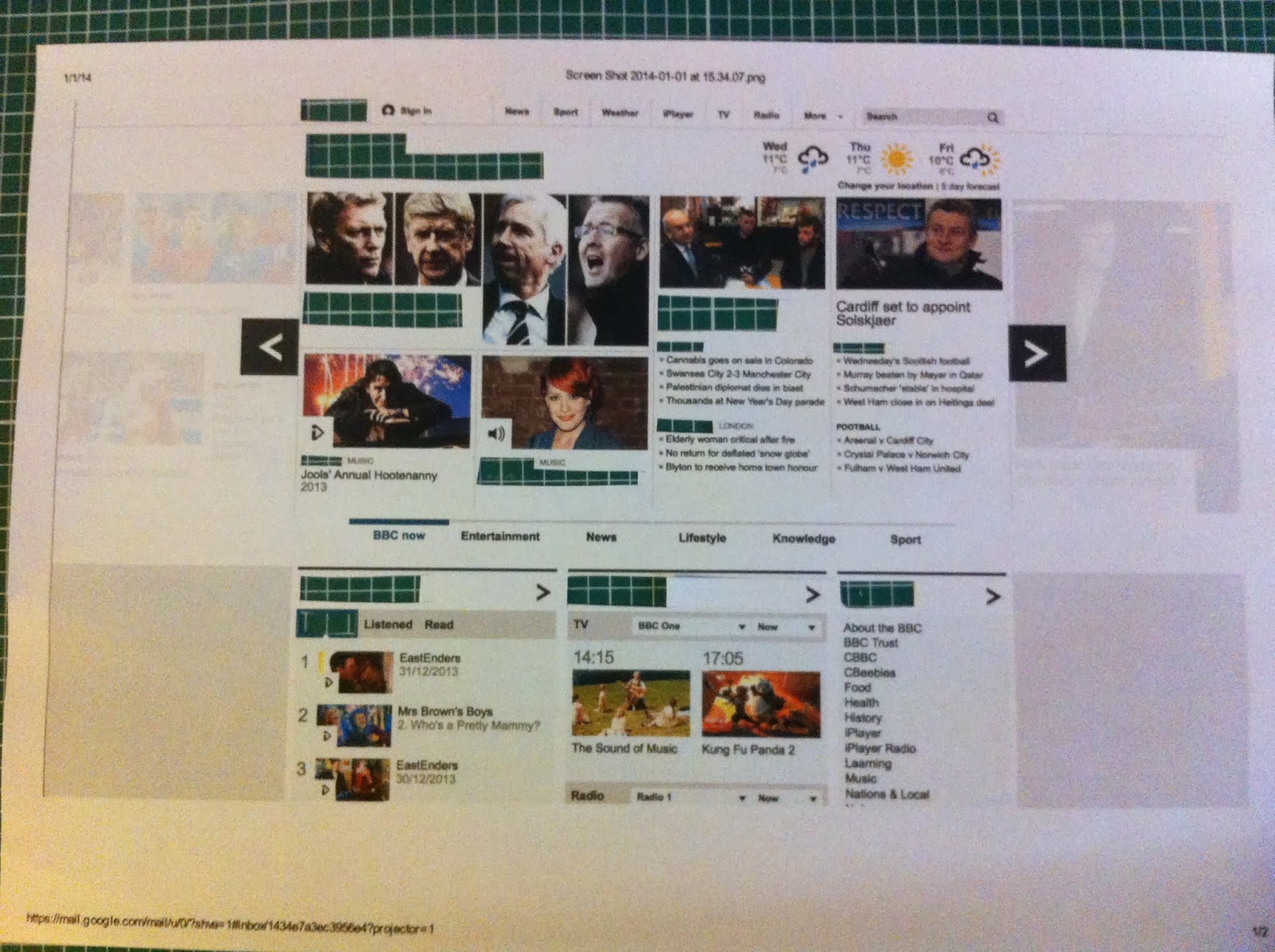
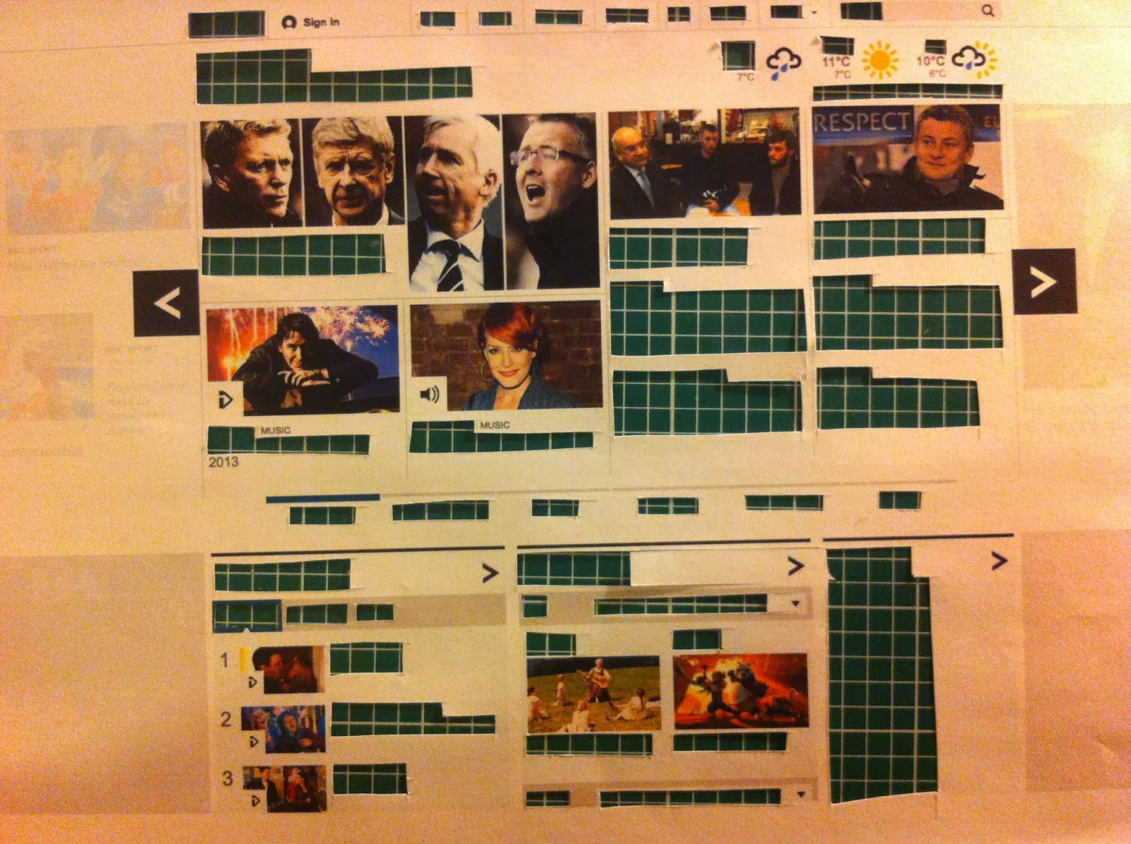
Unlike the printed formats I have previously done in this task this website only had three fonts which I believe to be Gill sans light, bold and regular. this could be because when viewing a web page you only see small sections and to use lots of fonts would over crowd it. Also I think Gill Sans has been used because of its clear association with the english identity (because of its use in the London Underground.) the main thing I noticed about its layout was its separation into columns and small boxes which brought tot mind not only the layout of many newspapers but also the structure of mobile websites. The largest difference between the first and second layout was the power reversed back text had out of context and the way small bold type had a strong grip on the eye in context yet in the second list all of these dropped down the hierarchy.
Monday, 6 January 2014
Wednesday, 1 January 2014
OUGD404 Type Journal Hand Rendered Signage
This set of shop signs are all hand painted yet make use of existing forms. The majority are based on stone production methods but there is also an image extending from the type on the 'gardening tools' sign. This suggests a heavier influence of the hand rendered style. The colours of the type and the way they are painted on banners suggests an established brand and although a specific era isn't referenced there is clearly a suggestion of age through the decision to use hand painted type.
OUGD404 Type Journal Meld of Sable and Bone Shop Front
The font used here is the same as that used on the branding and signage of this shop. However, small alterations have been made to allow for the amount of space available on the shop front. The gap between the two words is wider and the ratio of size between the two has changed, with the 'the' much bigger than on the sign. The italic style is derived from bone origins because of the squared off terminals and contrast of line weight. There is also a softness that I would associate with sable type production, so I would say that this hybrid could only be produced digitally, as well as the sizing exactness that would only be achievable in a digital way.
OUGD404 Type Journal Hand Rendered and Image as Type
This type created from image on the top of this board game, this would have to be hand drawn because of the file ability and change I each letter. The muted colour choices and the style of illustration definitely connotes another era; around the 40s perhaps because of the way it mimicked the finish of the printing methods of the time.
Subscribe to:
Posts (Atom)