
This design was intended for the purely image poster, it consists of two pictographic equations to show how we use electricity when we don't really need to. The starting point for this concept was part of studio brief 04, specifically the discovery that the majority of the energy we need is used to keep us warm. The link to this research can be found below, as can the feedback for this design.

The suggestion that this concept was the most obvious was surprising. The detached symbols were a bit of a risk and the simplicity of the design is intended to maintain a clear communication of meaning, which seems to have worked on at least one person.
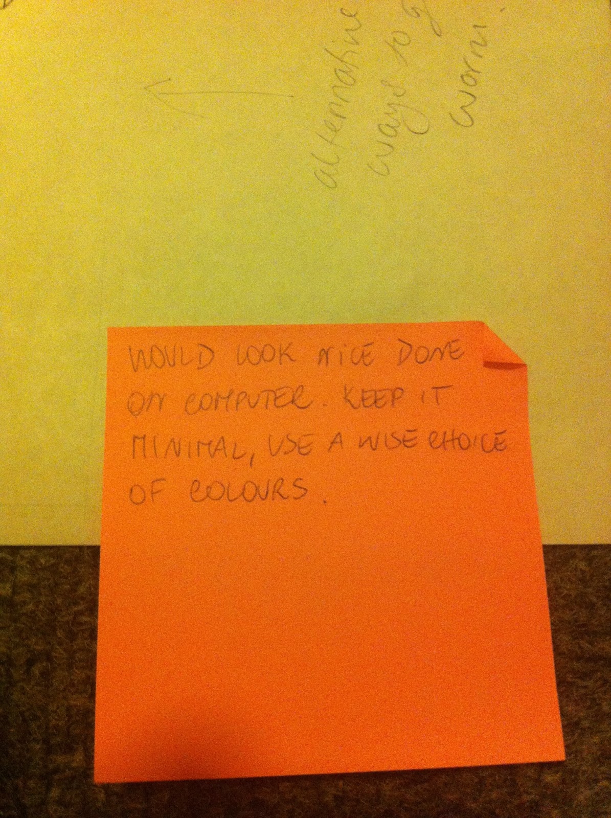
All of these designs were created with the simplistic clean cut finish of illustrator in mind, because of the brief requirement of a 'high impact' poster. I it reassuring to see that someone can see where the aesthetic of the posters are going and approves of it.

This concept developed after the project turned towards the idea of us being dependent on electricity in the same way that we are dependent on food.

This comment seems to be a generalisation on al of my sketches, however, the interest in the tone of voice that has been attempted in this project is encouraging and something to bare in mind during the rest of the project, so that there is a continuity of tone.

This was one of the earlier designs which was based on the idea of a physical dependence on electricity. It was intended to be an anatomical diagram of the human body but with electrical parallels-our bodies as electrical generators.

This design did not draw much comment but the suggestion of colour to improve it is a valid suggestion but the lack of comments suggest that it is possible not worth pursuing as a final design.

This design for the purely type poster is based on clutches of electrical wiring.

The ides of a consistent type face throughout is a great one to obtain the look of a set or a sequence of posters rather than separate posters simply on the same subject.

This comment got me thinking about exactly what the message the type is trying to convey and how it could be changed to fully and more effectively convey this. The message that has been identified for this project is that our consumption of electricity is glutinous. This could be communicated better by making fully connected lettering out of a single length of electrical cable, suggesting the transient nature of electricity and by extension the speed with which we use large amount of it.

Once the concept of the consumption of electricity had been identified this design looked at the most obvious way that I could symbolically convey this in the purely image poster.

Someone made a very vlid point, that it looks too much like a reference to the rolling stones most famous album cover. This was completely unintentional, and because these intertextual references do not fit with the message that was intended to be conveyed, this rules out this design. The references seem so strong that they overpower the message that should have been sent.

Some of the earlier comments suggested ways in which this continuity throughout the series of posters could be obtained (colour and typography), yet this is some thing that must be constantly monitored during the next stage of this project so that the final designs do have consistently.

The strength of illustration style seems to have drawn some attention so it may be a good idea to use these drawings as the base for the final designs, scanning them and tracing them rather than fully re-drawing them on illustrator.

Once again this idea comes from the consumption of electricity. The crit turned up no specific comments on this design which is possibly a sign that it simply doesn't draw attention enough to fulfill the brief specification of a 'high impact poster'.

This design for the purely typographic poster is drawn for the visual patterns found on micro chips. However, the message this is sending is confusing. Obviously the words convey a certain amount of the meaning but what does the typography convey apart from a general link to electricity?

The suggestion to mix all typographic designs into one is something that will not be acted on. This is because this would confuse the already ambiguous message being sent by the designs.

Something That will be experimented with is the use of yellow (a colour constantly associated with electicity). A bright yellow print can glow out of the design, possibly clearly communicating energy and electricity. The suggestion of using black and white is a fair one but its originality and effectiveness is questionable.

Although this comment understands that the visual inspiration for this design is a circuit board, this is the only thing it comments on, there is no development of the message being received, this is a major area that needs to be addressed in this brief.

Once again this is the strongest 'design' not the best form of communication. These designs are not intended to simply make people think that they look cool, they are supposed to communicate a message.

This design for the image and text poster is once again intended to convey the idea of our consumption of electricity. The text is a play on the saying a moment on the lips a life time on the hips.

Once again people seem to be referencing the visual aspect of the designs and less so the concept being conveyed by the visuals. However, the fact that someone didn't understand the reference to the saying mentioned above is a warning sign, if one person out of 25 didn't understand it then that would be a considerable cross section of the public were the designs to be used publicly.

The suggestion of looking into 1940s propaganda posters is an interesting one which could fit quite well into the style of digital illustration I have in mind with its high contrast shadows and block colours. A link can be found below to the research done in response to this suggestion.

This comment is looking more at what the design is conveying which is promising. The focus on gluttony could be made more clear by changing the text on the page, possibly by more overtly making a reference to eating in some way.

It is always nice to have a positive comment although there is little in constructive comments. The fact that there are a number of comments on this design, especially when compared to the others suggests that it is worth pursuing for a final design.
In order to see how the research done earlier in this project had fed into the designs please follow the link.
No comments:
Post a Comment