After the multiple thumbnails and the crit I went straight to the digital version I had of m very first layout and applied the suggestions that I got from the crit.

There was a lot of information that I needed to fit into this layout, and I used word spacing and line spacing to try and ensure that the bodies of text were evenly matched. Also, as was suggested in the crit, I have used letter spacing and the light version of Gill Sans to what I would have used as a quote, separate to the main bodies of text. I aligned the titles to the swatches lining the two outside lines of the pages.
I have drawn heavily from my exercises with type hierarchies in the creation of these spreads. I found that the most noticeable aspects of a page were where the type is either bold and heavy (mostly black) or light with large apertures. So, I used semi bold for the titles and widely spaced light gill sans for the 'quotes'.

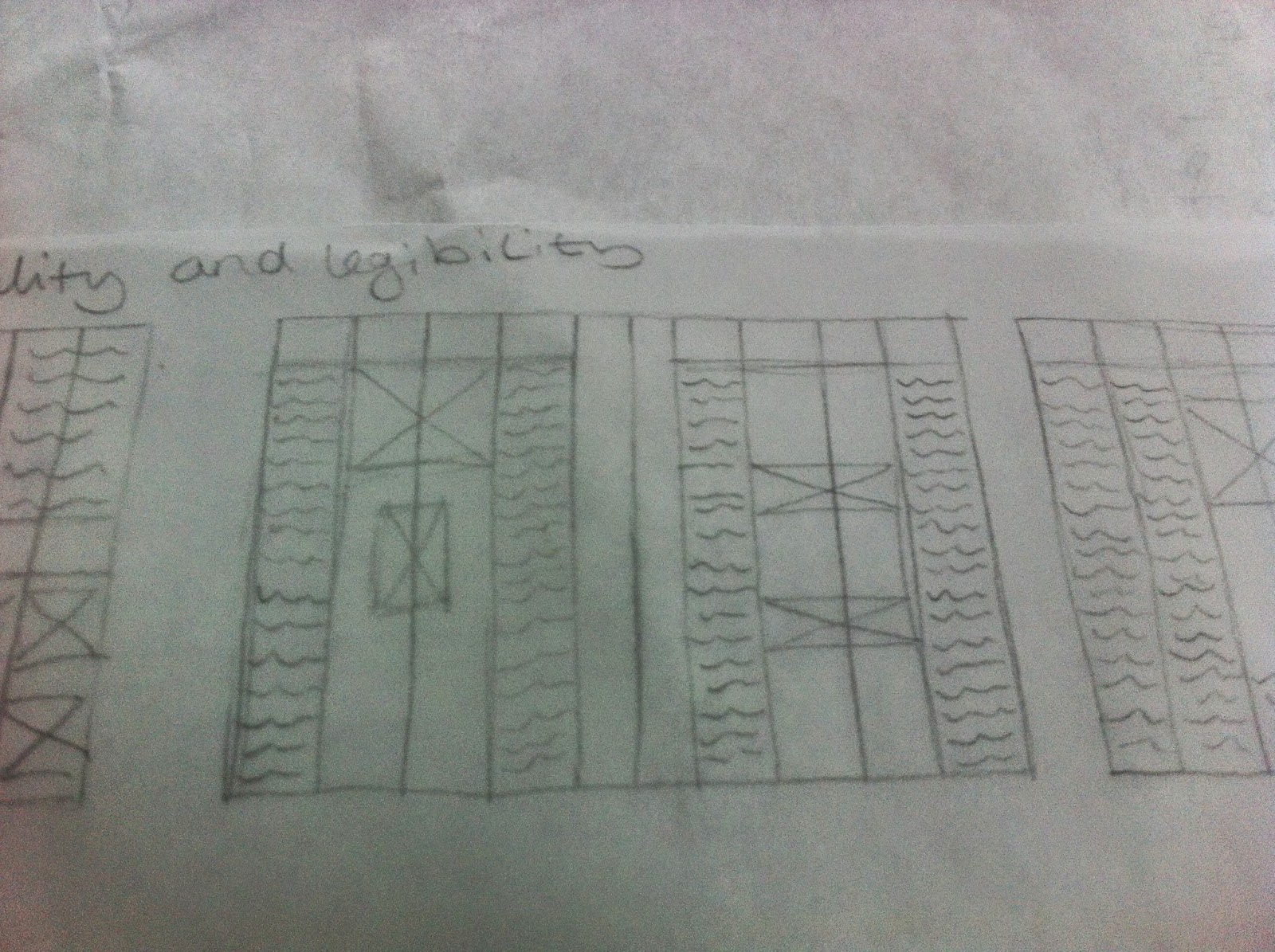
I stuck with the four column grid that I had at the crit but tried to insert some horizontal lines to form three rows across the spread.

However, I found that the content became far too restricted and regimented, making the page seem a bit unnatural and not read fluently. So, when constructing the page digitally, I drew from what I learned during the grid exercise we did earlier in the module. I found then that although many of them have horizontals, not all of the content abides by them. So I inserted the horizontals as I constructed the page I brought down rules to align certain aspects of the page such as images and the bottom of columns of text.
Another experience I have drawn from when digitally assembling this page was the layout brief I did in the studio brief on layout in module 2. This taught me that fully justified text is very visually appealing, but difficult to work with because it leads to rivers. This brief also allowed me to try out the idea of increasing the size or spacing of the first lines of columns to draw the eye to the beginning of the text.


I have found that often the layouts that look best in thumbnail form do not look best when digitally produced. So. I found myself trying out a number of the thumbnail designs and resolving on the one above with some slight changes to break up the text.

A suggested by the feedback received in the interim crit I have tried allowing the text to go beyond the bounds of the column lines to create a more cohesive whole. Because this creates a slightly less organised look, I have made sure that all aspects of the page at least hit the lines set out by the grid. I have done this by increasing the tracking on the titles and changing the sizes of the pictures.

To create continuity throughout the layouts I have decided to use Gill Sans. This is because it creates a variety on the page, with the light, regular and semi bold options within the type face, yet also the fonts do not fight with one another. This is hard to find and what makes a full type face so useful. As, I have learned from creating, or attempting to create my own typeface earlier in this project.
Something suggested by a pier on the course that I have also implemented is the use of a drawn line to try and ensure that all aspects of the page are evenly spaced. This is something I learned during the second brief of the third studio module when creating logo designs. Although I have implemented this a lot I try and create a balance between this and adhering to the grid lines.


The greatest problem I encountered when producing this layout was where to put the large amount of images. They include text on a number of them which means they couldn't be shrunk too much, otherwise legibility and readability is compromised.


Like in the previous layout I opted out of using frames on the images. This wa because the images had enough colour to distinguish them from the background and a frame might have been over doing it. Once again I used Gill Sans Semi-bold for the title and light for the subtitles (edited tracking to get it to hit the lines of the grid correctly.


After creating balanced lines and horizontals with the previous layouts I decided to try out miss matched column heights. However, the page just appeared a mess so I compromised with the text on the left being balanced and the columns on the right being in defending order. once again I made use of Gill Sans light and increased tracking to bring out the quotable areas of the text, establishing more continuity throughout the election of layouts.


Once again i established horizontals as I built up the page, aligning both images and text by adjusting the spacing and line spacing. I Once again made use of the soft grey frames, which provided a more assertive definition between the page and the images in such a way as to not detract from the dominance of the text. Once again I made use of the Gill Sans type face as mentioned in the previous layouts above.


As you can see I have taken the feedback received at the crit to heart and really tried to implement it. I have not stuck to the columns fully but allowed the text to expand beyond the singular column yet still used the lines a a guide. Light grey frames have been used once again with the spacing between each object on the page being moderated by the line trick mentioned earlier.


Because I wanted each paragraph to be below the one before I have relied much less on horizontals in this grid allowing the vertical to be the main restraining force.


To bring the focus to the centre of the page where the time line is I used the top of objects rather than the base line to line up with the horizontals of the page. I also allowed one of the images to bridge the gap between the two pages. this would not have been allowable for text and where legibility is a must but since it was an image I felt it would be ok. I may also be useful to mention here that the 0.5 cm margin and gutter are the result of the interim crit as well. It was suggested that I had more room there that could be used and since the book that these layouts would be used for wouldn't be all that big, a reasonably small gutter would pass muster.


No comments:
Post a Comment