https://www.behance.net/gallery/Chalk-Lettering/13974837
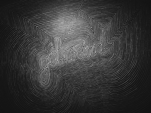
In its most basic form this type bares closest resemblance to sable type or simple hand written letters. However, the ornamentation of pattern around the type manages to successfully make it incredibly difficult to read, as does the lack of spacing between words.
No comments:
Post a Comment