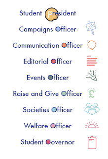
Because we had already developed an approach to the front of the heads up flyer we started by working on the back. I took the content and began to work in the icons, trying to create a sense of flow and legibility.
A lot of trial and error was involved in this but some feedback from Billie helped and reducing the icon size seemed to make a lot of difference.
Adding colours to the officer roles was just an experiment really but it seemed to add a sense of fun to something that would other wise seem very functional.
The only issue with this was the way that the governor and president roles didn't have any place to put the colour.
Putting it in anything but the 'O' seemed to ruin the context of them being like the planets in the logo.
In the end we settled on the compromise of using enclosed apertures only.
The front design had already been settled on but Billie did some work in photoshop and created a different version of the risograph texture with less semi tones. This can be seen when you compare the images above and below.
This more intense texture has more of a suggestion of a night sky. However, we have settled on doing a text print in the digital print so that we know which creates the better finish physically before we send it off to print. The presidential flyer was fairly simple too. Billie sent over the layout above and I tweaked it to the one you can see below.
It was decided that to create a definite sense of difference between this role and the others, this flyer would be A5 while the others are all A6. Following the same template as for the other flyer and te poster designs created a really nice sense of continuity for this design
The back layout proved more tricky because of the amount of content that we had to fit on it. We followed the same pattern of Billie creating the first draft, me trying a few things out and then sending it back and her refining it.
We knew that we needed some image content on the back and played around we a few ideas, but noting fitted with the rules set up by the designs so far except for using the Presidential icon.
We talked to Emma and Kaitlyn in the SU and they like this so we stuck with it.


No comments:
Post a Comment