Because I was having so much difficulty limiting where I wanted to go with the logo design, despite the fact tat I had a large number of ideas. So I simply started by scanning in the italic hand drawn type that had a positive response in the crit and started to experiment with some of the ideas I had sketched but in a digital format.
I had trouble with the quality of the scanned image, so I went on to trace the lettering with the pen tool in illustrator.
I experimented with the layering of type and image, looking at creating an opaque background to improve legibility.
I tried out some of the sketches in a digital format but nothing really grabbed me.
I then looked at the layering of lettering over the parallel lines, I quite liked this but felt that it could be improved somehow so I just started playing about with it.
I talked to Jess about it and asked a few other people and they said to make it more of a distinct overlay so it looked like it had been done more purposefully.
I did this in stages, slowly increasing the overlap.
This was a good improvement but I still felt uncertain about it. So, I asked a few more people for thoughts and suggestions and Taylor suggested that I perhaps should ornament the stem of the P, so I tried it out.
However, I just found that it distracted from the direction the word should be read in, just compromising the legibility.
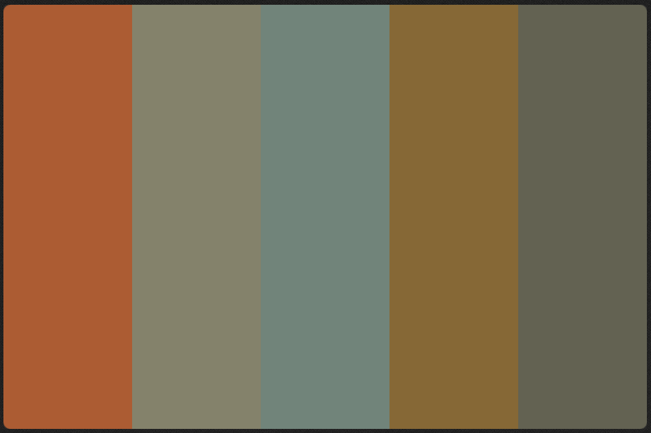
I thought that perhaps adding colour to the logo would help. I used a colour scheme from my summer project from a lichen plant. This stood out to me because I wanted to achieve something slightly more gender neutral, so that male feminists would not be put off buying the magazine, even though it may be aimed at women.
Simultaneously I tried simply reducing the opacity of the logo to get the cross over effect in a different way before I added the colours.
I really liked the way the two colours cross over allowing for a new colour overlap adding to the depth of the logo identity.
Following the same vein with the suggestions made for the black and white logo design and brought the two parallel lines closer together, I was unsure about this because I felt that perhaps the colours were too extreme.
But I continued to experiment with this movement anyway, just evaluating the effect it had both on the legibility of the text and the visual texture of the logo. I feel that cutting the letters up too much should be avoided because it does compromise the legibility too much.
I ended up producing a huge variety of different logo designs as I experimented with framing and interrupting the lettering along the theme of parallel. I also continued to tweak the opacity levels because I still felt that there might be something in this.
When I asked people to choose one I was still getting different choices each time. Although this narrowed the designs down to about 5 options this still did not give me much direction to develop in.
So, I tried looking at mocking the logos up using some of the images on the parallel tumblr account. I felt that the example above just looked too much like any other magazine title design and didn't communicate the 'different approach that parallel; it taking to the magazine world. Possibly the softness that the colour logos provide might get this 'difference' that I am looking for. The current magazine logos tend to have this sharp edgy look that I think Parallel should differentiate themselves from.
So, to try this out I went into indesign and looked at overlaying the only coloured logo that got two mentions, when people saw the page
I tweaked it a bit from the design seen on the sample page (fifth on the far left) so that this theme of parallel lines encompassed every aspect of the design.
However, When I overlaid this logo on the photograph It was just too dark to stand out from the photo. This lead me to try out some negative space to see if this would provide a slightly more visible platform for the type. But, this caused a problem; now there was no blue/green to pair with the orange. This was important in my opinion because it gave the brand flexibility. Having two colours is a must. Also the logo could not simply be printed on white paper without some kind of background.
In an attempt to find a way of integrating the blue/green I looked at having some kind of dotted line that matched to the parallel lines. I found that this was too reminiscent of the Tesco logo though so dropped it immediately.
Jess suggested that i darken the type so that it decisively came to the foreground and I think this really improves the logo. She also suggested I match the angle of the type to the parallel lines. This made the type much more legible.
I then started to consider how I would mesh the tag line with the logo because it is something the clearly want to do, as suggested by their current branding arrangement. This could be the way I integrate the colours that I wanted. The type i chose to use is called BP reply and I chose it because it had smooth rounded terminals that mimicked the style of the script font in the main logo. It seemed like the script font, if it wasn't script. I increased the tracking to 200 to gove it more of a sense of space.


No comments:
Post a Comment