After the file corrupted or something or other happened to the In Design document that had my magazine mock up I had to re do the entire thing. I encountered a few problems along the way.
To start with the overlap of the type, when imported into InDesign, didn't have the increase in colour that I was looking for. For some reason InDesign didn't copy over the opacity levels from Illustrator. So, I had to go in and trace over the sections by hand to get the effect I was looking for.
Once I had done this I looked at creating an integrated design for the front cover using the negative space logo that I had previously designed.
I then looked at some options for text justification That could work with the continuity the logo establishes. I used the same font as I did for the logo tag line with all caps and the same tracking.
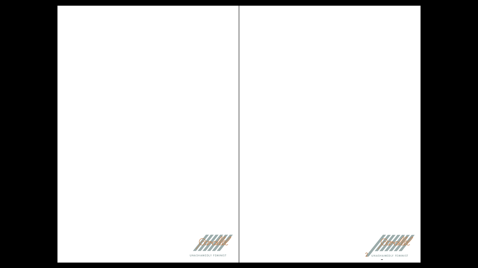
I also integrated the logo into the inner workings of the magazine. I extended one of the parallel lines in the logo on every other page, ending in the page number.
As the pages continued the logo increase in length with one extra parallel line for each extra page.
I went on to make a twitter page mock up, to show that this logo could work in a digital setting as well.
I used a zoomed in screen grab for the banner, outwardly advertising the magazines beliefs.
I then made sure I could get the logo central in its document before I placed it in the photoshop document.
I considered using a zoomed in texture of the hand rendered type but felt that making the tag line blatant was too useful to pass up.
I then simply placed the full logo into the profile picture section. I think this works surprisingly well and manages to be a bit edgy.
I then mocked up a navigation bar for the possible website that they would have. The parallel lines are extended once more, like in the booklet, with the buttons hidden behind their translucent form. Like tags they extend from these sheaths when hovered over to make them more functional as part of the design.


No comments:
Post a Comment