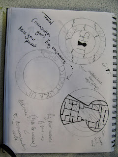
I was very much stuck on a circular design because I felt most locks were circular and the sticker was intended to be placed over the lock. We are undecided as to whether the sticker should have a hole in the middle where the key would be inserted into the lock or to leave a space where the key is supposed to break through the paper to lock the door. We like the way that the break of the sticker shows that the door has been locked (if only for the first time) but question its practicality as a product.
There were a number of ideas I was following that sprang from our early research, such as the texture created by the functioning edge of a key, the movement to locking something and even the texture and look of a micro chip in a credit card, but none of them really worked.
However, after we saw the work Alex had done with the Typeface Langdon, we went back to the drawing board using the shape of the letters and the drop shadow as a starting point. The design at the bottom of the picture below really caught our eye and so we took the idea further and did a couple more sketches inspired by the first, as seen at the bottom of the page.


No comments:
Post a Comment