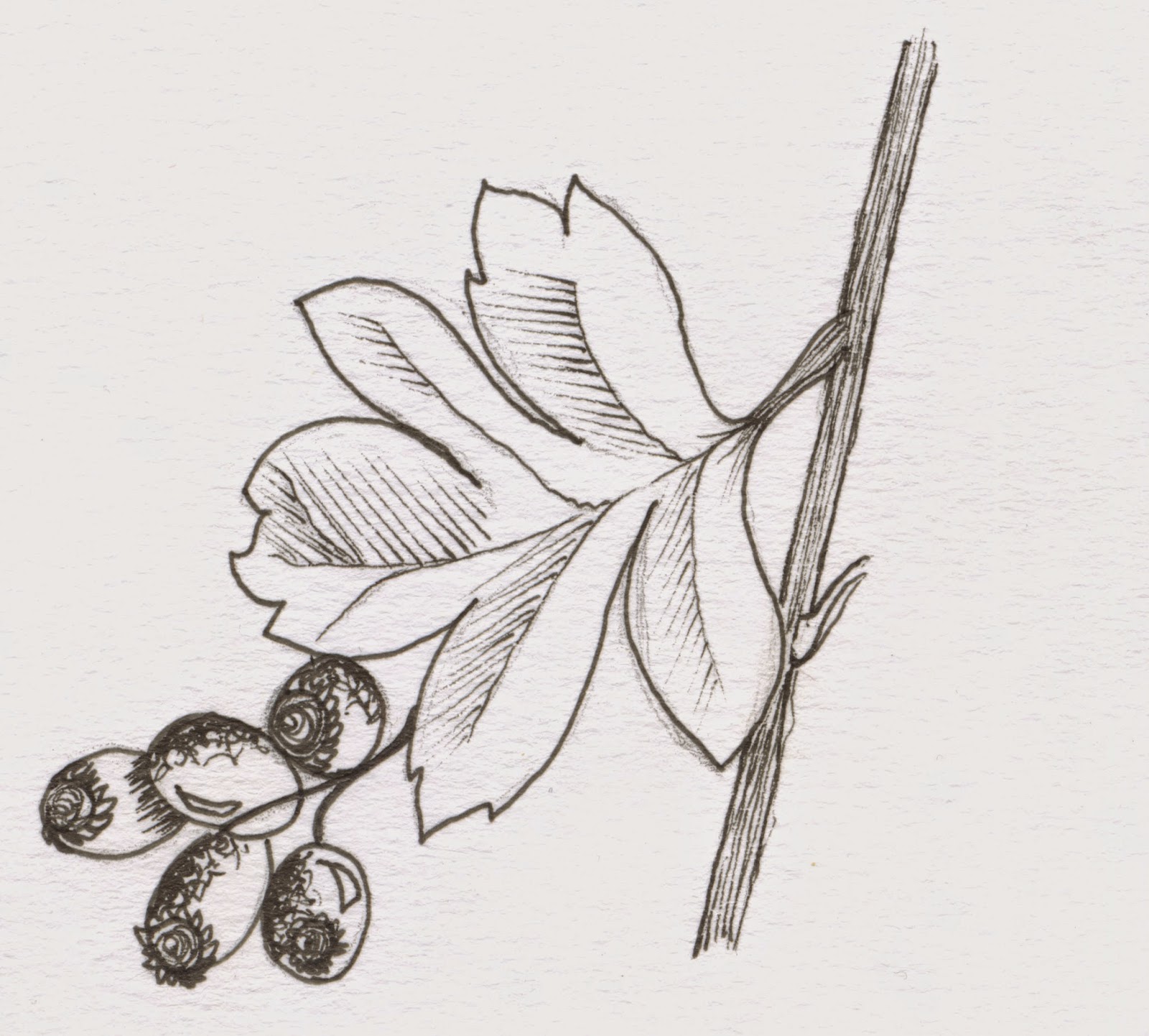
After figuring out the best way to vectorise the hawthorne illustration I thought that it would be simple to do the same with the illustrations shown further below.
However, as you can see they are all very different in shape and therefore required a slightly different approach each time. For the common bent (above) I used a tapered pen tool to create the branches and then made use of a wacom tablet to use the pencil tool and draw the seed heads by hand. This was hard to get to grips with but I think it creates a more illustrated look with the advantages of the low file size of a vector graphic.
For the Prickly saltwort I used the pencil tool throughout because I wanted a slightly scruffier finish and I really feel that I have achieved this.
I also added the type to the hunstanton logo. This was much easier than I expected because I didn't have to change a thing for the type to be legible and look right in a digital format. I feel that this is a marked improvement in my hand drawn type skills!
Once I had traced over the type for the other two walk logos I moved the illustrations around so that they could fit together slightly better.


No comments:
Post a Comment