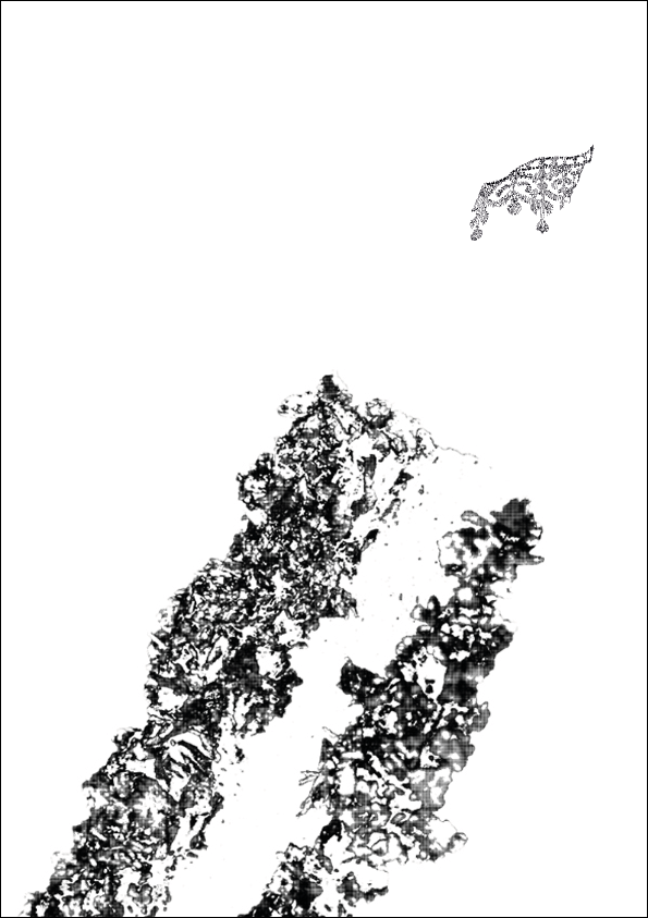
Once I had gotten the image onto the computer, the first issue I encountered was one of colour. The brief is limited to two colours plus stock and I had though previously that with this idea I could print a black and white image digitally with a gold spot colour screen printed over the gold in vetorised shapes I traced myself. However, after creating the image the idea of huge solid bits of ink on such a delicate image seemed far too dominant. So, I thought again and came up with half tone dots.
I selected the area I wanted to colour, Concentrating on the highlights of the foil and separated the layer from the black and white background.
I then made the selected area black and white and then selected the smallest 4 pixel half tone dots.
It created a fine web of shades that I think might just work.
When overlaid over the grey scale image it looked even better, the shades of the image adding depth to the half tone dots.
I also mocked up a quick look at how it might print out, adding brief colour to the dots and I think this could have side stepped the feeling of two definite layers that you can get from spot colours.

I also looked at how the image would work in portrait orientation and I think the angle works surprisingly well. It plays with the eye and the content is not so easily read because of the reflections. This fits with the content of the book in its evasive and open to interpretation manner but is explicit enough to just about make sense.
When it came to adding text I though for a wile about some of my other type only designs that I had discarded earlier in the design process. I had though to use something open and sans serif with a light stroke weight that hinted at tangibility and solidity but in its usage was the opposite. In this case opacity was the major tool to achieve this contrast.
Using the original book as a guide for content I played around with the idea that the word spectacle could fall behind the £5 note to suggest the close link between the spectacle and consumerism. However, after a brief crit it was suggested that this made the cover far too crowded, so I tried to make it feel more spacious by decreasing the size of the text and increasing the tracking as well as moving the text away from the note.
However, as I was working on the type I started to feel the the use of the gold ink in only one area of the design, although half tone dots, could seem a bit heavy and separate from the rest of the design.
If there was one area that I also wanted gold it was the £5 note. More than anything the reflection of the £5 note. This would help communicate the idea of our culture valuing appearances over all else. However, getting this to work visually was another problem. I tried a vector trace, but it just felt to crisp edged to sit next to the half tone dots.
I tried working on photoshop and both selecting the area for half tone dots and creating a separate layer of just the crown. In both situations it provided a very indistinct image.
Once this was done it creates two colour layers. One the image above and the other the positive below.
I went through the same mock up and half tone dot process with the other image from the shoot and I still really like it. It also got a good response during the crit so I will keep it and just try it out as a back cover image.


No comments:
Post a Comment