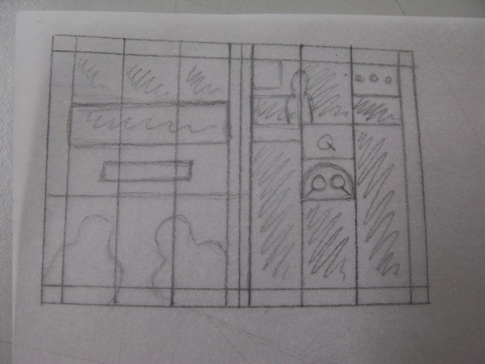
We repeated the grid drawing process, as can be seen below.
We each got a sheet of square paper and drew the spread proportionally correct but at a much smaller size.
Then taking the content that we had sign pointed when drawing the grid we created a new layout on the small thumbnail designs.
I fell into the trap of perhaps being too precious with my thumbnails. They are, after all, supposed to be quick simple mock ups, as long as I am aware of which images are where I need not make it more obvious to others.
I added some colour so that the text and image aspects of the page could be clearly separated.
Working to ratios rather than exact sizes works very well with layouts because they are fact and simple and easily translatable to a bigger size. Understanding the exact content you are working with is quintessential to creating useful thumbnails. When selecting content having less than you think you are going to need is a must. We all found that finding places for such a large amount of information was very difficult. The information needs to be in a variety of forms, so as to give the page texture and shape. Really anything above 12pt in print becomes a subtitle.
For the next session I need to select the specific content for five of my layouts with all of the above content in mind I will also do a selection of thumbnails for one of these layouts, just to keep in practice and start thinking about the design direction I want to go in.


No comments:
Post a Comment