Below are the design boards that I brought to the studio Brief 03 final crit.
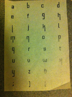
Below are the mandatory deliverables for this brief, the badge and A2 poster alphabet.
When it came to my feedback it was agreed that I had communicated what I has set out to when I defined what I waned to do with the words social, functional and confined. I had good reasons for each design decision. Possibly a little corporate in look. It conveyed the idea of a city environment but more in an architectural sense than the people that live in it which perhaps didn't match with Mo's personality. People were surprised at the personality traits I focussed in on and expected a much bigger brasher font.
I think the fact this it looks a bit corporate was something that I was aware of at an early stage and this would have been better explained if I had had the chance to show my design boards. These had the samples of mono-prints I did for this brief and the texture created by this process gave the glyph a much more human font and as a result less corporate.
General feedback that ran throughout many of the designs included:
-People often based their designs on what people liked rather than their actual personality aspects.
-When people research historical design examples people should analyse what exactly they communicate before they use influences from it.
- It was helpful to communication to look at current uses of fonts that communicate similar things. Intertextual references creating fast communication of idea.
- Influences out side photography created inventive designs.


No comments:
Post a Comment