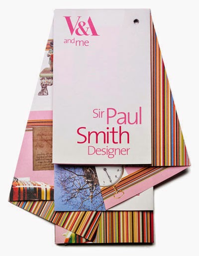
Out of all the designs I found online, Pinterest mostly, These were the ones that stood out.
I really love the way the folds of this suggest chaos and slight disorder, while still being practical and usable. This is something that I want to try and suggest with my design, so maybe what I need to do is look at 'bad folding' in a chaotic manner and seeing how content might fit into this frame work.

In lots of last years briefings I managed to completely disregard colour. This time I want to think about it from the get go. The example above in the form of a menu makes great use of simple folding and a limited two colour pallet. It gives a really strong sense of inside and out which is a theme I have been thinking about in relation to my design process. There is the face value of my design process, which can seem quite organised and normal, but really, inside I am a mess of ideas and thoughts all vying for my attention. This is something that I could focus on communicating. However, I need to be careful to limit the direction I am going in so that the message my design conveys is not too mixed.


There is the obvious option of creating a three dimensional leaflet of some description. I wanted to look at a box design because something I always like to do with a brief is to consider what the usual parameters for the brief might be, the proverbial box, and attempt to think outside of it. I would have to be careful to make the box reversible because I would not want to suggest that all my thoughts occur inside the proverbial box.


